- Power BI forums
- Updates
- News & Announcements
- Get Help with Power BI
- Desktop
- Service
- Report Server
- Power Query
- Mobile Apps
- Developer
- DAX Commands and Tips
- Custom Visuals Development Discussion
- Health and Life Sciences
- Power BI Spanish forums
- Translated Spanish Desktop
- Power Platform Integration - Better Together!
- Power Platform Integrations (Read-only)
- Power Platform and Dynamics 365 Integrations (Read-only)
- Training and Consulting
- Instructor Led Training
- Dashboard in a Day for Women, by Women
- Galleries
- Community Connections & How-To Videos
- COVID-19 Data Stories Gallery
- Themes Gallery
- Data Stories Gallery
- R Script Showcase
- Webinars and Video Gallery
- Quick Measures Gallery
- 2021 MSBizAppsSummit Gallery
- 2020 MSBizAppsSummit Gallery
- 2019 MSBizAppsSummit Gallery
- Events
- Ideas
- Custom Visuals Ideas
- Issues
- Issues
- Events
- Upcoming Events
- Community Blog
- Power BI Community Blog
- Custom Visuals Community Blog
- Community Support
- Community Accounts & Registration
- Using the Community
- Community Feedback
Register now to learn Fabric in free live sessions led by the best Microsoft experts. From Apr 16 to May 9, in English and Spanish.
- Power BI forums
- Forums
- Get Help with Power BI
- Desktop
- Show % of Total in bar chart
- Subscribe to RSS Feed
- Mark Topic as New
- Mark Topic as Read
- Float this Topic for Current User
- Bookmark
- Subscribe
- Printer Friendly Page
- Mark as New
- Bookmark
- Subscribe
- Mute
- Subscribe to RSS Feed
- Permalink
- Report Inappropriate Content
Show % of Total in bar chart
Hi there,
I'm hoping there is someone who can help me.
I am analyzing survey data.
The first question asks if there's been a "change in size". If they say "yes", then ask a follow up question that explains the reasons for the change in size. This is a multiple-choice question and they can choose as many options as they want for explaining the change in size.
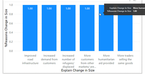
Now I want to show a bar chart that shows all the different reasons why there's a change in size, and the Value should be the % of the # of interviewees who mentioned this reason.
Because of the layout of the survey, if you added up all the percents across this bar chart, it should be more than 100%, because each interviewee is allowed to answer multiple choices.
But right now, this is all that I've been able to figure out:
The x-axis just shows the different reasons given.
The Value is a measure that I've currently got calculated as this:
%Reasons Change in Size =
DIVIDE (
COUNTA('mc_Explain Change in Size'[_uuid]),
CALCULATE ( COUNTA('MSMA 2A - KI Goods (Main Table)'[_uuid]),ALL('MSMA 2A - KI Goods (Main Table)'[_uuid]))
)
So, "_uuid" in each case is the unique ID code for each interviewee. If it's the _uuid from the main table - there is just one row for each interview. But the _uuid in the "Explain Change in Size" table is repeated multiple times (one time for each different option they chose).
So somehow, I just need the "count" of the UUID from the "Explain Change in Size" table to be filtered based on each option.
I'm hoping someone can help!
Thanks!
Janna
Solved! Go to Solution.
- Mark as New
- Bookmark
- Subscribe
- Mute
- Subscribe to RSS Feed
- Permalink
- Report Inappropriate Content
Okay - got it - you were super close, and it was indeed very simple.
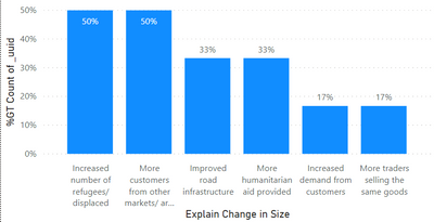
Here's the bar chart in the end. No measure used. But I was counting the wrong _uuid in the original version.
So, if I just drop the _uuid in from the main table (the parent table, not the child table) - then it gives the correct visualisation I'm looking for.
Thanks!
- Mark as New
- Bookmark
- Subscribe
- Mute
- Subscribe to RSS Feed
- Permalink
- Report Inappropriate Content
can you provide a example of it, maybe a excel file with some dummy data and a manual example of what you aiming for, to better respond the topic.
Did I answer your question? Mark my post as a solution! / Did it help? Give some Kudos!
Proud to be a Super User!
- Mark as New
- Bookmark
- Subscribe
- Mute
- Subscribe to RSS Feed
- Permalink
- Report Inappropriate Content
Okay - got it - you were super close, and it was indeed very simple.
Here's the bar chart in the end. No measure used. But I was counting the wrong _uuid in the original version.
So, if I just drop the _uuid in from the main table (the parent table, not the child table) - then it gives the correct visualisation I'm looking for.
Thanks!
- Mark as New
- Bookmark
- Subscribe
- Mute
- Subscribe to RSS Feed
- Permalink
- Report Inappropriate Content
Hi @jannahds
Are you trying to calculate the number of rows by category or summing up some numbers? I think your measure is dividing the same number by itself.
Try to put your 2 measures inside the DIVIDE in seperate once and then use them in a card to see if they are equal and from act upon the filters until you get the right one
A1 = COUNTA('mc_Explain Change in Size'[_uuid])
and
A2 = CALCULATE ( COUNTA('MSMA 2A - KI Goods (Main Table)'[_uuid]),ALL('MSMA 2A - KI Goods (Main Table)'[_uuid]))see A1 and A2 how they are calculated in a Card visual.
Regards
Amine Jerbi
If I answered your question, please mark this thread as accepted
and you can follow me on
My Website, LinkedIn and Facebook
- Mark as New
- Bookmark
- Subscribe
- Mute
- Subscribe to RSS Feed
- Permalink
- Report Inappropriate Content
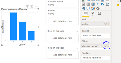
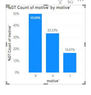
If I understand correctly it a simply soluction actually, you dont need a measure for this,
create your visual with the X-Axis as the change motives as you have, them add that same field as value and click on the field setting for the visual and set it to count:
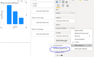
then in the circle area click it and select show % of grand total
Did I answer your question? Mark my post as a solution! / Did it help? Give some Kudos!
Proud to be a Super User!
- Mark as New
- Bookmark
- Subscribe
- Mute
- Subscribe to RSS Feed
- Permalink
- Report Inappropriate Content
Hi! So, in your bar chart - the total of the percentages add up to 100% - because you're calculating the percentage of times each motivation showed up out of the total list of motivations. However, what I'm trying to do is get it to be a percentage of the # of interviews (a much lower number).
So - the number of interviewees is 10, for example, and each interviewee gives 3 motivations for change - so I end up with 30 motivations total.
Now in the final bar chart, I'm trying to see what % of interviewees gave "A" as the reason for change - so maybe 80% of interviewees gave "A" as the reason, and only 10% gave "B" as the reason, and maybe 30% gave "C" as the reason...does that make sense?
Just not sure what the measure needs to be to calculate this...
Thanks!
Janna
Helpful resources

Microsoft Fabric Learn Together
Covering the world! 9:00-10:30 AM Sydney, 4:00-5:30 PM CET (Paris/Berlin), 7:00-8:30 PM Mexico City

Power BI Monthly Update - April 2024
Check out the April 2024 Power BI update to learn about new features.

| User | Count |
|---|---|
| 96 | |
| 93 | |
| 82 | |
| 70 | |
| 64 |
| User | Count |
|---|---|
| 118 | |
| 106 | |
| 93 | |
| 79 | |
| 72 |
