- Power BI forums
- Updates
- News & Announcements
- Get Help with Power BI
- Desktop
- Service
- Report Server
- Power Query
- Mobile Apps
- Developer
- DAX Commands and Tips
- Custom Visuals Development Discussion
- Health and Life Sciences
- Power BI Spanish forums
- Translated Spanish Desktop
- Power Platform Integration - Better Together!
- Power Platform Integrations (Read-only)
- Power Platform and Dynamics 365 Integrations (Read-only)
- Training and Consulting
- Instructor Led Training
- Dashboard in a Day for Women, by Women
- Galleries
- Community Connections & How-To Videos
- COVID-19 Data Stories Gallery
- Themes Gallery
- Data Stories Gallery
- R Script Showcase
- Webinars and Video Gallery
- Quick Measures Gallery
- 2021 MSBizAppsSummit Gallery
- 2020 MSBizAppsSummit Gallery
- 2019 MSBizAppsSummit Gallery
- Events
- Ideas
- Custom Visuals Ideas
- Issues
- Issues
- Events
- Upcoming Events
- Community Blog
- Power BI Community Blog
- Custom Visuals Community Blog
- Community Support
- Community Accounts & Registration
- Using the Community
- Community Feedback
Register now to learn Fabric in free live sessions led by the best Microsoft experts. From Apr 16 to May 9, in English and Spanish.
- Power BI forums
- Forums
- Get Help with Power BI
- Desktop
- Show data label as percentage of total for stacked...
- Subscribe to RSS Feed
- Mark Topic as New
- Mark Topic as Read
- Float this Topic for Current User
- Bookmark
- Subscribe
- Printer Friendly Page
- Mark as New
- Bookmark
- Subscribe
- Mute
- Subscribe to RSS Feed
- Permalink
- Report Inappropriate Content
Show data label as percentage of total for stacked bar chart instead of absolute value
Hi guys,
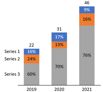
I was wondering if there is a workaround for Power BI stacked bar chart to show percentage of total (example below) instead of absolute value. By default only 100% stacked column chart could show data label in percentages but I would like to replicate sometime similar to the chart below instead. Thanks!
- Mark as New
- Bookmark
- Subscribe
- Mute
- Subscribe to RSS Feed
- Permalink
- Report Inappropriate Content
excellent
- Mark as New
- Bookmark
- Subscribe
- Mute
- Subscribe to RSS Feed
- Permalink
- Report Inappropriate Content
A half-solution I have found to allow you to simultaneously display absolute values and percentages is to use a Line + Stacked Column chart and put your percentage measure on the secondary y-axis and change your line width to 0px. It does achieve a different result to what you're after as the percentage won't position themselves inside the stacked bars like you're requesting. They would either position according to the 0->100% secondary y-axis or you could get a single measure to display at the bottom of each column, like this:
This shows the absolute values as well as the percentage of purple vs pink
- Mark as New
- Bookmark
- Subscribe
- Mute
- Subscribe to RSS Feed
- Permalink
- Report Inappropriate Content
Hello @Nomadexchris, any updates on the issue? I have the same use case, did you find any workaround?
Kind regards.
- Mark as New
- Bookmark
- Subscribe
- Mute
- Subscribe to RSS Feed
- Permalink
- Report Inappropriate Content
@Nomadexchris , You have to create a % measure and then show that as value and a total measure that you have to show as line and make line color same as background or #FFFFFF00
Meausre1 = calculate([measure], removefilters(Table[series]))
or
Meausre1 = calculate([measure], filters(allselected(Table[series]), Table[series] = max(Table[series])))
% total = divide([Measure], [Measure1])
Use Measure 1 and % total
Microsoft Power BI Learning Resources, 2023 !!
Learn Power BI - Full Course with Dec-2022, with Window, Index, Offset, 100+ Topics !!
Did I answer your question? Mark my post as a solution! Appreciate your Kudos !! Proud to be a Super User! !!
- Mark as New
- Bookmark
- Subscribe
- Mute
- Subscribe to RSS Feed
- Permalink
- Report Inappropriate Content
Dear @amitchandak, thanks for your response. However, I think the result will be a 100% stacked chart with a total amount. However, this would not allow me to show the overall trend using the bar chart
- Mark as New
- Bookmark
- Subscribe
- Mute
- Subscribe to RSS Feed
- Permalink
- Report Inappropriate Content
Hi @Nomadexchris have you had any luck in recreating the chart from your example?
I have the same use case and can't figure a way around it and all the solutions from Microsoft experts all point to 100% stacked charts.
Helpful resources

Microsoft Fabric Learn Together
Covering the world! 9:00-10:30 AM Sydney, 4:00-5:30 PM CET (Paris/Berlin), 7:00-8:30 PM Mexico City

Power BI Monthly Update - April 2024
Check out the April 2024 Power BI update to learn about new features.

| User | Count |
|---|---|
| 100 | |
| 99 | |
| 80 | |
| 77 | |
| 66 |
| User | Count |
|---|---|
| 134 | |
| 106 | |
| 104 | |
| 85 | |
| 73 |


