- Power BI forums
- Updates
- News & Announcements
- Get Help with Power BI
- Desktop
- Service
- Report Server
- Power Query
- Mobile Apps
- Developer
- DAX Commands and Tips
- Custom Visuals Development Discussion
- Health and Life Sciences
- Power BI Spanish forums
- Translated Spanish Desktop
- Power Platform Integration - Better Together!
- Power Platform Integrations (Read-only)
- Power Platform and Dynamics 365 Integrations (Read-only)
- Training and Consulting
- Instructor Led Training
- Dashboard in a Day for Women, by Women
- Galleries
- Community Connections & How-To Videos
- COVID-19 Data Stories Gallery
- Themes Gallery
- Data Stories Gallery
- R Script Showcase
- Webinars and Video Gallery
- Quick Measures Gallery
- 2021 MSBizAppsSummit Gallery
- 2020 MSBizAppsSummit Gallery
- 2019 MSBizAppsSummit Gallery
- Events
- Ideas
- Custom Visuals Ideas
- Issues
- Issues
- Events
- Upcoming Events
- Community Blog
- Power BI Community Blog
- Custom Visuals Community Blog
- Community Support
- Community Accounts & Registration
- Using the Community
- Community Feedback
Register now to learn Fabric in free live sessions led by the best Microsoft experts. From Apr 16 to May 9, in English and Spanish.
- Power BI forums
- Forums
- Get Help with Power BI
- Desktop
- Scaling X Axis on a Line Chart so that a full year...
- Subscribe to RSS Feed
- Mark Topic as New
- Mark Topic as Read
- Float this Topic for Current User
- Bookmark
- Subscribe
- Printer Friendly Page
- Mark as New
- Bookmark
- Subscribe
- Mute
- Subscribe to RSS Feed
- Permalink
- Report Inappropriate Content
Scaling X Axis on a Line Chart so that a full year fits in view
I want to look at historical volumes over one calendar year, where I can easily see the monthly difference between each year. I have found a crude work-around but it requires me to use false-dates (I trick the data by using a date with a year that is irrelevent and putting the data in seperate columns by the correct year, stored as text).
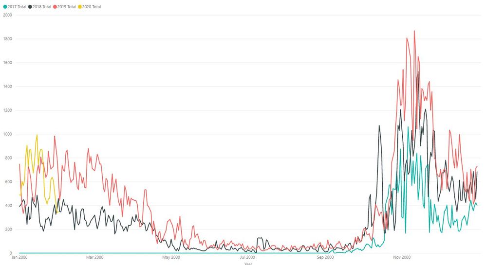
TO make this graph look about right, I use one column for dates with a false year (like 2000) and columns for each of the correct years (Where the year is stored as text), but then the axis (while it looks great!) shows the year 2000, which is false.
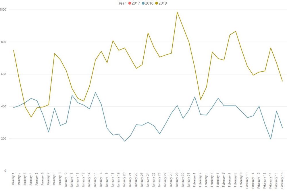
To achieve the graph below, here, I have one column for the correct date, and one for the volume value. Then in the graph details, I can use date hiarchary and remove the YEAR to have them overlayed by day-of-the-year. BUT The scale is so large, that it is meaningless because you have to scroll and scroll and can't see a snapshot of the whole year.
Both of these graphs show the same data, the same number of data points. Both are displaying daily values.
Main Question: How can I get my graph to shrink the scale so that a full year fits on the screen with daily data points?
- Mark as New
- Bookmark
- Subscribe
- Mute
- Subscribe to RSS Feed
- Permalink
- Report Inappropriate Content
I'm having the same issue. Basically, I'd like to have the scaling functionality of a continuous x-axis while keeping my date hierarchy. Otherwise, for many time series, the date hierarchy is much less useful. One major plus of the date hierarchy is the ability to move seamlessly from yearly data to daily data (and anything in between) which almost by definition creates 250 to 365 times more data points (depending on whether business days or calendar days are used) so for the x-axis to not be able to scale is a pretty big shortfall.
If anyone has any luck with this, it'd be helpful.
- Mark as New
- Bookmark
- Subscribe
- Mute
- Subscribe to RSS Feed
- Permalink
- Report Inappropriate Content
@amelindah Have you had any luck getting this to work? I have a very similar problem to yours (the only difference is that I have sales on the y-axis). This seems like a very simple visual to "ask" of Power BI... how is it that it is impossible to create without some brute force workaround? And, how are we the only two people in the universe with this problem?
Would it be possible for you to share more details on the way you "trick the data?"
- Mark as New
- Bookmark
- Subscribe
- Mute
- Subscribe to RSS Feed
- Permalink
- Report Inappropriate Content
Hey @amelindah ,
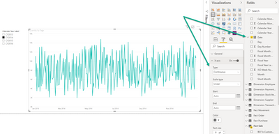
I assume you want something like this:
Make sure that the Day column that you are using on the x-axis is of data type date or datetime.
Make sure the x-axis Type is Continuous.
Then it should work.
Hopefully, this provides what you are looking for.
Regards,
Tom
Did I answer your question? Mark my post as a solution, this will help others!
Proud to be a Super User!
I accept Kudos 😉
Hamburg, Germany
- Mark as New
- Bookmark
- Subscribe
- Mute
- Subscribe to RSS Feed
- Permalink
- Report Inappropriate Content
Thanks, Tom.
This does not work because the data is then displayed in chronological order, and the different years are not overlayed, they are one after the next from left to right in the chart. Does that make sense?
When I uncheck the YYYY in the date heirarchy, it doesn't allow me to go continuous, as it shouldn't, since I want it to "loop". The X axis would be January-December of ANY given year, where the year is the legend.
Helpful resources

Microsoft Fabric Learn Together
Covering the world! 9:00-10:30 AM Sydney, 4:00-5:30 PM CET (Paris/Berlin), 7:00-8:30 PM Mexico City

Power BI Monthly Update - April 2024
Check out the April 2024 Power BI update to learn about new features.

| User | Count |
|---|---|
| 114 | |
| 105 | |
| 77 | |
| 67 | |
| 63 |
| User | Count |
|---|---|
| 144 | |
| 107 | |
| 105 | |
| 82 | |
| 69 |


