- Power BI forums
- Updates
- News & Announcements
- Get Help with Power BI
- Desktop
- Service
- Report Server
- Power Query
- Mobile Apps
- Developer
- DAX Commands and Tips
- Custom Visuals Development Discussion
- Health and Life Sciences
- Power BI Spanish forums
- Translated Spanish Desktop
- Power Platform Integration - Better Together!
- Power Platform Integrations (Read-only)
- Power Platform and Dynamics 365 Integrations (Read-only)
- Training and Consulting
- Instructor Led Training
- Dashboard in a Day for Women, by Women
- Galleries
- Community Connections & How-To Videos
- COVID-19 Data Stories Gallery
- Themes Gallery
- Data Stories Gallery
- R Script Showcase
- Webinars and Video Gallery
- Quick Measures Gallery
- 2021 MSBizAppsSummit Gallery
- 2020 MSBizAppsSummit Gallery
- 2019 MSBizAppsSummit Gallery
- Events
- Ideas
- Custom Visuals Ideas
- Issues
- Issues
- Events
- Upcoming Events
- Community Blog
- Power BI Community Blog
- Custom Visuals Community Blog
- Community Support
- Community Accounts & Registration
- Using the Community
- Community Feedback
Register now to learn Fabric in free live sessions led by the best Microsoft experts. From Apr 16 to May 9, in English and Spanish.
- Power BI forums
- Forums
- Get Help with Power BI
- Desktop
- Questions about line charts
- Subscribe to RSS Feed
- Mark Topic as New
- Mark Topic as Read
- Float this Topic for Current User
- Bookmark
- Subscribe
- Printer Friendly Page
- Mark as New
- Bookmark
- Subscribe
- Mute
- Subscribe to RSS Feed
- Permalink
- Report Inappropriate Content
Questions about line charts
Hello!
I have built Power BI files for three different projects with similar line charts, but the charts behave differently, and I am trying to figure out why. I have two questions/problems.
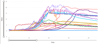
The picture shows as an example graph from the first Power BI. This is the ideal line chart - there are 18 lines and when I hover my mouse over the line it shows the tooltip only for that line.
I wanted to build exactly same Power BI for the next project, but I ran to a limitation of 10 lines. The second chart should also have 18 lines, but it shows only 10. The first question is - where does the limitation come from and is it possible to show more lines?
And for the third Power BI the problem is that the tooltip shows information for all the lines, but I want to show it for only one like for the first two graphs. The only differenceI can think of is, that this chart currently has only 5 lines.
- Mark as New
- Bookmark
- Subscribe
- Mute
- Subscribe to RSS Feed
- Permalink
- Report Inappropriate Content
Hi @nufffins ,
As far as I know , there is no limitation on the number of lines in Power BI Line chart. If your data model in second Power BI report is the same as the first one. I think two chart should be the same. What the visual looks like should be impacted by the size of your visual or other filters in your report. Please check whether there are some other filters in your report in Page level or Report level.
If this reply still couldn't help you solve your problem, please share a sample file with me. And show me a screenshot with the result you want. This will make it easier for me to find the solution.
Best Regards,
Rico Zhou
If this post helps, then please consider Accept it as the solution to help the other members find it more quickly.
- Mark as New
- Bookmark
- Subscribe
- Mute
- Subscribe to RSS Feed
- Permalink
- Report Inappropriate Content
Hi! Thanks for the answer and willingness to help.
The data model is not exactly the same for the three files, but it is very similar. I prepared a sample PowerBI and files. They are here: https://wetransfer.com/downloads/d4cd23c978bc4795b18077707150ed0020220729095357/8adc7246b63ad1e4b7e7...
Firstly I want to know if it is possible to show more than 10 lines on the graph.
Second issue, that I didn't address in this topic, is that I would want the shaded standard deviation error area to be on both side of the line. Example screenshots are in the other topic: Re: Shaded standard deviation on line graph - Microsoft Power BI Community
Helpful resources

Microsoft Fabric Learn Together
Covering the world! 9:00-10:30 AM Sydney, 4:00-5:30 PM CET (Paris/Berlin), 7:00-8:30 PM Mexico City

Power BI Monthly Update - April 2024
Check out the April 2024 Power BI update to learn about new features.

| User | Count |
|---|---|
| 106 | |
| 104 | |
| 79 | |
| 68 | |
| 61 |
| User | Count |
|---|---|
| 144 | |
| 104 | |
| 103 | |
| 82 | |
| 70 |

