- Power BI forums
- Updates
- News & Announcements
- Get Help with Power BI
- Desktop
- Service
- Report Server
- Power Query
- Mobile Apps
- Developer
- DAX Commands and Tips
- Custom Visuals Development Discussion
- Health and Life Sciences
- Power BI Spanish forums
- Translated Spanish Desktop
- Power Platform Integration - Better Together!
- Power Platform Integrations (Read-only)
- Power Platform and Dynamics 365 Integrations (Read-only)
- Training and Consulting
- Instructor Led Training
- Dashboard in a Day for Women, by Women
- Galleries
- Community Connections & How-To Videos
- COVID-19 Data Stories Gallery
- Themes Gallery
- Data Stories Gallery
- R Script Showcase
- Webinars and Video Gallery
- Quick Measures Gallery
- 2021 MSBizAppsSummit Gallery
- 2020 MSBizAppsSummit Gallery
- 2019 MSBizAppsSummit Gallery
- Events
- Ideas
- Custom Visuals Ideas
- Issues
- Issues
- Events
- Upcoming Events
- Community Blog
- Power BI Community Blog
- Custom Visuals Community Blog
- Community Support
- Community Accounts & Registration
- Using the Community
- Community Feedback
Register now to learn Fabric in free live sessions led by the best Microsoft experts. From Apr 16 to May 9, in English and Spanish.
- Power BI forums
- Forums
- Get Help with Power BI
- Desktop
- Pie Chart Data value not showing all the values
- Subscribe to RSS Feed
- Mark Topic as New
- Mark Topic as Read
- Float this Topic for Current User
- Bookmark
- Subscribe
- Printer Friendly Page
- Mark as New
- Bookmark
- Subscribe
- Mute
- Subscribe to RSS Feed
- Permalink
- Report Inappropriate Content
Pie Chart Data value not showing all the values
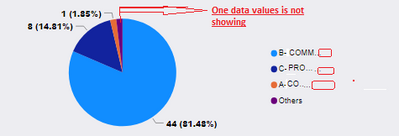
I am using pie chart. The attached sample pie chart contains 4 data values. but, it showing 0nly 3 values.
If i increase the height and width, then only it's showing all the data values.
How to show all the values in one single view....?
Note : Legen values also will not be showing full words.
Solved! Go to Solution.
- Mark as New
- Bookmark
- Subscribe
- Mute
- Subscribe to RSS Feed
- Permalink
- Report Inappropriate Content
Hi @saivina2920 ,
You will have to do 2 things to achieve this:
- Adjust the size of the data lables.
- Try to use data lables in non-bold format.
- Adjust the size of the pie-chart visual.
Also, your remaining sectors on the pie-chart are too small, as compared to the dominating ones; therefore you will have to try adjusting it somehow.
Thanks,
Pragati
- Mark as New
- Bookmark
- Subscribe
- Mute
- Subscribe to RSS Feed
- Permalink
- Report Inappropriate Content
Hello @saivina2920 ,
I am not sure if there is other soultion on this. You need to expand/enlarge the visual size to appear data lables and lagends.
- Mark as New
- Bookmark
- Subscribe
- Mute
- Subscribe to RSS Feed
- Permalink
- Report Inappropriate Content
- Mark as New
- Bookmark
- Subscribe
- Mute
- Subscribe to RSS Feed
- Permalink
- Report Inappropriate Content
Hi @saivina2920 ,
You will have to do 2 things to achieve this:
- Adjust the size of the data lables.
- Try to use data lables in non-bold format.
- Adjust the size of the pie-chart visual.
Also, your remaining sectors on the pie-chart are too small, as compared to the dominating ones; therefore you will have to try adjusting it somehow.
Thanks,
Pragati
- Mark as New
- Bookmark
- Subscribe
- Mute
- Subscribe to RSS Feed
- Permalink
- Report Inappropriate Content
Thanks for your suggestions. but, have to improve lot in pie chart have to improve the features more when compare the other reporting tool.
Helpful resources

Microsoft Fabric Learn Together
Covering the world! 9:00-10:30 AM Sydney, 4:00-5:30 PM CET (Paris/Berlin), 7:00-8:30 PM Mexico City

Power BI Monthly Update - April 2024
Check out the April 2024 Power BI update to learn about new features.

| User | Count |
|---|---|
| 104 | |
| 95 | |
| 80 | |
| 67 | |
| 62 |
| User | Count |
|---|---|
| 138 | |
| 107 | |
| 104 | |
| 82 | |
| 63 |

