- Power BI forums
- Updates
- News & Announcements
- Get Help with Power BI
- Desktop
- Service
- Report Server
- Power Query
- Mobile Apps
- Developer
- DAX Commands and Tips
- Custom Visuals Development Discussion
- Health and Life Sciences
- Power BI Spanish forums
- Translated Spanish Desktop
- Power Platform Integration - Better Together!
- Power Platform Integrations (Read-only)
- Power Platform and Dynamics 365 Integrations (Read-only)
- Training and Consulting
- Instructor Led Training
- Dashboard in a Day for Women, by Women
- Galleries
- Community Connections & How-To Videos
- COVID-19 Data Stories Gallery
- Themes Gallery
- Data Stories Gallery
- R Script Showcase
- Webinars and Video Gallery
- Quick Measures Gallery
- 2021 MSBizAppsSummit Gallery
- 2020 MSBizAppsSummit Gallery
- 2019 MSBizAppsSummit Gallery
- Events
- Ideas
- Custom Visuals Ideas
- Issues
- Issues
- Events
- Upcoming Events
- Community Blog
- Power BI Community Blog
- Custom Visuals Community Blog
- Community Support
- Community Accounts & Registration
- Using the Community
- Community Feedback
Register now to learn Fabric in free live sessions led by the best Microsoft experts. From Apr 16 to May 9, in English and Spanish.
- Power BI forums
- Forums
- Get Help with Power BI
- Desktop
- PLEASE HELP, CHALLENGING VISUAL
- Subscribe to RSS Feed
- Mark Topic as New
- Mark Topic as Read
- Float this Topic for Current User
- Bookmark
- Subscribe
- Printer Friendly Page
- Mark as New
- Bookmark
- Subscribe
- Mute
- Subscribe to RSS Feed
- Permalink
- Report Inappropriate Content
PLEASE HELP, CHALLENGING VISUAL
Hi everyone,
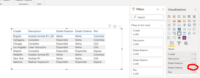
First, I have the following datas:
Where "País", "Ciudad", "Estado Estación" and "Descripción" are given.
"Estado Sistema" depends on the other datas, where if a "País" has a "Ciudad" with 1 or more "Estado Estación"= Alerta then "Estado Sistema" will be Alerta for all the "Ciudad" of "País".
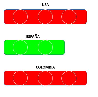
Now I want to create the following visual:
Where if a "Pais" has his "Estado Sistema" in Alerta the figure will become red, but if is Disponible then the figure will become green.
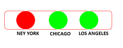
And if I click on the Figure of a "País" then will appear the following visual:
Where if a "Ciudad" has his "Estado Estación" in Alerta his circle will be red or if is Disponible, green.
And if i select on "CIudad"the will appear a table with "Descipción".
I don´t have any idea how to do this, and if is possible in Power BI
Please I need help.
Sorry for the bad english 🙂
Solved! Go to Solution.
- Mark as New
- Bookmark
- Subscribe
- Mute
- Subscribe to RSS Feed
- Permalink
- Report Inappropriate Content
First, I am going to assume that you are already calculating "Estado Estación". You are only asking if, given a value in "Estado Estación," how can you best visualize this in Power BI as red or green. Correct?
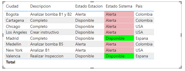
If yes, then add a column that changes "Estado Sistema" to a numeral (example below).
With that change to your data, the easiest solution is a Table visualization. In a Table visualization, you can set the background color or use an icon for a specific value.
1. In the Values list for the Table, click the down arrow for the "Estado Sistema" field.
2. In the pop-up menu, choose Conditional formatting > Background (The other options are similar. I will show Background below.). The same setting can be found in the Table format (paint roller).
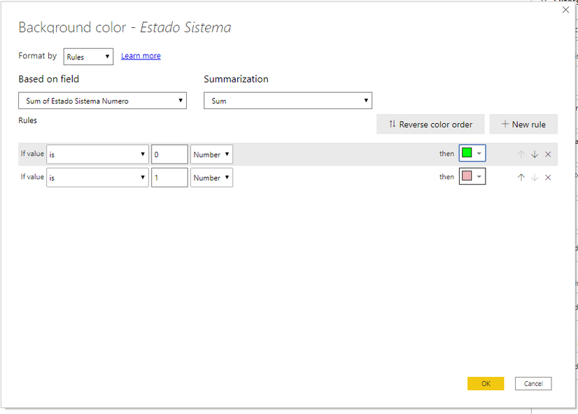
3. Make the Background settings as shown below.
4. After pressing OK, you will get a result like this.
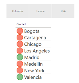
You can change the look of this by putting the Country (Pais) into a horizontal Slicer and the City (Ciudad) into a Table with Icons. The same Conditional Formatting as used above will get you the icons.
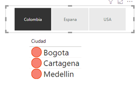
Choosing "Colombia" ...
- Mark as New
- Bookmark
- Subscribe
- Mute
- Subscribe to RSS Feed
- Permalink
- Report Inappropriate Content
Hi,
Did the first reply solved your issue?
If so, please mark it as a solution for others to see.
Best Regards,
Giotto
- Mark as New
- Bookmark
- Subscribe
- Mute
- Subscribe to RSS Feed
- Permalink
- Report Inappropriate Content
First, I am going to assume that you are already calculating "Estado Estación". You are only asking if, given a value in "Estado Estación," how can you best visualize this in Power BI as red or green. Correct?
If yes, then add a column that changes "Estado Sistema" to a numeral (example below).
With that change to your data, the easiest solution is a Table visualization. In a Table visualization, you can set the background color or use an icon for a specific value.
1. In the Values list for the Table, click the down arrow for the "Estado Sistema" field.
2. In the pop-up menu, choose Conditional formatting > Background (The other options are similar. I will show Background below.). The same setting can be found in the Table format (paint roller).
3. Make the Background settings as shown below.
4. After pressing OK, you will get a result like this.
You can change the look of this by putting the Country (Pais) into a horizontal Slicer and the City (Ciudad) into a Table with Icons. The same Conditional Formatting as used above will get you the icons.
Choosing "Colombia" ...
Helpful resources

Microsoft Fabric Learn Together
Covering the world! 9:00-10:30 AM Sydney, 4:00-5:30 PM CET (Paris/Berlin), 7:00-8:30 PM Mexico City

Power BI Monthly Update - April 2024
Check out the April 2024 Power BI update to learn about new features.

| User | Count |
|---|---|
| 102 | |
| 101 | |
| 78 | |
| 70 | |
| 63 |
| User | Count |
|---|---|
| 141 | |
| 106 | |
| 101 | |
| 85 | |
| 72 |

