- Power BI forums
- Updates
- News & Announcements
- Get Help with Power BI
- Desktop
- Service
- Report Server
- Power Query
- Mobile Apps
- Developer
- DAX Commands and Tips
- Custom Visuals Development Discussion
- Health and Life Sciences
- Power BI Spanish forums
- Translated Spanish Desktop
- Power Platform Integration - Better Together!
- Power Platform Integrations (Read-only)
- Power Platform and Dynamics 365 Integrations (Read-only)
- Training and Consulting
- Instructor Led Training
- Dashboard in a Day for Women, by Women
- Galleries
- Community Connections & How-To Videos
- COVID-19 Data Stories Gallery
- Themes Gallery
- Data Stories Gallery
- R Script Showcase
- Webinars and Video Gallery
- Quick Measures Gallery
- 2021 MSBizAppsSummit Gallery
- 2020 MSBizAppsSummit Gallery
- 2019 MSBizAppsSummit Gallery
- Events
- Ideas
- Custom Visuals Ideas
- Issues
- Issues
- Events
- Upcoming Events
- Community Blog
- Power BI Community Blog
- Custom Visuals Community Blog
- Community Support
- Community Accounts & Registration
- Using the Community
- Community Feedback
Register now to learn Fabric in free live sessions led by the best Microsoft experts. From Apr 16 to May 9, in English and Spanish.
- Power BI forums
- Forums
- Get Help with Power BI
- Desktop
- Need help with strange behaviour
- Subscribe to RSS Feed
- Mark Topic as New
- Mark Topic as Read
- Float this Topic for Current User
- Bookmark
- Subscribe
- Printer Friendly Page
- Mark as New
- Bookmark
- Subscribe
- Mute
- Subscribe to RSS Feed
- Permalink
- Report Inappropriate Content
Need help with strange behaviour
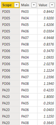
I have a simple table "tbl_OperationalActivity" in Power BI Desktop, with three columns (Scope, Main and Value) as shown below.
I have also created a measure called “Duration” with the following syntax.
The above table and measure enable me to create the following matrix on the reporting canvas.
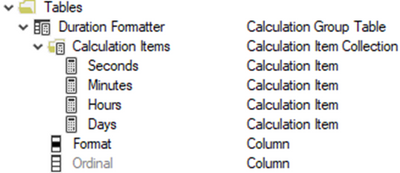
The first requirement is the show Duration in different formats. Not only do I want to show Duration in days (default format in this example) but also in hours, minutes and seconds. To do this I have created a calculation group called “Duration Formatter”.
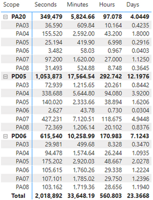
The calculation group enables me to move between different formats without having to create additional measures. If you want to know how to do this, please follow this link to the blog of Sergio Murru. After insering the calculation group into the data model the matrix looks like this.
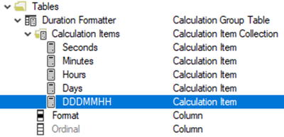
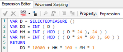
The second requirement is to show Duration in one additional format, called “DDDHHMM”. This format is not native to Power BI but Sergio Murru describes very well how this can be implemented. I’ve altered his example a little bit to accommodate my specific requirements but the method is basically the same.
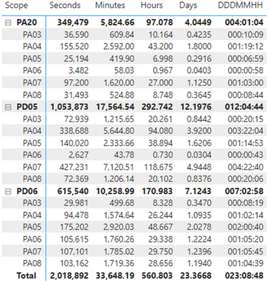
After adding the new calculation item to the calculation table the matrix looks like this.
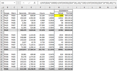
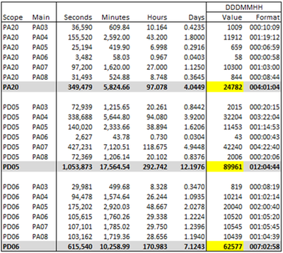
Now, you may get a bit confused when you look at the above DAX logic that calculates the DDDHHMM value. Don’t worry, I’ve recreated all calculations in an Excel file, which I will add to this post. Let me just say that the logic calculates a value that, in itself is nonsense, but which “fits” neatly within the “000:00:00” format.
Oke, so far so good. We now have a table, a measure and a calculation group that is able to format the value that the measure produces in the formats that I want to have. Now the fun starts.
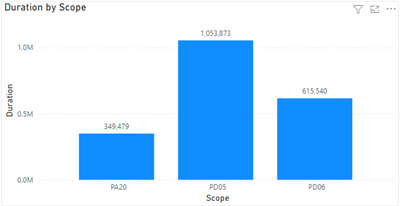
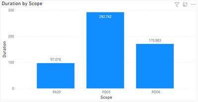
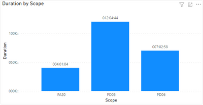
When I add a stacked column chart to the reporting canvas (Duration by Scope) I can also make use of the different formats that I have created in the calculation group.
Seconds
Hours
DDDHHMM
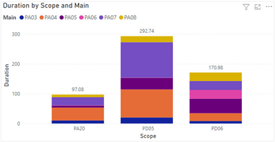
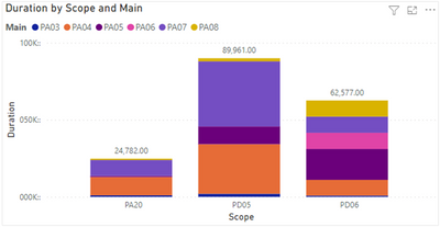
But when I add the Main column as a legend in the stacked column chart something strange happens when I use the DDDHHMM format.
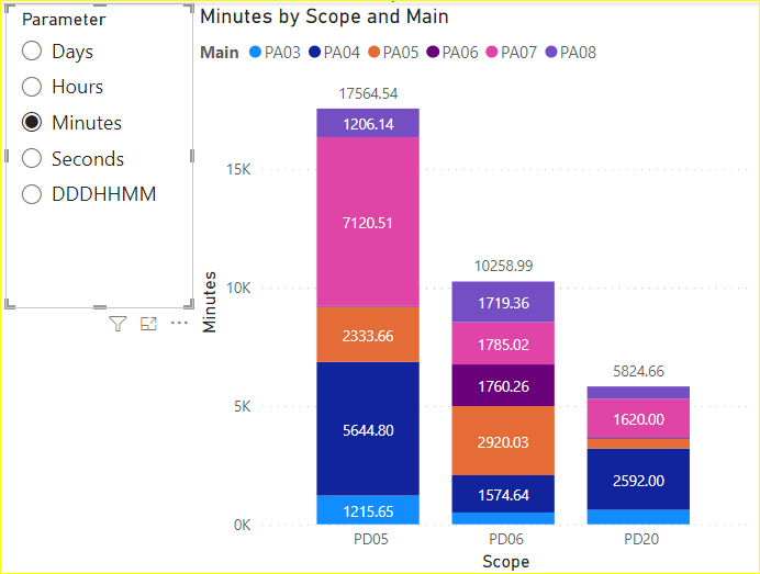
Seconds (ALL GOOD)
Hours (STILL GOOD)
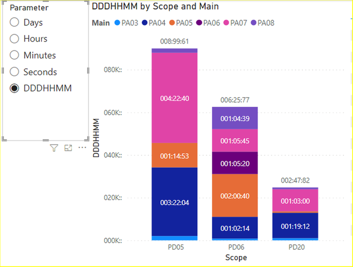
DDHHMM (WRONG)
As you can see the chart labels show the wrong format (I expect to see DDDHHMM format). But also, the height of the columns, in relation to each other, has changed from other formats. When I look back at the Excel file I can clearly see the values that Power BI is showing in the Scope and Main scenario.
My conclusion is that the behaviour of the matrix visual and the stacked column chart visual is different in the Scope and Main scenario. The stacked column chart clearly shows the wrong value AND the wrong format.
My question is: Is there any way around this issue? Should I report this to Microsoft as a bug?
Many thanks in advance for your replies.
Regards,
Erwin
- Mark as New
- Bookmark
- Subscribe
- Mute
- Subscribe to RSS Feed
- Permalink
- Report Inappropriate Content
Hi @erwinsc ,
You need to set the format '000:00:00' for the measure [DDDMMHH] in desktop separately.
Results:
Different from your step here I use the field parameter to switch the y-axis. The PBIX file is attached for reference.
Best Regards,
Gao
Community Support Team
If there is any post helps, then please consider Accept it as the solution to help the other members find it more quickly. If I misunderstand your needs or you still have problems on it, please feel free to let us know. Thanks a lot!
How to get your questions answered quickly -- How to provide sample data
- Mark as New
- Bookmark
- Subscribe
- Mute
- Subscribe to RSS Feed
- Permalink
- Report Inappropriate Content
Hi Gao,
Thanks for your input. I've evaluated your approach through field parameter instead of calculation group.
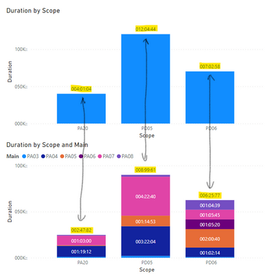
However, the issue still persists, also in your appraoch. Please review below picture.
As you can see the total label of the stacked column chart in the scope scenario shows the correct value in
DDDHHMM format, while the same visual in the scope and main scenario shows the wrong value in the wrong format. Also, the column heights are different in the scope and main scenario due to the wrong value being used to calculate column height.
The original question remains. Is there any way around this issue? Should I report this to Microsoft as a bug?
Many thanks in advance for your reply.
Greetings,
Erwin
Helpful resources

Microsoft Fabric Learn Together
Covering the world! 9:00-10:30 AM Sydney, 4:00-5:30 PM CET (Paris/Berlin), 7:00-8:30 PM Mexico City

Power BI Monthly Update - April 2024
Check out the April 2024 Power BI update to learn about new features.

| User | Count |
|---|---|
| 114 | |
| 105 | |
| 79 | |
| 68 | |
| 63 |
| User | Count |
|---|---|
| 148 | |
| 107 | |
| 106 | |
| 82 | |
| 70 |
