- Power BI forums
- Updates
- News & Announcements
- Get Help with Power BI
- Desktop
- Service
- Report Server
- Power Query
- Mobile Apps
- Developer
- DAX Commands and Tips
- Custom Visuals Development Discussion
- Health and Life Sciences
- Power BI Spanish forums
- Translated Spanish Desktop
- Power Platform Integration - Better Together!
- Power Platform Integrations (Read-only)
- Power Platform and Dynamics 365 Integrations (Read-only)
- Training and Consulting
- Instructor Led Training
- Dashboard in a Day for Women, by Women
- Galleries
- Community Connections & How-To Videos
- COVID-19 Data Stories Gallery
- Themes Gallery
- Data Stories Gallery
- R Script Showcase
- Webinars and Video Gallery
- Quick Measures Gallery
- 2021 MSBizAppsSummit Gallery
- 2020 MSBizAppsSummit Gallery
- 2019 MSBizAppsSummit Gallery
- Events
- Ideas
- Custom Visuals Ideas
- Issues
- Issues
- Events
- Upcoming Events
- Community Blog
- Power BI Community Blog
- Custom Visuals Community Blog
- Community Support
- Community Accounts & Registration
- Using the Community
- Community Feedback
Register now to learn Fabric in free live sessions led by the best Microsoft experts. From Apr 16 to May 9, in English and Spanish.
- Power BI forums
- Forums
- Get Help with Power BI
- Desktop
- Need help with bar chart
- Subscribe to RSS Feed
- Mark Topic as New
- Mark Topic as Read
- Float this Topic for Current User
- Bookmark
- Subscribe
- Printer Friendly Page
- Mark as New
- Bookmark
- Subscribe
- Mute
- Subscribe to RSS Feed
- Permalink
- Report Inappropriate Content
Need help with bar chart
Hi,
New to Power BI here.
If I have 20 Likert scale survey questions, can I create a dynamic bar chart that displays the agree/disagree response count for one question at a time? i.e. if I choose "question1" it will show the response counts for question1 but no other questions.
And then I can select "question2" to view only the response counts for question 2 etc. Example image of graph below.
I'm not sure whether to use a slicer or filter?
Thank you kindly
Ang
Solved! Go to Solution.
- Mark as New
- Bookmark
- Subscribe
- Mute
- Subscribe to RSS Feed
- Permalink
- Report Inappropriate Content
@Anonymous
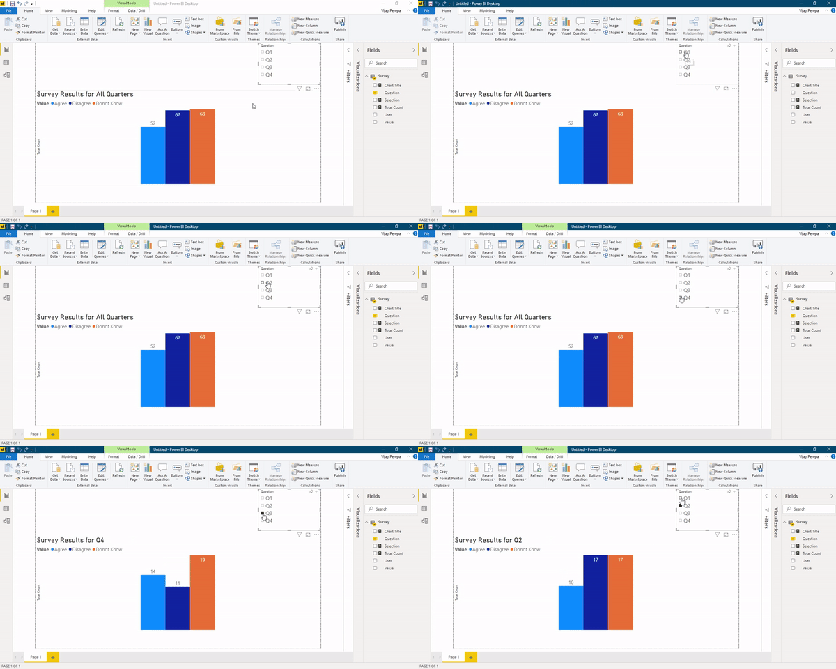
Please watch attached video for steps. *** Note: there are many ways of doing it.
- Mark as New
- Bookmark
- Subscribe
- Mute
- Subscribe to RSS Feed
- Permalink
- Report Inappropriate Content
Did I answer your question? Mark my post as a solution! Appreciate your Kudos!!
MY Blog || My YouTube Channel || Connect with me on Linkedin || My Latest Data Story - Ageing Analysis
Proud to be a Super User!
- Mark as New
- Bookmark
- Subscribe
- Mute
- Subscribe to RSS Feed
- Permalink
- Report Inappropriate Content
This looks very promising! Could you please share the video on how to do this? Thanks very much.
- Mark as New
- Bookmark
- Subscribe
- Mute
- Subscribe to RSS Feed
- Permalink
- Report Inappropriate Content
@Anonymous wrote:This looks very promising! Could you please share the video on how to do this? Thanks very much.
https://drive.google.com/open?id=1WRCzlb4lasREhUHk5ErRRMU-kAG3Krty
Please download the link of Pbix File. Will share the video in some time.
Did I answer your question? Mark my post as a solution! Appreciate your Kudos!!
MY Blog || My YouTube Channel || Connect with me on Linkedin || My Latest Data Story - Ageing Analysis
Proud to be a Super User!
- Mark as New
- Bookmark
- Subscribe
- Mute
- Subscribe to RSS Feed
- Permalink
- Report Inappropriate Content
@Anonymous
There are many of ways of doing it. I am not infront of system, but I belive you can create two measures using follwing expression.
Like Count =
SWITCH(
SELECTEDVALUE([survey questions])
,1, CALCULATE(COUNT([Like and Dislike column]),FILTER(Table,[Like and Dislike column] = "Like" && [survey questions]=1))
,2, CALCULATE(COUNT([Like and Dislike column]),FILTER(Table,[Like and Dislike column] = "Like" && [survey questions]=2))
,3, CALCULATE(COUNT([Like and Dislike column]),FILTER(Table,[Like and Dislike column] = "Like" && [survey questions]=3))
, CALCULATE(COUNT([Like and Dislike column]),FILTER(Table,[Like and Dislike column] = "Like" && [survey questions]=1))
)
DisLike Count =
SWITCH(
SELECTEDVALUE([survey questions])
,1, CALCULATE(COUNT([Like and Dislike column]),FILTER(Table,[Like and Dislike column] = "DisLike" && [survey questions]=1))
,2, CALCULATE(COUNT([Like and Dislike column]),FILTER(Table,[Like and Dislike column] = "DisLike" && [survey questions]=2))
,3, CALCULATE(COUNT([Like and Dislike column]),FILTER(Table,[Like and Dislike column] = "DisLike" && [survey questions]=3))
, CALCULATE(COUNT([Like and Dislike column]),FILTER(Table,[Like and Dislike column] = "DisLike" && [survey questions]=1))
)
Use them in chart. Please let me know how it goes.
- Mark as New
- Bookmark
- Subscribe
- Mute
- Subscribe to RSS Feed
- Permalink
- Report Inappropriate Content
Hey thanks for your reply. I'm really very new to Power BI and coding, would it be possible to break down the instructions further or link a video tutorial that demonstartes how to do this?
Thanks very much.
- Mark as New
- Bookmark
- Subscribe
- Mute
- Subscribe to RSS Feed
- Permalink
- Report Inappropriate Content
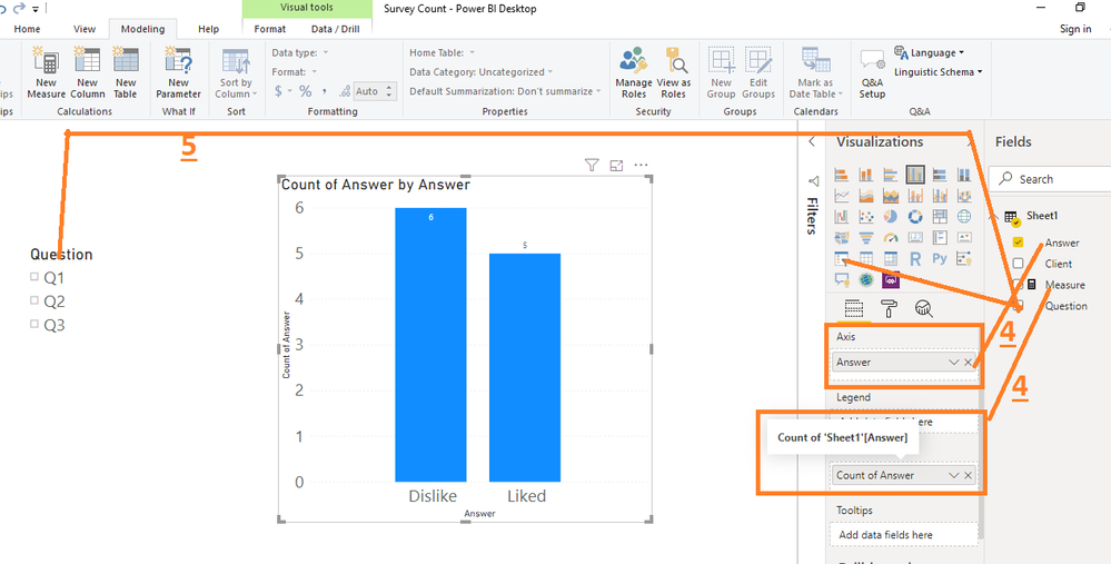
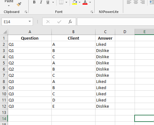
@Anonymous I am sorry I am not sure how to create video and link. Please follow below steps.
1)Assume that you have following data
2)Then Open Power BI Desktop, create a mesure as follows
3) Use following expression

- Mark as New
- Bookmark
- Subscribe
- Mute
- Subscribe to RSS Feed
- Permalink
- Report Inappropriate Content
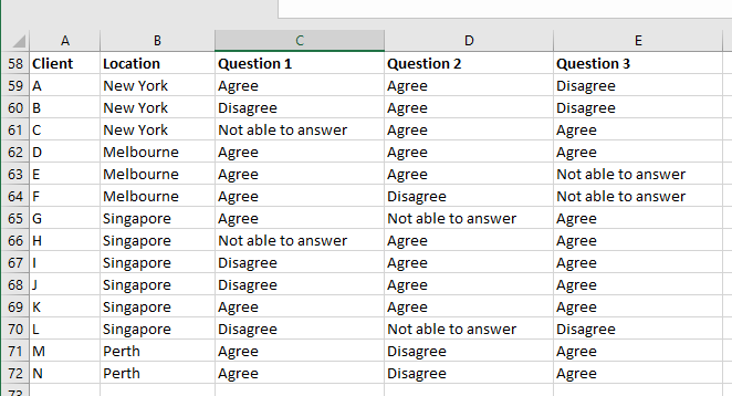
Thanks for the instructions! Based on the below I'm thinking perhaps my data is not set up correctly for Power BI... it is currently in this format:
Will this still work for what I'm trying to do?
- Mark as New
- Bookmark
- Subscribe
- Mute
- Subscribe to RSS Feed
- Permalink
- Report Inappropriate Content
Yes it will work. First UnPivot all Question Columns into One Column and follow my other instructions.
You need to create a measure the way I have created and rest the same.
Did I answer your question? Mark my post as a solution! Appreciate your Kudos!!
MY Blog || My YouTube Channel || Connect with me on Linkedin || My Latest Data Story - Ageing Analysis
Proud to be a Super User!
- Mark as New
- Bookmark
- Subscribe
- Mute
- Subscribe to RSS Feed
- Permalink
- Report Inappropriate Content
@Anonymous
Please watch attached video for steps. *** Note: there are many ways of doing it.
Helpful resources

Microsoft Fabric Learn Together
Covering the world! 9:00-10:30 AM Sydney, 4:00-5:30 PM CET (Paris/Berlin), 7:00-8:30 PM Mexico City

Power BI Monthly Update - April 2024
Check out the April 2024 Power BI update to learn about new features.

| User | Count |
|---|---|
| 108 | |
| 106 | |
| 86 | |
| 77 | |
| 69 |
| User | Count |
|---|---|
| 120 | |
| 112 | |
| 94 | |
| 84 | |
| 75 |


