- Power BI forums
- Updates
- News & Announcements
- Get Help with Power BI
- Desktop
- Service
- Report Server
- Power Query
- Mobile Apps
- Developer
- DAX Commands and Tips
- Custom Visuals Development Discussion
- Health and Life Sciences
- Power BI Spanish forums
- Translated Spanish Desktop
- Power Platform Integration - Better Together!
- Power Platform Integrations (Read-only)
- Power Platform and Dynamics 365 Integrations (Read-only)
- Training and Consulting
- Instructor Led Training
- Dashboard in a Day for Women, by Women
- Galleries
- Community Connections & How-To Videos
- COVID-19 Data Stories Gallery
- Themes Gallery
- Data Stories Gallery
- R Script Showcase
- Webinars and Video Gallery
- Quick Measures Gallery
- 2021 MSBizAppsSummit Gallery
- 2020 MSBizAppsSummit Gallery
- 2019 MSBizAppsSummit Gallery
- Events
- Ideas
- Custom Visuals Ideas
- Issues
- Issues
- Events
- Upcoming Events
- Community Blog
- Power BI Community Blog
- Custom Visuals Community Blog
- Community Support
- Community Accounts & Registration
- Using the Community
- Community Feedback
Register now to learn Fabric in free live sessions led by the best Microsoft experts. From Apr 16 to May 9, in English and Spanish.
- Power BI forums
- Forums
- Get Help with Power BI
- Desktop
- Make tooltips not filter by legends
- Subscribe to RSS Feed
- Mark Topic as New
- Mark Topic as Read
- Float this Topic for Current User
- Bookmark
- Subscribe
- Printer Friendly Page
- Mark as New
- Bookmark
- Subscribe
- Mute
- Subscribe to RSS Feed
- Permalink
- Report Inappropriate Content
Make tooltips not filter by legends
I have a bar chart with multiple bars and multiple legends, I want to make a rooltip which only filters by the x axis and not by the legends but I can't seem to do so, is there any way to do it? (I am using power bi desktop may 2022 and sadly cannot upgrade as of now)
Solved! Go to Solution.
- Mark as New
- Bookmark
- Subscribe
- Mute
- Subscribe to RSS Feed
- Permalink
- Report Inappropriate Content
sorry for my late reply .
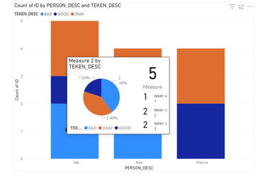
if this not what you want, can you please write on the screenshot the needed output numbers base on the sample data you have provided.
If my response has successfully addressed your issue kindly consider marking it as the accepted solution! This will help others find it quickly. Dont forget to hit that thumbs up button 🫡👍
- Mark as New
- Bookmark
- Subscribe
- Mute
- Subscribe to RSS Feed
- Permalink
- Report Inappropriate Content
hello @Pynter
create you own custom tooltip.
https://www.youtube.com/watch?v=URTA7JZsAtw
and you need to use some DAX , to remove the filter coming from the legend
example :
calculate ( sum(table_name[col_name] , removefilters(table_name[legend_col_name]))
*---------------
If my response has successfully addressed your issue, kindly consider marking it as the accepted solution ✅. This not only helps you keep track of resolved matters but also assists other community members who may encounter similar challenges. Additionally, your acknowledgment by giving a thumbs up 👍 is greatly appreciated. Thank you for contributing to the community's collaborative spirit.
- Mark as New
- Bookmark
- Subscribe
- Mute
- Subscribe to RSS Feed
- Permalink
- Report Inappropriate Content
Thanks doe the help @Daniel29195
This solves 50% of my problem as now the tooltip does not filter by the legends, however I now have the problem that all the legends are now the same %, so let's say my total count of rows is 60 and I got 3 legends, the pie graph I got in my legend is showing up as 33.33% 60, 33.33% 60, 33.33% 60 instead of something like 50% 30, 10% 6, 35% 24
- Mark as New
- Bookmark
- Subscribe
- Mute
- Subscribe to RSS Feed
- Permalink
- Report Inappropriate Content
- Mark as New
- Bookmark
- Subscribe
- Mute
- Subscribe to RSS Feed
- Permalink
- Report Inappropriate Content
I sadly cannot share the actual power bi file but I made a new file with the same error, please have a look at it
https://we.tl/t-CPNoJuzITI (WETRANSFER link)
Thanks 🙂
- Mark as New
- Bookmark
- Subscribe
- Mute
- Subscribe to RSS Feed
- Permalink
- Report Inappropriate Content
sorry for my late reply .
if this not what you want, can you please write on the screenshot the needed output numbers base on the sample data you have provided.
If my response has successfully addressed your issue kindly consider marking it as the accepted solution! This will help others find it quickly. Dont forget to hit that thumbs up button 🫡👍
Helpful resources

Microsoft Fabric Learn Together
Covering the world! 9:00-10:30 AM Sydney, 4:00-5:30 PM CET (Paris/Berlin), 7:00-8:30 PM Mexico City

Power BI Monthly Update - April 2024
Check out the April 2024 Power BI update to learn about new features.

| User | Count |
|---|---|
| 96 | |
| 93 | |
| 82 | |
| 70 | |
| 64 |
| User | Count |
|---|---|
| 118 | |
| 106 | |
| 93 | |
| 79 | |
| 72 |

