- Power BI forums
- Updates
- News & Announcements
- Get Help with Power BI
- Desktop
- Service
- Report Server
- Power Query
- Mobile Apps
- Developer
- DAX Commands and Tips
- Custom Visuals Development Discussion
- Health and Life Sciences
- Power BI Spanish forums
- Translated Spanish Desktop
- Power Platform Integration - Better Together!
- Power Platform Integrations (Read-only)
- Power Platform and Dynamics 365 Integrations (Read-only)
- Training and Consulting
- Instructor Led Training
- Dashboard in a Day for Women, by Women
- Galleries
- Community Connections & How-To Videos
- COVID-19 Data Stories Gallery
- Themes Gallery
- Data Stories Gallery
- R Script Showcase
- Webinars and Video Gallery
- Quick Measures Gallery
- 2021 MSBizAppsSummit Gallery
- 2020 MSBizAppsSummit Gallery
- 2019 MSBizAppsSummit Gallery
- Events
- Ideas
- Custom Visuals Ideas
- Issues
- Issues
- Events
- Upcoming Events
- Community Blog
- Power BI Community Blog
- Custom Visuals Community Blog
- Community Support
- Community Accounts & Registration
- Using the Community
- Community Feedback
Register now to learn Fabric in free live sessions led by the best Microsoft experts. From Apr 16 to May 9, in English and Spanish.
- Power BI forums
- Forums
- Get Help with Power BI
- Desktop
- Line chart with missing value
- Subscribe to RSS Feed
- Mark Topic as New
- Mark Topic as Read
- Float this Topic for Current User
- Bookmark
- Subscribe
- Printer Friendly Page
- Mark as New
- Bookmark
- Subscribe
- Mute
- Subscribe to RSS Feed
- Permalink
- Report Inappropriate Content
Line chart with missing value
Hi all,
I have a line chart with 3 metrics.
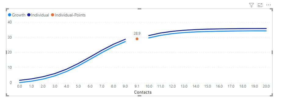
Two metrics (Growth and Individual) represent a curve
The Individual point is an indication of a specific moment that occurs at 9.1 contacts.
My question is:
- Can the two blue lines be continuous (no break between 9 contacts and 10 contacts) ?
- Can I get rid of the 9.1 in the X-Xaxis (contacts)
Below is my data used
Many thanks in advance
D.
| Contacts | Individual | Growth | Individual-Points |
| 0 | 1.528716301 | 0 | |
| 1 | 2.451718549 | 0.923002247 | |
| 2 | 3.868910809 | 2.340194508 | |
| 3 | 5.958488009 | 4.429771707 | |
| 4 | 8.862417829 | 7.333701527 | |
| 5 | 12.58284838 | 11.05413208 | |
| 6 | 16.88261508 | 15.35389878 | |
| 7 | 21.29800479 | 19.76928849 | |
| 8 | 25.31467164 | 23.78595534 | |
| 9 | 28.58532245 | 27.05660615 | |
| 9.1 | 28.86574326 | ||
| 10 | 31.01651328 | 29.48779698 | |
| 11 | 32.70400268 | 31.17528638 | |
| 12 | 33.82032617 | 32.29160987 | |
| 13 | 34.53551258 | 33.00679628 | |
| 14 | 34.98433996 | 33.45562365 | |
| 15 | 35.26236832 | 33.73365202 | |
| 16 | 35.43320852 | 33.90449222 | |
| 17 | 35.53766411 | 34.00894781 | |
| 18 | 35.60133658 | 34.07262028 | |
| 19 | 35.64007712 | 34.11136082 | |
| 20 | 35.66362159 | 34.13490529 |
Solved! Go to Solution.
- Mark as New
- Bookmark
- Subscribe
- Mute
- Subscribe to RSS Feed
- Permalink
- Report Inappropriate Content
@ADP007 yes you can achieve bar, use Line and Clustered column chart
✨ Follow us on LinkedIn and  to our YouTube channel
Learn about conditional formatting at Microsoft Reactor
My latest blog post The Power of Using Calculation Groups with Inactive Relationships (Part 1) (perytus.com) I would ❤ Kudos if my solution helped. 👉 If you can spend time posting the question, you can also make efforts to give Kudos to whoever helped to solve your problem. It is a token of appreciation!
⚡ Visit us at https://perytus.com, your one-stop-shop for Power BI-related projects/training/consultancy.
Subscribe to the @PowerBIHowTo YT channel for an upcoming video on List and Record functions in Power Query!!
Learn Power BI and Fabric - subscribe to our YT channel - Click here: @PowerBIHowTo
If my solution proved useful, I'd be delighted to receive Kudos. When you put effort into asking a question, it's equally thoughtful to acknowledge and give Kudos to the individual who helped you solve the problem. It's a small gesture that shows appreciation and encouragement! ❤
Did I answer your question? Mark my post as a solution. Proud to be a Super User! Appreciate your Kudos 🙂
Feel free to email me with any of your BI needs.
- Mark as New
- Bookmark
- Subscribe
- Mute
- Subscribe to RSS Feed
- Permalink
- Report Inappropriate Content
@ADP007 yes you can achieve bar, use Line and Clustered column chart
✨ Follow us on LinkedIn and  to our YouTube channel
Learn about conditional formatting at Microsoft Reactor
My latest blog post The Power of Using Calculation Groups with Inactive Relationships (Part 1) (perytus.com) I would ❤ Kudos if my solution helped. 👉 If you can spend time posting the question, you can also make efforts to give Kudos to whoever helped to solve your problem. It is a token of appreciation!
⚡ Visit us at https://perytus.com, your one-stop-shop for Power BI-related projects/training/consultancy.
Subscribe to the @PowerBIHowTo YT channel for an upcoming video on List and Record functions in Power Query!!
Learn Power BI and Fabric - subscribe to our YT channel - Click here: @PowerBIHowTo
If my solution proved useful, I'd be delighted to receive Kudos. When you put effort into asking a question, it's equally thoughtful to acknowledge and give Kudos to the individual who helped you solve the problem. It's a small gesture that shows appreciation and encouragement! ❤
Did I answer your question? Mark my post as a solution. Proud to be a Super User! Appreciate your Kudos 🙂
Feel free to email me with any of your BI needs.
- Mark as New
- Bookmark
- Subscribe
- Mute
- Subscribe to RSS Feed
- Permalink
- Report Inappropriate Content
- Mark as New
- Bookmark
- Subscribe
- Mute
- Subscribe to RSS Feed
- Permalink
- Report Inappropriate Content
Hi @amitchandak
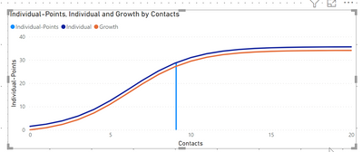
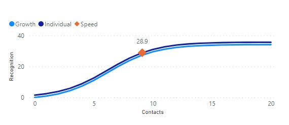
Yes it does work thanks. Just a pity I can't see all the X values 0,1,2,3 instead of 0,5,10 etc...
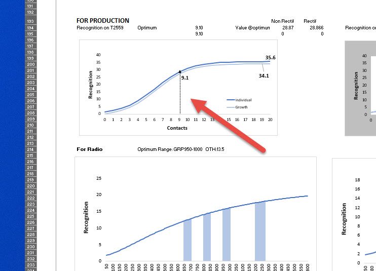
Do you think it's possible somehow to have a vertical line at 28.9? Like the image below (see red arrow)
Thanks
D.
- Mark as New
- Bookmark
- Subscribe
- Mute
- Subscribe to RSS Feed
- Permalink
- Report Inappropriate Content
@ADP007 , I doubt we have any control when continuous values are displayed
Microsoft Power BI Learning Resources, 2023 !!
Learn Power BI - Full Course with Dec-2022, with Window, Index, Offset, 100+ Topics !!
Did I answer your question? Mark my post as a solution! Appreciate your Kudos !! Proud to be a Super User! !!
- Mark as New
- Bookmark
- Subscribe
- Mute
- Subscribe to RSS Feed
- Permalink
- Report Inappropriate Content
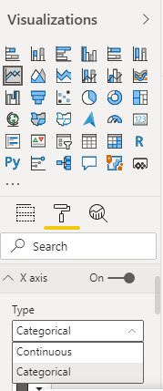
@ADP007 , I think if the axis type is continuous, it can work. Supported for numeric and date columns
Microsoft Power BI Learning Resources, 2023 !!
Learn Power BI - Full Course with Dec-2022, with Window, Index, Offset, 100+ Topics !!
Did I answer your question? Mark my post as a solution! Appreciate your Kudos !! Proud to be a Super User! !!
Helpful resources

Microsoft Fabric Learn Together
Covering the world! 9:00-10:30 AM Sydney, 4:00-5:30 PM CET (Paris/Berlin), 7:00-8:30 PM Mexico City

Power BI Monthly Update - April 2024
Check out the April 2024 Power BI update to learn about new features.

| User | Count |
|---|---|
| 104 | |
| 103 | |
| 87 | |
| 73 | |
| 66 |
| User | Count |
|---|---|
| 119 | |
| 111 | |
| 95 | |
| 79 | |
| 72 |
