- Power BI forums
- Updates
- News & Announcements
- Get Help with Power BI
- Desktop
- Service
- Report Server
- Power Query
- Mobile Apps
- Developer
- DAX Commands and Tips
- Custom Visuals Development Discussion
- Health and Life Sciences
- Power BI Spanish forums
- Translated Spanish Desktop
- Power Platform Integration - Better Together!
- Power Platform Integrations (Read-only)
- Power Platform and Dynamics 365 Integrations (Read-only)
- Training and Consulting
- Instructor Led Training
- Dashboard in a Day for Women, by Women
- Galleries
- Community Connections & How-To Videos
- COVID-19 Data Stories Gallery
- Themes Gallery
- Data Stories Gallery
- R Script Showcase
- Webinars and Video Gallery
- Quick Measures Gallery
- 2021 MSBizAppsSummit Gallery
- 2020 MSBizAppsSummit Gallery
- 2019 MSBizAppsSummit Gallery
- Events
- Ideas
- Custom Visuals Ideas
- Issues
- Issues
- Events
- Upcoming Events
- Community Blog
- Power BI Community Blog
- Custom Visuals Community Blog
- Community Support
- Community Accounts & Registration
- Using the Community
- Community Feedback
Register now to learn Fabric in free live sessions led by the best Microsoft experts. From Apr 16 to May 9, in English and Spanish.
- Power BI forums
- Forums
- Get Help with Power BI
- Desktop
- Line chart 2D plot
- Subscribe to RSS Feed
- Mark Topic as New
- Mark Topic as Read
- Float this Topic for Current User
- Bookmark
- Subscribe
- Printer Friendly Page
- Mark as New
- Bookmark
- Subscribe
- Mute
- Subscribe to RSS Feed
- Permalink
- Report Inappropriate Content
Line chart 2D plot
Hello,
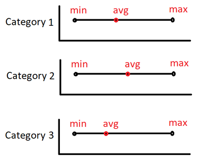
I have an idea to visualise data this way. Does someone know if it's possible to visualise anything like this or similar to it?
It is survey data where you can answer 1 to 5 and then I want to see the average for each question.
My idea:
I hope someone has a good idea 🙂
Solved! Go to Solution.
- Mark as New
- Bookmark
- Subscribe
- Mute
- Subscribe to RSS Feed
- Permalink
- Report Inappropriate Content
Hi @Xilitor01 ,
How about creating a custom visual by yourself?
Please refer to the following document for Detailed steps.
https://docs.microsoft.com/en-us/power-bi/developer/visuals/develop-circle-card
Best Regards
Community Support Team _ polly
If this post helps, then please consider Accept it as the solution to help the other members find it more quickly.
- Mark as New
- Bookmark
- Subscribe
- Mute
- Subscribe to RSS Feed
- Permalink
- Report Inappropriate Content
Hi Polly,
Thank you for your answer.
I think making a custom visual is the best idea for now.
Thank you 🙂
- Mark as New
- Bookmark
- Subscribe
- Mute
- Subscribe to RSS Feed
- Permalink
- Report Inappropriate Content
Hello @Xilitor01
The reference file link and image is attached for your quick reference.
https://drive.google.com/file/d/13AB_sAD5Q5ujvk6G9aK3VV_LyY30IItu/view?usp=sharing
Regards
Kumail Raza
If this answers your query, mark it as solution.
Kudos are appreciated 🙂
- Mark as New
- Bookmark
- Subscribe
- Mute
- Subscribe to RSS Feed
- Permalink
- Report Inappropriate Content
Hi Kumail,
Thank you for your response.
I am unfortunately unable to open your link as I get an "Access Denied".
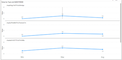
Based on your image I might've been unclear.
It should be something like below, but because this is a custom visual I lose a lot of possibilities - like I want it to be dots on a line instead of a bar:
Thank you 🙂
- Mark as New
- Bookmark
- Subscribe
- Mute
- Subscribe to RSS Feed
- Permalink
- Report Inappropriate Content
Send your request again.
You need to mention the custom visual that you are looking to use.
- Mark as New
- Bookmark
- Subscribe
- Mute
- Subscribe to RSS Feed
- Permalink
- Report Inappropriate Content
@Xilitor01 , Create a table like this
union(
Summarize(Table, Table[Category], "Value", min(Table[Value]), "Type", "Min"),
Summarize(Table, Table[Category], "Value", max(Table[Value]), "Type", "Max"),
Summarize(Table, Table[Category], "Value", Average(Table[Value]), "Type", "Avg")
)
and the create a line/abr visual with axis as Type, Value and Value and Category as small multiple
with no of columns =1
Microsoft Power BI Learning Resources, 2023 !!
Learn Power BI - Full Course with Dec-2022, with Window, Index, Offset, 100+ Topics !!
Did I answer your question? Mark my post as a solution! Appreciate your Kudos !! Proud to be a Super User! !!
- Mark as New
- Bookmark
- Subscribe
- Mute
- Subscribe to RSS Feed
- Permalink
- Report Inappropriate Content
Hi amitchandak,
Thank you very much for your response.
Unfortunatel I get this error:
Some (maybe) useful information:
It is two tables with a DirectQuery whereas the question comes from the one table (SINGLECHOICEQUESTIONVIEW) and the answers come from another table (SINGLECHOICEANSWERVIEW). These are connected on QuestionID.
I hope you can still help me! 🙂
- Mark as New
- Bookmark
- Subscribe
- Mute
- Subscribe to RSS Feed
- Permalink
- Report Inappropriate Content
Hello @Xilitor01
If you could send a sample .pbix that demonstrates what you are looking to get. It would really help to provide you with a quick solution.
Regards
Kumail Raza
- Mark as New
- Bookmark
- Subscribe
- Mute
- Subscribe to RSS Feed
- Permalink
- Report Inappropriate Content
Hi Kumail,
Thank you for your response.
As this is a DirectQuery I cannot give you a pbix with the exact data. But I have exported the some sample data to Excel and created a pbix file you can download below.
I know it look a little scuffed but I hope you get the idea anyway - please think about a solution that would work on a DirectQuery.
Download pbix here: https://easyupload.io/voh485
Thank you very much! 🙂
Helpful resources

Microsoft Fabric Learn Together
Covering the world! 9:00-10:30 AM Sydney, 4:00-5:30 PM CET (Paris/Berlin), 7:00-8:30 PM Mexico City

Power BI Monthly Update - April 2024
Check out the April 2024 Power BI update to learn about new features.

| User | Count |
|---|---|
| 102 | |
| 101 | |
| 78 | |
| 69 | |
| 63 |
| User | Count |
|---|---|
| 141 | |
| 106 | |
| 101 | |
| 85 | |
| 72 |


