- Power BI forums
- Updates
- News & Announcements
- Get Help with Power BI
- Desktop
- Service
- Report Server
- Power Query
- Mobile Apps
- Developer
- DAX Commands and Tips
- Custom Visuals Development Discussion
- Health and Life Sciences
- Power BI Spanish forums
- Translated Spanish Desktop
- Power Platform Integration - Better Together!
- Power Platform Integrations (Read-only)
- Power Platform and Dynamics 365 Integrations (Read-only)
- Training and Consulting
- Instructor Led Training
- Dashboard in a Day for Women, by Women
- Galleries
- Community Connections & How-To Videos
- COVID-19 Data Stories Gallery
- Themes Gallery
- Data Stories Gallery
- R Script Showcase
- Webinars and Video Gallery
- Quick Measures Gallery
- 2021 MSBizAppsSummit Gallery
- 2020 MSBizAppsSummit Gallery
- 2019 MSBizAppsSummit Gallery
- Events
- Ideas
- Custom Visuals Ideas
- Issues
- Issues
- Events
- Upcoming Events
- Community Blog
- Power BI Community Blog
- Custom Visuals Community Blog
- Community Support
- Community Accounts & Registration
- Using the Community
- Community Feedback
Register now to learn Fabric in free live sessions led by the best Microsoft experts. From Apr 16 to May 9, in English and Spanish.
- Power BI forums
- Forums
- Get Help with Power BI
- Desktop
- Interaction between filtered visuals
- Subscribe to RSS Feed
- Mark Topic as New
- Mark Topic as Read
- Float this Topic for Current User
- Bookmark
- Subscribe
- Printer Friendly Page
- Mark as New
- Bookmark
- Subscribe
- Mute
- Subscribe to RSS Feed
- Permalink
- Report Inappropriate Content
Interaction between filtered visuals
Hi all,
I am fairly new with PowerBI. I am trying to analyse the results of a survey with this fantastic tool and I am having troubles connecting the interactions between different visuals. I have processed my data so that is in the following form:
| Respondent ID | Country | Education Level | Question | Answer |
| 1 | DE | Undegraduate | Q1 | A1 |
| 1 | DE | Undegraduate | Q2 | A2 |
| 1 | DE | Undegraduate | Q3 | A3 |
| 1 | DE | Undegraduate | Q4 | A4 |
| 1 | DE | Undegraduate | Q5 | A5 |
| 2 | IT | Undegraduate | Q1 | A1 |
| 2 | IT | Undegraduate | Q2 | A2 |
| 2 | IT | Undegraduate | Q3 | A6 |
| 2 | IT | Undegraduate | Q4 | A7 |
| 3 | US | Doctorate | Q1 | A1 |
| 3 | US | Doctorate | Q2 | A8 |
| 3 | US | Doctorate | Q3 | A3 |
| 3 | US | Doctorate | Q4 | A7 |
| 3 | US | Doctorate | Q5 | A8 |
My goal is to create different visuals for the different questions, and then to analyse the data further by e.g. selecting one particular answer in one of the visuals and see how the same users have answered other questions. As long as I deal with demographic, filters work like a charm. e.g. if I select on a given Education Level I see the correct Country distribution.
The problem I have is with the different question and answers. I have a different chart for each question. In order to create them I filter visuals to get answers for that question only. My goal would be to be able to see the results for each visuals of the participants that have given a particular answer to one of the questions (e.g. I want to see how everyone that has answered "A1" to Q1 has answered the other questions). But when I click on any of my answers, all the other charts data disappear.
I believe the problem is that the set of quesitons and answer are always on the same row. Demographic works well because every row has a connection Country-Education level. But due to the way I store my question-answers results this is not possible.
What I would like to do is the following: given a selected answer, fetch the corresponding "Respondent ID" in the row and interact with the other visuals so that they show only answers from these particular "Respondent ID".
I have tried to look in the forum and other sources but I don't seem to be able to make any progress on this. Has any of you experience with the topic and could help me solving this issue ?
Thanks a lot for your help in advance.
Cheers,
Federico
Edit: to make it clearer, here is an example of what I would like to get.
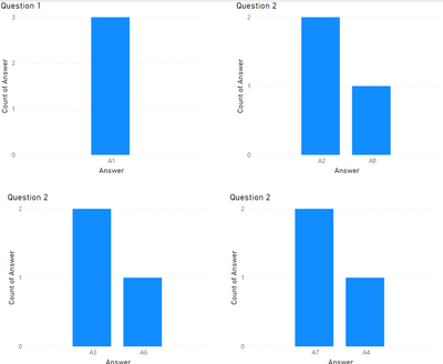
Here are 4 plots for 4 of the questions in the table I have presented.
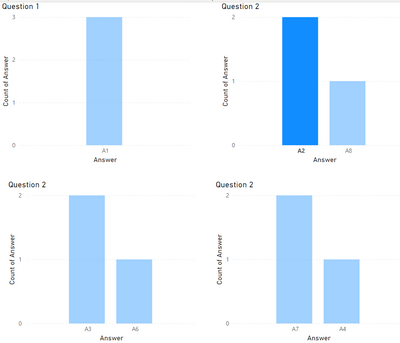
Now if I click on A2 for question 2, I see no interactions with other plots.
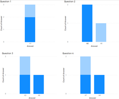
What I would like to see, is how the users that have responded A2 in Question 2 have also answered the other questions. In this case I know that A2 was answered by users with Respondent ID = 1, 2. So I would expect in all plots to have highlighted the answers provided by these users. Somethign like this:
Below the links for the example excel and PBI files.
MS Excel file: https://www.dropbox.com/s/ya9p6nr4h7g4v7j/DataExample.xlsx?dl=0
PBI file: https://www.dropbox.com/s/z5x2no024bcdkdg/PlotExample.pbix?dl=0
- Mark as New
- Bookmark
- Subscribe
- Mute
- Subscribe to RSS Feed
- Permalink
- Report Inappropriate Content
Hi,
Based on the Table that you have shared, show the expected result with various filter/slicer selections.
Regards,
Ashish Mathur
http://www.ashishmathur.com
https://www.linkedin.com/in/excelenthusiasts/
- Mark as New
- Bookmark
- Subscribe
- Mute
- Subscribe to RSS Feed
- Permalink
- Report Inappropriate Content
Hi Ashish_Mathur,
Thanks for your reply, your are right it will be much clearer if I show it. Here are 4 plots for 4 of the questions in the table I have presented.
Now if I click on A2 for question 2, I see no interactions with other plots.
What I would like to see, is how the users that have responded A2 in Question 2 have also answered the other questions. In this case I know that A2 was answered by users with Respondent ID = 1, 2. So I would expect in all plots to have highlighted the answers provided by these users. Somethign like this:
- Mark as New
- Bookmark
- Subscribe
- Mute
- Subscribe to RSS Feed
- Permalink
- Report Inappropriate Content
Hi,
Share the download link of the PBI file and also the MS Excel file which you imported into the PowerBI file.
Regards,
Ashish Mathur
http://www.ashishmathur.com
https://www.linkedin.com/in/excelenthusiasts/
- Mark as New
- Bookmark
- Subscribe
- Mute
- Subscribe to RSS Feed
- Permalink
- Report Inappropriate Content
Hi Ashish_Mathur,
Here you have the link to the files you have requested:
MS Excel file: https://www.dropbox.com/s/ya9p6nr4h7g4v7j/DataExample.xlsx?dl=0
PBI file: https://www.dropbox.com/s/z5x2no024bcdkdg/PlotExample.pbix?dl=0
Thanks for you help. Please let me know if you need any further information.
Best,
Federico
- Mark as New
- Bookmark
- Subscribe
- Mute
- Subscribe to RSS Feed
- Permalink
- Report Inappropriate Content
- Mark as New
- Bookmark
- Subscribe
- Mute
- Subscribe to RSS Feed
- Permalink
- Report Inappropriate Content
Hi,
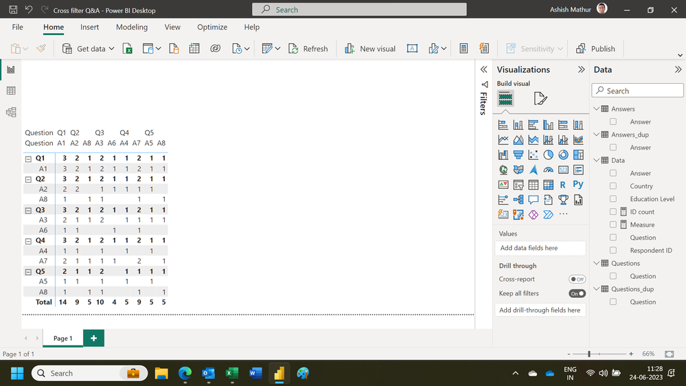
thanks a lot for your support. That's a good step already, but harder to visualize that graphs. What would it take to translate it into visual interactions ? Would a different structure of the data help ?
Regards,
Federico
- Mark as New
- Bookmark
- Subscribe
- Mute
- Subscribe to RSS Feed
- Permalink
- Report Inappropriate Content
You are welcome. i do not know how to visualise that matrix.
Regards,
Ashish Mathur
http://www.ashishmathur.com
https://www.linkedin.com/in/excelenthusiasts/
- Mark as New
- Bookmark
- Subscribe
- Mute
- Subscribe to RSS Feed
- Permalink
- Report Inappropriate Content
Your expectations align more with the way the Qlik associative model works across network graphs. In Power BI you have a stricter adherence to data models and object hierarchies. You can still achieve your desired outcome but it will be much more manual and requires you to remember prior results like in this scenario
selecting one particular answer in one of the visuals and see how the same users have answered other questions
where you need to manually adjust the filters. It doesn't take a lot of effort but it is certainly not seemless.
- Mark as New
- Bookmark
- Subscribe
- Mute
- Subscribe to RSS Feed
- Permalink
- Report Inappropriate Content
Thank you Ibendlin,
Do you think there is any sort of measure or anything I can use to do that ? Otherwise, how could I apply such filters ?
Best,
Federico
- Mark as New
- Bookmark
- Subscribe
- Mute
- Subscribe to RSS Feed
- Permalink
- Report Inappropriate Content
You can apply these filters manually.
Helpful resources

Microsoft Fabric Learn Together
Covering the world! 9:00-10:30 AM Sydney, 4:00-5:30 PM CET (Paris/Berlin), 7:00-8:30 PM Mexico City

Power BI Monthly Update - April 2024
Check out the April 2024 Power BI update to learn about new features.

| User | Count |
|---|---|
| 96 | |
| 93 | |
| 82 | |
| 70 | |
| 64 |
| User | Count |
|---|---|
| 115 | |
| 105 | |
| 95 | |
| 79 | |
| 72 |


