- Power BI forums
- Updates
- News & Announcements
- Get Help with Power BI
- Desktop
- Service
- Report Server
- Power Query
- Mobile Apps
- Developer
- DAX Commands and Tips
- Custom Visuals Development Discussion
- Health and Life Sciences
- Power BI Spanish forums
- Translated Spanish Desktop
- Power Platform Integration - Better Together!
- Power Platform Integrations (Read-only)
- Power Platform and Dynamics 365 Integrations (Read-only)
- Training and Consulting
- Instructor Led Training
- Dashboard in a Day for Women, by Women
- Galleries
- Community Connections & How-To Videos
- COVID-19 Data Stories Gallery
- Themes Gallery
- Data Stories Gallery
- R Script Showcase
- Webinars and Video Gallery
- Quick Measures Gallery
- 2021 MSBizAppsSummit Gallery
- 2020 MSBizAppsSummit Gallery
- 2019 MSBizAppsSummit Gallery
- Events
- Ideas
- Custom Visuals Ideas
- Issues
- Issues
- Events
- Upcoming Events
- Community Blog
- Power BI Community Blog
- Custom Visuals Community Blog
- Community Support
- Community Accounts & Registration
- Using the Community
- Community Feedback
Register now to learn Fabric in free live sessions led by the best Microsoft experts. From Apr 16 to May 9, in English and Spanish.
- Power BI forums
- Forums
- Get Help with Power BI
- Desktop
- Insert multiple rows with some blank and some comp...
- Subscribe to RSS Feed
- Mark Topic as New
- Mark Topic as Read
- Float this Topic for Current User
- Bookmark
- Subscribe
- Printer Friendly Page
- Mark as New
- Bookmark
- Subscribe
- Mute
- Subscribe to RSS Feed
- Permalink
- Report Inappropriate Content
Insert multiple rows with some blank and some computed columns till some date to show trend line
Hello,
In my current example, I am holding data for let's say till 7th of May. However, there is some future date decided to forecast the trend line, suppose 8th of August. Now, how do I insert such rows(number of rows to be inserted would be in days for 8th of Aug minus 7th of May) in the dataset with some blank columns and some columns that would be computed based upon a formula.
Currently, PBI only shows up the data that it can fetch but nothing to show as a trend line.
Please help.
Thanks,
Nitin
- Mark as New
- Bookmark
- Subscribe
- Mute
- Subscribe to RSS Feed
- Permalink
- Report Inappropriate Content
Hi @Anonymous
I am not very clear about your needs, if there is no data for the corresponding date, it will not be displayed on the line chart
This my sample, maybe you can refer to it .
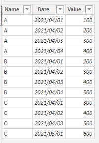
Original data:
Add a Line chart , use [Date] as Axis , [Name] as Legend , [Value] as Values .
Best Regards
Community Support Team _ Ailsa Tao
If this post helps, then please consider Accept it as the solution to help the other members find it more quickly.
- Mark as New
- Bookmark
- Subscribe
- Mute
- Subscribe to RSS Feed
- Permalink
- Report Inappropriate Content
Not all the columns have values for future dates except one column whose values are calculated based upon some formula from previous dates. This is why it is important to plot the calculated future values on the chart. This actually depicts the forecast trends for future dates and there is no way I see to plot in PBI. Please refer to the sample data and sample figure in previous replies in this post.
Thanks.
- Mark as New
- Bookmark
- Subscribe
- Mute
- Subscribe to RSS Feed
- Permalink
- Report Inappropriate Content
@Anonymous ,Not very clear to me. Can you share sample data and sample output in table format? Or a sample pbix after removing sensitive data.
Microsoft Power BI Learning Resources, 2023 !!
Learn Power BI - Full Course with Dec-2022, with Window, Index, Offset, 100+ Topics !!
Did I answer your question? Mark my post as a solution! Appreciate your Kudos !! Proud to be a Super User! !!
- Mark as New
- Bookmark
- Subscribe
- Mute
- Subscribe to RSS Feed
- Permalink
- Report Inappropriate Content
sample:
901 740 571 662 5/5/2021
903 737 564 659 5/6/2021
903 737 558 659 5/7/2021
552 5/8/2021
545 5/9/2021
539 5/10/2021
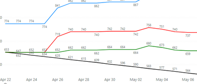
PBI draws till date 5/7/2021 where it finds all the date from the subsequent row. However, I want to draw till 5/10/2021 in a line chart.
- Mark as New
- Bookmark
- Subscribe
- Mute
- Subscribe to RSS Feed
- Permalink
- Report Inappropriate Content
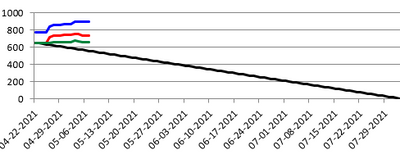
Intended sample picture:
While PBI drawn picture:
As you can see the black line is not extended just like in the first figure.
- Mark as New
- Bookmark
- Subscribe
- Mute
- Subscribe to RSS Feed
- Permalink
- Report Inappropriate Content
Any idea on this one please?
- Mark as New
- Bookmark
- Subscribe
- Mute
- Subscribe to RSS Feed
- Permalink
- Report Inappropriate Content
Reason for this is that all column values are available only for rows till 5/7/2021. Rest of the values are not availble. Hence, how could I achieve this as intended in the figure and sample data shown above.
- Mark as New
- Bookmark
- Subscribe
- Mute
- Subscribe to RSS Feed
- Permalink
- Report Inappropriate Content
Any help regarding this would be greatful.
Thanks.
- Mark as New
- Bookmark
- Subscribe
- Mute
- Subscribe to RSS Feed
- Permalink
- Report Inappropriate Content
Actually I need to insert few more rows of data which are calculated from a measure based upon previous rows data. I thought of inserting calculated data using InsertRows function but that work on columns while I do not want to add a new column, just the additional computed rows dynamically in a for loop or so. Seems like not supported in PBI, dynamic rows creation. Please help.
Helpful resources

Microsoft Fabric Learn Together
Covering the world! 9:00-10:30 AM Sydney, 4:00-5:30 PM CET (Paris/Berlin), 7:00-8:30 PM Mexico City

Power BI Monthly Update - April 2024
Check out the April 2024 Power BI update to learn about new features.

| User | Count |
|---|---|
| 96 | |
| 95 | |
| 82 | |
| 71 | |
| 64 |
| User | Count |
|---|---|
| 115 | |
| 105 | |
| 95 | |
| 79 | |
| 72 |


