- Power BI forums
- Updates
- News & Announcements
- Get Help with Power BI
- Desktop
- Service
- Report Server
- Power Query
- Mobile Apps
- Developer
- DAX Commands and Tips
- Custom Visuals Development Discussion
- Health and Life Sciences
- Power BI Spanish forums
- Translated Spanish Desktop
- Power Platform Integration - Better Together!
- Power Platform Integrations (Read-only)
- Power Platform and Dynamics 365 Integrations (Read-only)
- Training and Consulting
- Instructor Led Training
- Dashboard in a Day for Women, by Women
- Galleries
- Community Connections & How-To Videos
- COVID-19 Data Stories Gallery
- Themes Gallery
- Data Stories Gallery
- R Script Showcase
- Webinars and Video Gallery
- Quick Measures Gallery
- 2021 MSBizAppsSummit Gallery
- 2020 MSBizAppsSummit Gallery
- 2019 MSBizAppsSummit Gallery
- Events
- Ideas
- Custom Visuals Ideas
- Issues
- Issues
- Events
- Upcoming Events
- Community Blog
- Power BI Community Blog
- Custom Visuals Community Blog
- Community Support
- Community Accounts & Registration
- Using the Community
- Community Feedback
Register now to learn Fabric in free live sessions led by the best Microsoft experts. From Apr 16 to May 9, in English and Spanish.
- Power BI forums
- Forums
- Get Help with Power BI
- Desktop
- Increasing and Decreasing trend color in line char...
- Subscribe to RSS Feed
- Mark Topic as New
- Mark Topic as Read
- Float this Topic for Current User
- Bookmark
- Subscribe
- Printer Friendly Page
- Mark as New
- Bookmark
- Subscribe
- Mute
- Subscribe to RSS Feed
- Permalink
- Report Inappropriate Content
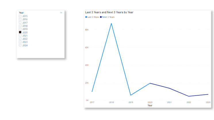
Increasing and Decreasing trend color in line chart.
I want to have a dynmaic color feature for my line chart.
If the value goes up, then the line color should be green and if it goes down then it should be in red.
I have attached screenshot of my visual.
If anyone knows a way, then do please let me know.
Regards,
Sanket Bhagwat
Solved! Go to Solution.
- Mark as New
- Bookmark
- Subscribe
- Mute
- Subscribe to RSS Feed
- Permalink
- Report Inappropriate Content
Hi @SanketBhagwat ,
Based on my test, Conditional Formatting is not supported for Line chart currently,but this is at idea/feedback level alone. You could vote some submitted ideas in Power BI ideas forum as shown below :
Conditional formating on linear or area chart ?
Conditionally format line chart
Line Chart Marker Color Conditional Formatting
And based on my test, you may try the following workarounds:
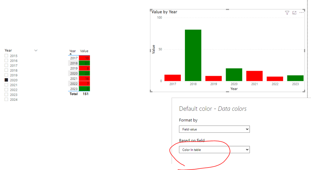
- Measure1:
Color In table =
var _curr=CALCULATE(SUM('Table'[Value]),FILTER('Table','Table'[Year]=MAX('Table'[Year])))
var _last=CALCULATE(SUM('Table'[Value]),FILTER(ALL('Table'),'Table'[Year]=MAX('Table'[Year])-1))
return IF(_last>_curr,"Red","Green")
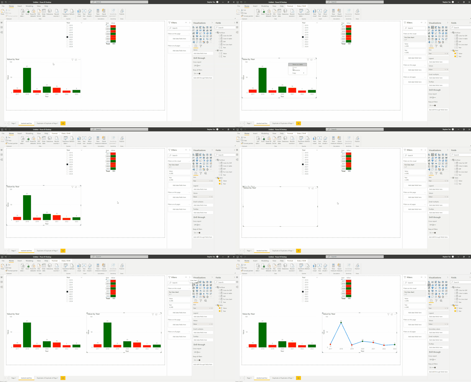
1. Use Stacked column chart
2.Then copy ,paste the Stacked column visual, and change it to Line chart, the data point would change colors as well:
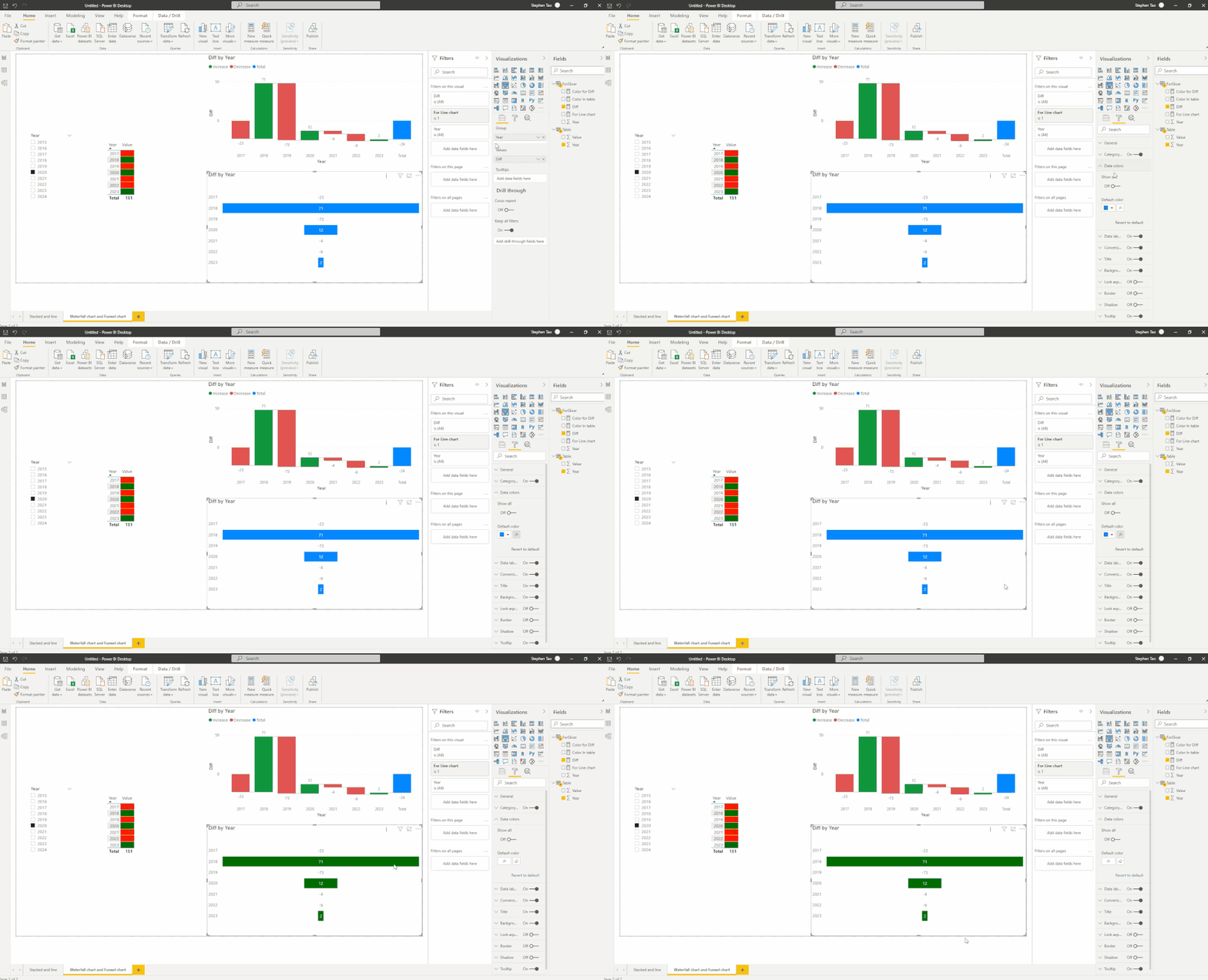
- Measure2:
Diff =
var _curr=CALCULATE(SUM('Table'[Value]),FILTER('Table','Table'[Year]=MAX('Table'[Year])))
var _last=CALCULATE(SUM('Table'[Value]),FILTER(ALL('Table'),'Table'[Year]=MAX('Table'[Year])-1))
return _curr-_last
Color for Diff = IF([Diff]>=0,"Green","Red")3.Use Waterfall chart, data lable is value diff not the value:
4. Use Funnel chart, this charts don't support negative numbers: they're plotted on the chart as zero, so no bars are displayed for negative values. However, despite there being no colored bar, the label for a negative value is displayed on the chart.
Best Regards,
Eyelyn Qin
If this post helps, then please consider Accept it as the solution to help the other members find it more quickly.
- Mark as New
- Bookmark
- Subscribe
- Mute
- Subscribe to RSS Feed
- Permalink
- Report Inappropriate Content
Hey @SanketBhagwat ,
as amitchandak mentioned you cannot change the color within one value.
Even if you would split it in 2 measures be aware that at the point where the change happens you have to make sure that both values exist for both measures. Otherwise you will have a gap.
- Mark as New
- Bookmark
- Subscribe
- Mute
- Subscribe to RSS Feed
- Permalink
- Report Inappropriate Content
@SanketBhagwat , You can only have color markers, that too you need to have conditional formatting in bar and then use line.
This Year = CALCULATE(sum('order'[Qty]),filter(ALL('Date'),'Date'[Year]=max('Date'[Year])))
Last Year = CALCULATE(sum('order'[Qty]),filter(ALL('Date'),'Date'[Year]=max('Date'[Year])-1))
diff = [This Year]-[Last Year ]
then create a measure
if([Diff] >0, "Green", "Red")
use this measure in conditional formatting using field value option
How to do conditional formatting by measure and apply it on pie?: https://youtu.be/RqBb5eBf_I4
Microsoft Power BI Learning Resources, 2023 !!
Learn Power BI - Full Course with Dec-2022, with Window, Index, Offset, 100+ Topics !!
Did I answer your question? Mark my post as a solution! Appreciate your Kudos !! Proud to be a Super User! !!
- Mark as New
- Bookmark
- Subscribe
- Mute
- Subscribe to RSS Feed
- Permalink
- Report Inappropriate Content
Then how do you show increasing or decreasing trend?
Is KPI Indicator the only way to show the same?
And if Power BI doesn't offer such functionality, do you guys think that it should be posted as an idea?
Regards,
Sanket Bhagwat
- Mark as New
- Bookmark
- Subscribe
- Mute
- Subscribe to RSS Feed
- Permalink
- Report Inappropriate Content
Hi @SanketBhagwat ,
Based on my test, Conditional Formatting is not supported for Line chart currently,but this is at idea/feedback level alone. You could vote some submitted ideas in Power BI ideas forum as shown below :
Conditional formating on linear or area chart ?
Conditionally format line chart
Line Chart Marker Color Conditional Formatting
And based on my test, you may try the following workarounds:
- Measure1:
Color In table =
var _curr=CALCULATE(SUM('Table'[Value]),FILTER('Table','Table'[Year]=MAX('Table'[Year])))
var _last=CALCULATE(SUM('Table'[Value]),FILTER(ALL('Table'),'Table'[Year]=MAX('Table'[Year])-1))
return IF(_last>_curr,"Red","Green")
1. Use Stacked column chart
2.Then copy ,paste the Stacked column visual, and change it to Line chart, the data point would change colors as well:
- Measure2:
Diff =
var _curr=CALCULATE(SUM('Table'[Value]),FILTER('Table','Table'[Year]=MAX('Table'[Year])))
var _last=CALCULATE(SUM('Table'[Value]),FILTER(ALL('Table'),'Table'[Year]=MAX('Table'[Year])-1))
return _curr-_last
Color for Diff = IF([Diff]>=0,"Green","Red")3.Use Waterfall chart, data lable is value diff not the value:
4. Use Funnel chart, this charts don't support negative numbers: they're plotted on the chart as zero, so no bars are displayed for negative values. However, despite there being no colored bar, the label for a negative value is displayed on the chart.
Best Regards,
Eyelyn Qin
If this post helps, then please consider Accept it as the solution to help the other members find it more quickly.
Helpful resources

Microsoft Fabric Learn Together
Covering the world! 9:00-10:30 AM Sydney, 4:00-5:30 PM CET (Paris/Berlin), 7:00-8:30 PM Mexico City

Power BI Monthly Update - April 2024
Check out the April 2024 Power BI update to learn about new features.

| User | Count |
|---|---|
| 106 | |
| 105 | |
| 79 | |
| 69 | |
| 61 |
| User | Count |
|---|---|
| 143 | |
| 104 | |
| 103 | |
| 82 | |
| 70 |


