- Power BI forums
- Updates
- News & Announcements
- Get Help with Power BI
- Desktop
- Service
- Report Server
- Power Query
- Mobile Apps
- Developer
- DAX Commands and Tips
- Custom Visuals Development Discussion
- Health and Life Sciences
- Power BI Spanish forums
- Translated Spanish Desktop
- Power Platform Integration - Better Together!
- Power Platform Integrations (Read-only)
- Power Platform and Dynamics 365 Integrations (Read-only)
- Training and Consulting
- Instructor Led Training
- Dashboard in a Day for Women, by Women
- Galleries
- Community Connections & How-To Videos
- COVID-19 Data Stories Gallery
- Themes Gallery
- Data Stories Gallery
- R Script Showcase
- Webinars and Video Gallery
- Quick Measures Gallery
- 2021 MSBizAppsSummit Gallery
- 2020 MSBizAppsSummit Gallery
- 2019 MSBizAppsSummit Gallery
- Events
- Ideas
- Custom Visuals Ideas
- Issues
- Issues
- Events
- Upcoming Events
- Community Blog
- Power BI Community Blog
- Custom Visuals Community Blog
- Community Support
- Community Accounts & Registration
- Using the Community
- Community Feedback
Register now to learn Fabric in free live sessions led by the best Microsoft experts. From Apr 16 to May 9, in English and Spanish.
- Power BI forums
- Forums
- Get Help with Power BI
- Desktop
- Identify significant dates on a line chart
- Subscribe to RSS Feed
- Mark Topic as New
- Mark Topic as Read
- Float this Topic for Current User
- Bookmark
- Subscribe
- Printer Friendly Page
- Mark as New
- Bookmark
- Subscribe
- Mute
- Subscribe to RSS Feed
- Permalink
- Report Inappropriate Content
Identify significant dates on a line chart
Is there a way to insert a line or a call out on specific dates on a line chart. I'd like to point out significant dates.
Solved! Go to Solution.
- Mark as New
- Bookmark
- Subscribe
- Mute
- Subscribe to RSS Feed
- Permalink
- Report Inappropriate Content
- Mark as New
- Bookmark
- Subscribe
- Mute
- Subscribe to RSS Feed
- Permalink
- Report Inappropriate Content
- Mark as New
- Bookmark
- Subscribe
- Mute
- Subscribe to RSS Feed
- Permalink
- Report Inappropriate Content
Hi @Turf03 ,
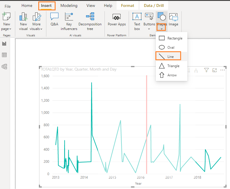
You may insert Shapes (such as line or Triangle) into the specific location which you want on Axis of chart, and it is not dynamic as explained. See the attached screenshot.
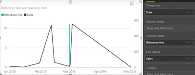
In addition, you may try to use a combination chart.
- Create a "line and stacked column chart"
- Put column [Date] into shared axis , and put [values] into line values.
- Create a measure that evaluates to the maximum value when Date=specific date(otherwise blank), put this measure into column values.
You may create measure like DAX below:
Specific Date line = IF ( VALUES ( Table1[Date] ) = DATE ( 2020, 9, 1 ), MAXX ( ALL ( Table1[Date] ), MAX ( Table1[Sales] ) ))
Best Regards,
Amy
Community Support Team _ Amy
If this post helps, then please consider Accept it as the solution to help the other members find it more quickly.
- Mark as New
- Bookmark
- Subscribe
- Mute
- Subscribe to RSS Feed
- Permalink
- Report Inappropriate Content
@Turf03 , The information you have provided is not making the problem clear to me. Can you please explain with an example.
ideally, Insert should have value and removal means blank value
Appreciate your Kudos.
Microsoft Power BI Learning Resources, 2023 !!
Learn Power BI - Full Course with Dec-2022, with Window, Index, Offset, 100+ Topics !!
Did I answer your question? Mark my post as a solution! Appreciate your Kudos !! Proud to be a Super User! !!
- Mark as New
- Bookmark
- Subscribe
- Mute
- Subscribe to RSS Feed
- Permalink
- Report Inappropriate Content
- Mark as New
- Bookmark
- Subscribe
- Mute
- Subscribe to RSS Feed
- Permalink
- Report Inappropriate Content
@Turf03 , For that One way is to have conditional formatting, which only possible when you have one measure and no legend .
So create a measure like example
Color Date =
var _min =minx(allselected(Date,Date[Year])
return
Switch( true(),
FIRSTNONBLANK('Date'[Year],year(TODAY()))-_min =0 ,"lightgreen",
FIRSTNONBLANK('Date'[Year],year(TODAY()))-_min =0 ,"blue",
"red")
Now first create BAR visual and do conditional formatting and in that use "Field Value" Option
refer
https://radacad.com/dax-and-conditional-formatting-better-together-find-the-biggest-and-smallest-num...
https://docs.microsoft.com/en-us/power-bi/desktop-conditional-table-formatting#color-by-color-values
Other is have a line with blank and nonblank values based on condition. Refer I use that in this blog
Microsoft Power BI Learning Resources, 2023 !!
Learn Power BI - Full Course with Dec-2022, with Window, Index, Offset, 100+ Topics !!
Did I answer your question? Mark my post as a solution! Appreciate your Kudos !! Proud to be a Super User! !!
Helpful resources

Microsoft Fabric Learn Together
Covering the world! 9:00-10:30 AM Sydney, 4:00-5:30 PM CET (Paris/Berlin), 7:00-8:30 PM Mexico City

Power BI Monthly Update - April 2024
Check out the April 2024 Power BI update to learn about new features.

| User | Count |
|---|---|
| 97 | |
| 96 | |
| 81 | |
| 74 | |
| 66 |
| User | Count |
|---|---|
| 126 | |
| 105 | |
| 103 | |
| 81 | |
| 72 |


