- Power BI forums
- Updates
- News & Announcements
- Get Help with Power BI
- Desktop
- Service
- Report Server
- Power Query
- Mobile Apps
- Developer
- DAX Commands and Tips
- Custom Visuals Development Discussion
- Health and Life Sciences
- Power BI Spanish forums
- Translated Spanish Desktop
- Power Platform Integration - Better Together!
- Power Platform Integrations (Read-only)
- Power Platform and Dynamics 365 Integrations (Read-only)
- Training and Consulting
- Instructor Led Training
- Dashboard in a Day for Women, by Women
- Galleries
- Community Connections & How-To Videos
- COVID-19 Data Stories Gallery
- Themes Gallery
- Data Stories Gallery
- R Script Showcase
- Webinars and Video Gallery
- Quick Measures Gallery
- 2021 MSBizAppsSummit Gallery
- 2020 MSBizAppsSummit Gallery
- 2019 MSBizAppsSummit Gallery
- Events
- Ideas
- Custom Visuals Ideas
- Issues
- Issues
- Events
- Upcoming Events
- Community Blog
- Power BI Community Blog
- Custom Visuals Community Blog
- Community Support
- Community Accounts & Registration
- Using the Community
- Community Feedback
Register now to learn Fabric in free live sessions led by the best Microsoft experts. From Apr 16 to May 9, in English and Spanish.
- Power BI forums
- Forums
- Get Help with Power BI
- Desktop
- How to show individual bars in a group
- Subscribe to RSS Feed
- Mark Topic as New
- Mark Topic as Read
- Float this Topic for Current User
- Bookmark
- Subscribe
- Printer Friendly Page
- Mark as New
- Bookmark
- Subscribe
- Mute
- Subscribe to RSS Feed
- Permalink
- Report Inappropriate Content
How to show individual bars in a group
Hi,
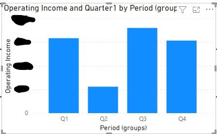
I am trying to create a table where you can see Q1 for year 2020 comapred to Q1 for year 2021, and I want to do this for all four quarters of each year. I have attached a photo of what it should look like (how it looks in Tableau). You can see the grey and blue bars within each quarter, grey representing one year and blue representing the other. I also attached a photo of what this looks like in Power BI so far. I have grouped the quarters, but the visual is showing both years as one bar, totaled. I need this separated.
I would appreciate any adivce on how to fix this!
Thanks!

- Mark as New
- Bookmark
- Subscribe
- Mute
- Subscribe to RSS Feed
- Permalink
- Report Inappropriate Content
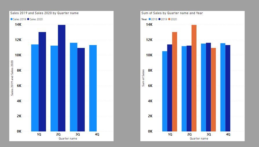
Does this work?
Did I answer your question? Mark my post as a solution!
In doing so, you are also helping me. Thank you!
Proud to be a Super User!
Paul on Linkedin.
- Mark as New
- Bookmark
- Subscribe
- Mute
- Subscribe to RSS Feed
- Permalink
- Report Inappropriate Content
Yes, this is what I am looking for! The issue I am having now is with the formatting of my period. I do not have separate dimensions for quarter and year; they are combined in one dimension. I am able to create a new measure to separate them, but Power BI only allows me to add this new measure as a tooltip, not the the axis, legend, or values.
- Mark as New
- Bookmark
- Subscribe
- Mute
- Subscribe to RSS Feed
- Permalink
- Report Inappropriate Content
You must create a new calculated column in the table. Btw, are you using a Date table as a dimension? (you should be!)
Can you show us what the quarter-year field is like? we can create separate columns for each of these that you can then use on the axis or data segmentation, etc...
Did I answer your question? Mark my post as a solution!
In doing so, you are also helping me. Thank you!
Proud to be a Super User!
Paul on Linkedin.
- Mark as New
- Bookmark
- Subscribe
- Mute
- Subscribe to RSS Feed
- Permalink
- Report Inappropriate Content
Additionally, my period field was formatted like this: FY21Q1
So, I created two new calculated columns. I had to first create a new measure for the list of period values to be able to use in functions. For the quarter, I used the 'right' function, and for the year, I used the 'mid' function. Worked like a charm.
- Mark as New
- Bookmark
- Subscribe
- Mute
- Subscribe to RSS Feed
- Permalink
- Report Inappropriate Content
Hi @amconnel ,
Could you please provide some orginal data(exclude sensitive data) of your tables in order to provide you a solution suitable for your scenario? About sorting by multiple columns, you can refer the content in the following links:
Sort using the Sort by Column button
Best Regards
If this post helps, then please consider Accept it as the solution to help the other members find it more quickly.
- Mark as New
- Bookmark
- Subscribe
- Mute
- Subscribe to RSS Feed
- Permalink
- Report Inappropriate Content
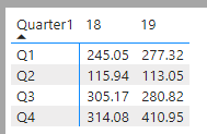
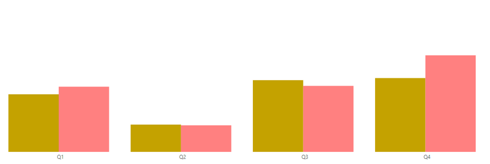
(Using previous years' data - 2018 and 2019 rather than 2020 and 2021)
I attached a photo of what the data looks like as a table and what the visual is looking like so far. I need the chart to be sorted first by quarter, like it is, from Q1 to Q4. Then, I need to sort the data by year, from 2019 to 2018. So, the pink should be coming before the yellow.
I will note that I do not have the option to sort by year. I only have the options to sort by Quarter and AOI.
- Mark as New
- Bookmark
- Subscribe
- Mute
- Subscribe to RSS Feed
- Permalink
- Report Inappropriate Content
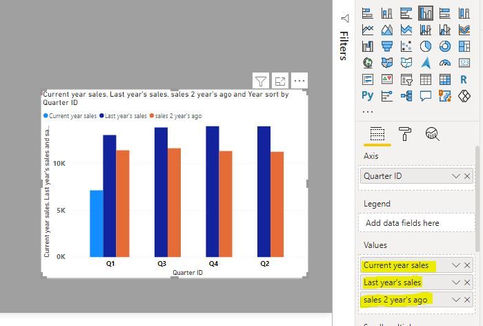
If you have measures for each of the year's calculations, you can sort the years by the order you include the measures in the values bucket (you can drag them up or down to change the order)
Did I answer your question? Mark my post as a solution!
In doing so, you are also helping me. Thank you!
Proud to be a Super User!
Paul on Linkedin.
- Mark as New
- Bookmark
- Subscribe
- Mute
- Subscribe to RSS Feed
- Permalink
- Report Inappropriate Content
Unfortunately, my data is not formatted this way. I have all data in a 'Period' measure that I just filter for the years we are looking at specifically.
- Mark as New
- Bookmark
- Subscribe
- Mute
- Subscribe to RSS Feed
- Permalink
- Report Inappropriate Content
Wow this was a huge help! I am still very new to Power BI and did not know about creating new columns!!
So, I have been able to make my graph look like yours which is great! The last thing it looks like I need to do that I am also having trouble figuring out is sorting. I need it sorted two ways:
1. By quarter, ascending
2. By year, descending
Is it possible for me to do this?
- Mark as New
- Bookmark
- Subscribe
- Mute
- Subscribe to RSS Feed
- Permalink
- Report Inappropriate Content
@amconnel Have you tried including Year from your Date table on the same axis with Quarter? It should work.
- Mark as New
- Bookmark
- Subscribe
- Mute
- Subscribe to RSS Feed
- Permalink
- Report Inappropriate Content
Upon thinking about this futher, my data is formatted a bit unfortunately. I have a dimension titled 'Period' that is formatted like: "FY21Q1"
I created a new measure for the quarter, but I am only able to add this as a tooltip. I cannot add this measure to the axis or legend or as a value. It will be the same if I create a measure for year.
Is there a potential solution for that issue? As I said in my previous reply, I have made individual visuals for each quarter for the time being, and it looks great. But, it will be tedious in the future when we are rolling over the years and using '21 and '22 rather than '20 and '21.
- Mark as New
- Bookmark
- Subscribe
- Mute
- Subscribe to RSS Feed
- Permalink
- Report Inappropriate Content
This may have worked, but I ended up just doing individual charts for each quarter. If your solution does work, it will make things much more efficient, so I will try this soon. I will update the thread when I do so, but for now, thank you! 😊
Helpful resources

Microsoft Fabric Learn Together
Covering the world! 9:00-10:30 AM Sydney, 4:00-5:30 PM CET (Paris/Berlin), 7:00-8:30 PM Mexico City

Power BI Monthly Update - April 2024
Check out the April 2024 Power BI update to learn about new features.

| User | Count |
|---|---|
| 104 | |
| 95 | |
| 80 | |
| 67 | |
| 62 |
| User | Count |
|---|---|
| 138 | |
| 107 | |
| 104 | |
| 82 | |
| 63 |
