- Power BI forums
- Updates
- News & Announcements
- Get Help with Power BI
- Desktop
- Service
- Report Server
- Power Query
- Mobile Apps
- Developer
- DAX Commands and Tips
- Custom Visuals Development Discussion
- Health and Life Sciences
- Power BI Spanish forums
- Translated Spanish Desktop
- Power Platform Integration - Better Together!
- Power Platform Integrations (Read-only)
- Power Platform and Dynamics 365 Integrations (Read-only)
- Training and Consulting
- Instructor Led Training
- Dashboard in a Day for Women, by Women
- Galleries
- Community Connections & How-To Videos
- COVID-19 Data Stories Gallery
- Themes Gallery
- Data Stories Gallery
- R Script Showcase
- Webinars and Video Gallery
- Quick Measures Gallery
- 2021 MSBizAppsSummit Gallery
- 2020 MSBizAppsSummit Gallery
- 2019 MSBizAppsSummit Gallery
- Events
- Ideas
- Custom Visuals Ideas
- Issues
- Issues
- Events
- Upcoming Events
- Community Blog
- Power BI Community Blog
- Custom Visuals Community Blog
- Community Support
- Community Accounts & Registration
- Using the Community
- Community Feedback
Register now to learn Fabric in free live sessions led by the best Microsoft experts. From Apr 16 to May 9, in English and Spanish.
- Power BI forums
- Forums
- Get Help with Power BI
- Desktop
- How to separate the same values in a scatter graph...
- Subscribe to RSS Feed
- Mark Topic as New
- Mark Topic as Read
- Float this Topic for Current User
- Bookmark
- Subscribe
- Printer Friendly Page
- Mark as New
- Bookmark
- Subscribe
- Mute
- Subscribe to RSS Feed
- Permalink
- Report Inappropriate Content
How to separate the same values in a scatter graph so they don't combine
HI there,
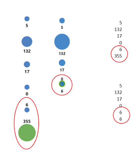
I have a dataset where one column has two rows with the same value in it (shown in the image below where there are two '6' values). This means that when I plot the values (within the details section, not x axis) on a scatter graph they go on top of each other on the y axis, despite having different y axis values (each point is valued at 6,5,4,3,2,1 to keep the linear formation for the visual).
Is there a way to ensure that even if the values are the same, they remain separated on the y axis?
I've noticed this combination of same values occurs in other instances too, such as if I have a multicard with two of the same words in it, it aggregates the rows into. I've tried not summarizing the metric but that doesn't work.
Thanks!
Solved! Go to Solution.
- Mark as New
- Bookmark
- Subscribe
- Mute
- Subscribe to RSS Feed
- Permalink
- Report Inappropriate Content
Hi @Anonymous ,
According to your description, I think you need to enable other axis or legend field to grouping measure result with different fields.
Regards,
Xiaoxin Sheng
If this post helps, please consider accept as solution to help other members find it more quickly.
- Mark as New
- Bookmark
- Subscribe
- Mute
- Subscribe to RSS Feed
- Permalink
- Report Inappropriate Content
HI @Anonymous ,
I'm not so clarify for your data structure, can you please share some sample data to help use clarify your requirement.
In addition, you can consider to write a measure formula to summarize result based on current group.
Measure =
CALCULATE (
    SUM ( Table[Amount] ),
    ALLSELECTED ( Table ),
    VALUES ( Table[Category] )
)
Regards,
Xiaoxin Sheng
If this post helps, please consider accept as solution to help other members find it more quickly.
- Mark as New
- Bookmark
- Subscribe
- Mute
- Subscribe to RSS Feed
- Permalink
- Report Inappropriate Content
Hi Xiaoxin,
Thanks, I don't think a measure would work as I really need a calculated column so that the problem doesn't occur again when the data is updated each week. I don't want to have to manually add a circle using the measure when the problem occurs, I would like the scatter graph to keep two of the same values separate automatically.
Below are two examples of my data. The column on the right has two of the same values (6 and 6). It is this duplication that causes the scatter plot circles to fall on top of each other. The image attached also shows how I input the metrics into the scatter graph
| Story | Sort Order | Avg Engagement | Avg Engagement |
| Daily Mirror | 6 | 5 | 5 |
| Daily Mail | 5 | 132 | 132 |
| The Sun | 4 | 17 | 17 |
| Daily Star | 3 | 0 | 0 |
| The Star | 2 | 6 | 6 |
| The Mirror | 1 | 355 | 6 |
I hope this helps. Thanks,
Finny
- Mark as New
- Bookmark
- Subscribe
- Mute
- Subscribe to RSS Feed
- Permalink
- Report Inappropriate Content
Hi @Anonymous ,
According to your description, I think you need to enable other axis or legend field to grouping measure result with different fields.
Regards,
Xiaoxin Sheng
If this post helps, please consider accept as solution to help other members find it more quickly.
Helpful resources

Microsoft Fabric Learn Together
Covering the world! 9:00-10:30 AM Sydney, 4:00-5:30 PM CET (Paris/Berlin), 7:00-8:30 PM Mexico City

Power BI Monthly Update - April 2024
Check out the April 2024 Power BI update to learn about new features.

| User | Count |
|---|---|
| 105 | |
| 94 | |
| 75 | |
| 63 | |
| 62 |
| User | Count |
|---|---|
| 137 | |
| 105 | |
| 104 | |
| 80 | |
| 63 |


