- Power BI forums
- Updates
- News & Announcements
- Get Help with Power BI
- Desktop
- Service
- Report Server
- Power Query
- Mobile Apps
- Developer
- DAX Commands and Tips
- Custom Visuals Development Discussion
- Health and Life Sciences
- Power BI Spanish forums
- Translated Spanish Desktop
- Power Platform Integration - Better Together!
- Power Platform Integrations (Read-only)
- Power Platform and Dynamics 365 Integrations (Read-only)
- Training and Consulting
- Instructor Led Training
- Dashboard in a Day for Women, by Women
- Galleries
- Community Connections & How-To Videos
- COVID-19 Data Stories Gallery
- Themes Gallery
- Data Stories Gallery
- R Script Showcase
- Webinars and Video Gallery
- Quick Measures Gallery
- 2021 MSBizAppsSummit Gallery
- 2020 MSBizAppsSummit Gallery
- 2019 MSBizAppsSummit Gallery
- Events
- Ideas
- Custom Visuals Ideas
- Issues
- Issues
- Events
- Upcoming Events
- Community Blog
- Power BI Community Blog
- Custom Visuals Community Blog
- Community Support
- Community Accounts & Registration
- Using the Community
- Community Feedback
Register now to learn Fabric in free live sessions led by the best Microsoft experts. From Apr 16 to May 9, in English and Spanish.
- Power BI forums
- Forums
- Get Help with Power BI
- Desktop
- How to preserve Size in a Scatter Plot when adding...
- Subscribe to RSS Feed
- Mark Topic as New
- Mark Topic as Read
- Float this Topic for Current User
- Bookmark
- Subscribe
- Printer Friendly Page
- Mark as New
- Bookmark
- Subscribe
- Mute
- Subscribe to RSS Feed
- Permalink
- Report Inappropriate Content
How to preserve Size in a Scatter Plot when adding a Ratio Line
Hi,
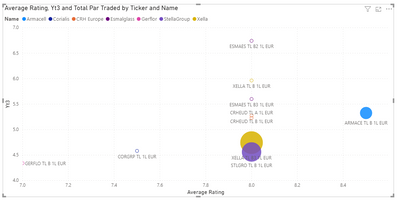
I have a scatter plot based on some data, as shown below. Importantly, I am using a column from my Table in the Size field. It behaves as intended.
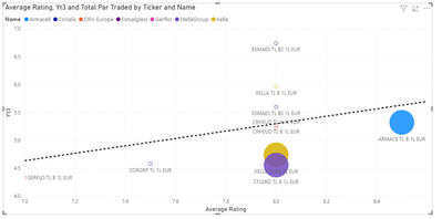
However, when I try to add a Ratio Line, the Size field stops working, it essentially makes the bubbles as big as each other.
How can I get a Ratio line (or something similar) on my scatter plot whilst showing accurate bubble Sizes?
- Mark as New
- Bookmark
- Subscribe
- Mute
- Subscribe to RSS Feed
- Permalink
- Report Inappropriate Content
Hi @HugoArtus ,
I don't see 'Ratio line' too, my Power BI Desktop version is Nov2020.
Maybe you could try to update the application to latest version and check if the problem still exists.
Best Regards,
Jay
If this post helps, then please consider Accept it as the solution to help the other members find it.
- Mark as New
- Bookmark
- Subscribe
- Mute
- Subscribe to RSS Feed
- Permalink
- Report Inappropriate Content
Hi @HugoArtus ,
What Ratio line are you talking about here?
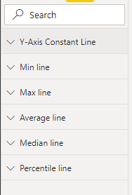
For scatter chart I see following options:
Also when I add one of the above lines, I see the Size of the the bubbles stay right at my end.
- Mark as New
- Bookmark
- Subscribe
- Mute
- Subscribe to RSS Feed
- Permalink
- Report Inappropriate Content
Thanks for responding.
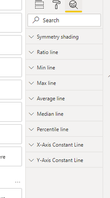
Weird, I see the following options:
It is only when adding the Ratio line that the bubble sizes get weird but this is the line I need in the chart (unless there is another way to produce a Line of Best Fit or something similar).
Any advice?
- Mark as New
- Bookmark
- Subscribe
- Mute
- Subscribe to RSS Feed
- Permalink
- Report Inappropriate Content
Hi @HugoArtus ,
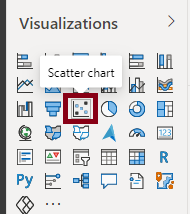
What visual are you using? I am using a Scatter Chart visual as shown below:
Also I am working with Power BI November 2020 Update.
Thanks,
Pragati
- Mark as New
- Bookmark
- Subscribe
- Mute
- Subscribe to RSS Feed
- Permalink
- Report Inappropriate Content
I am also using a Scatter plot
It looks like I am using the Aug-20 version (2.84.861.0), could this be the issue? Not sure if I can get an update to the Nov version because this is controlled centrally my by employer.
Helpful resources

Microsoft Fabric Learn Together
Covering the world! 9:00-10:30 AM Sydney, 4:00-5:30 PM CET (Paris/Berlin), 7:00-8:30 PM Mexico City

Power BI Monthly Update - April 2024
Check out the April 2024 Power BI update to learn about new features.

| User | Count |
|---|---|
| 107 | |
| 105 | |
| 88 | |
| 74 | |
| 66 |
| User | Count |
|---|---|
| 126 | |
| 111 | |
| 100 | |
| 83 | |
| 71 |
