- Power BI forums
- Updates
- News & Announcements
- Get Help with Power BI
- Desktop
- Service
- Report Server
- Power Query
- Mobile Apps
- Developer
- DAX Commands and Tips
- Custom Visuals Development Discussion
- Health and Life Sciences
- Power BI Spanish forums
- Translated Spanish Desktop
- Power Platform Integration - Better Together!
- Power Platform Integrations (Read-only)
- Power Platform and Dynamics 365 Integrations (Read-only)
- Training and Consulting
- Instructor Led Training
- Dashboard in a Day for Women, by Women
- Galleries
- Community Connections & How-To Videos
- COVID-19 Data Stories Gallery
- Themes Gallery
- Data Stories Gallery
- R Script Showcase
- Webinars and Video Gallery
- Quick Measures Gallery
- 2021 MSBizAppsSummit Gallery
- 2020 MSBizAppsSummit Gallery
- 2019 MSBizAppsSummit Gallery
- Events
- Ideas
- Custom Visuals Ideas
- Issues
- Issues
- Events
- Upcoming Events
- Community Blog
- Power BI Community Blog
- Custom Visuals Community Blog
- Community Support
- Community Accounts & Registration
- Using the Community
- Community Feedback
Register now to learn Fabric in free live sessions led by the best Microsoft experts. From Apr 16 to May 9, in English and Spanish.
- Power BI forums
- Forums
- Get Help with Power BI
- Desktop
- How do i create a chart that shows me if something...
- Subscribe to RSS Feed
- Mark Topic as New
- Mark Topic as Read
- Float this Topic for Current User
- Bookmark
- Subscribe
- Printer Friendly Page
- Mark as New
- Bookmark
- Subscribe
- Mute
- Subscribe to RSS Feed
- Permalink
- Report Inappropriate Content
How do i create a chart that shows me if something happens at least once in a variable time frame?
Hi, everyone. I have a single table with Users in it, and then a Participated field with a yes or no value in it. There is also a Date date and a Team field. Each record equals a single day for a single user. So a user in one month will have thirty records.10 users will have 300 records that month. etc.
My goal is to show a bar chart that has one bar for Group A and one bar for Group B. Group A is composed of 3 users and Group B is composed of 4 users. I want my bar chart to show the percent of users that have at least one yes for whatever date range is selected on the report.
For example, if I pick January 1 & 2 (two days, but the example is the same if I picked a week or a year), One of my group A users participated one day, did not participate the next. The second user participated both days. And the final user has all No values.
Team A for Jan 1 & 2:
User 1 Day 1 = Yes
User 1 Day 2 = No
User 2 Day 1 = Yes
User 2 Day 2 = Yes
User 3 Day 1 = No
User 3 Day 2 = No
So what I want is for the bar chart to show that 66% of my users participated and 34% did not. However, i can only get Power BI to show the overall count and percentages based on the number of occurences of Yes vs No. So in my example, it actually show 50% Yes and 50% No.
Any help would be most appreciated!
Scott
Solved! Go to Solution.
- Mark as New
- Bookmark
- Subscribe
- Mute
- Subscribe to RSS Feed
- Permalink
- Report Inappropriate Content
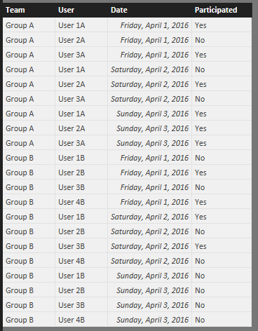
@Anonymous here's the table I used
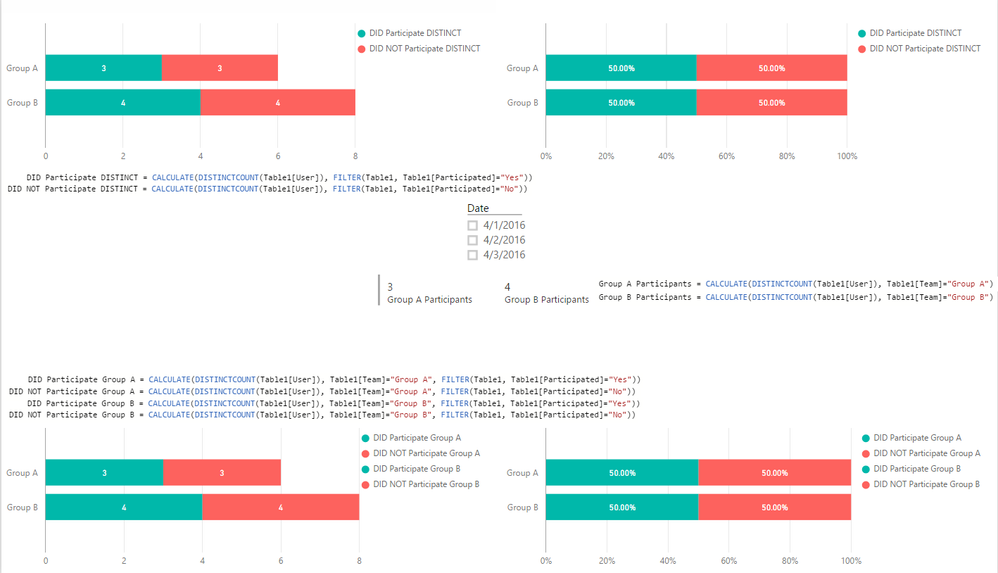
and the result - includes the Measures
You can just do the top or bottom left bar charts
for the ones on the right just Ctrl+C => Ctrl+V => change to 100% Stacked Bar
Hope this helps!
- Mark as New
- Bookmark
- Subscribe
- Mute
- Subscribe to RSS Feed
- Permalink
- Report Inappropriate Content
Try using a measure like the one below:
Attended Number := countrows(filter(DataTable,'DataTable'[Attended]="Yes"))
- Mark as New
- Bookmark
- Subscribe
- Mute
- Subscribe to RSS Feed
- Permalink
- Report Inappropriate Content
Look at my response here
http://community.powerbi.com/t5/Desktop/Average-of-result-grouped-by-dates/m-p/28973
- Mark as New
- Bookmark
- Subscribe
- Mute
- Subscribe to RSS Feed
- Permalink
- Report Inappropriate Content
@Anonymous here's the table I used
and the result - includes the Measures
You can just do the top or bottom left bar charts
for the ones on the right just Ctrl+C => Ctrl+V => change to 100% Stacked Bar
Hope this helps!
- Mark as New
- Bookmark
- Subscribe
- Mute
- Subscribe to RSS Feed
- Permalink
- Report Inappropriate Content
Helpful resources

Microsoft Fabric Learn Together
Covering the world! 9:00-10:30 AM Sydney, 4:00-5:30 PM CET (Paris/Berlin), 7:00-8:30 PM Mexico City

Power BI Monthly Update - April 2024
Check out the April 2024 Power BI update to learn about new features.

| User | Count |
|---|---|
| 104 | |
| 95 | |
| 80 | |
| 67 | |
| 62 |
| User | Count |
|---|---|
| 138 | |
| 107 | |
| 104 | |
| 82 | |
| 63 |


