- Power BI forums
- Updates
- News & Announcements
- Get Help with Power BI
- Desktop
- Service
- Report Server
- Power Query
- Mobile Apps
- Developer
- DAX Commands and Tips
- Custom Visuals Development Discussion
- Health and Life Sciences
- Power BI Spanish forums
- Translated Spanish Desktop
- Power Platform Integration - Better Together!
- Power Platform Integrations (Read-only)
- Power Platform and Dynamics 365 Integrations (Read-only)
- Training and Consulting
- Instructor Led Training
- Dashboard in a Day for Women, by Women
- Galleries
- Community Connections & How-To Videos
- COVID-19 Data Stories Gallery
- Themes Gallery
- Data Stories Gallery
- R Script Showcase
- Webinars and Video Gallery
- Quick Measures Gallery
- 2021 MSBizAppsSummit Gallery
- 2020 MSBizAppsSummit Gallery
- 2019 MSBizAppsSummit Gallery
- Events
- Ideas
- Custom Visuals Ideas
- Issues
- Issues
- Events
- Upcoming Events
- Community Blog
- Power BI Community Blog
- Custom Visuals Community Blog
- Community Support
- Community Accounts & Registration
- Using the Community
- Community Feedback
Register now to learn Fabric in free live sessions led by the best Microsoft experts. From Apr 16 to May 9, in English and Spanish.
- Power BI forums
- Forums
- Get Help with Power BI
- Desktop
- How do I "hide" a column from the legend?
- Subscribe to RSS Feed
- Mark Topic as New
- Mark Topic as Read
- Float this Topic for Current User
- Bookmark
- Subscribe
- Printer Friendly Page
- Mark as New
- Bookmark
- Subscribe
- Mute
- Subscribe to RSS Feed
- Permalink
- Report Inappropriate Content
How do I "hide" a column from the legend?
Hello!
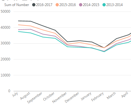
I am creating a line graph of data from 2013 to 2017 on a monthly basis and in order to get the month to be in the desired order, I had to create a new column with the month number. Now the sum of number is in the legend but not needed. I have changed the colour to white, but would prefer to completely hide it from the legend. Is this possible.
I have included a picture of the graph for your reference.
Thank you.
Solved! Go to Solution.
- Mark as New
- Bookmark
- Subscribe
- Mute
- Subscribe to RSS Feed
- Permalink
- Report Inappropriate Content
Hey,
to get what you wanted
- go to the data view
- switch to the Modeling menu
- mark the column that contains the month name you are using in your visual
- from the ribbon use "Sort by column" and select the column you want to use to sort your montn name. please be aware that every instance of your month must have the same value
Hope this helps
Regards
Tom
Did I answer your question? Mark my post as a solution, this will help others!
Proud to be a Super User!
I accept Kudos 😉
Hamburg, Germany
- Mark as New
- Bookmark
- Subscribe
- Mute
- Subscribe to RSS Feed
- Permalink
- Report Inappropriate Content
If you've already properly set up the Sort by Column as he explained, go to the little ... icon in the upper right hand corner of your chart and change what the chart is sorted by.
Did I answer your question? Mark my post as a solution!
Proud to be a Super User!
- Mark as New
- Bookmark
- Subscribe
- Mute
- Subscribe to RSS Feed
- Permalink
- Report Inappropriate Content
Hey,
to get what you wanted
- go to the data view
- switch to the Modeling menu
- mark the column that contains the month name you are using in your visual
- from the ribbon use "Sort by column" and select the column you want to use to sort your montn name. please be aware that every instance of your month must have the same value
Hope this helps
Regards
Tom
Did I answer your question? Mark my post as a solution, this will help others!
Proud to be a Super User!
I accept Kudos 😉
Hamburg, Germany
- Mark as New
- Bookmark
- Subscribe
- Mute
- Subscribe to RSS Feed
- Permalink
- Report Inappropriate Content
Hi Tom,
Thanks for replying. I followed your instructions but the sum of number is still showing up in the legend.
Do you have any other ideas.
Thanks,
Maegan
- Mark as New
- Bookmark
- Subscribe
- Mute
- Subscribe to RSS Feed
- Permalink
- Report Inappropriate Content
Did I answer your question? Mark my post as a solution, this will help others!
Proud to be a Super User!
I accept Kudos 😉
Hamburg, Germany
- Mark as New
- Bookmark
- Subscribe
- Mute
- Subscribe to RSS Feed
- Permalink
- Report Inappropriate Content
Unfortunately, without that extra column, the months go out of order. This was the only fix I could find for that...
- Mark as New
- Bookmark
- Subscribe
- Mute
- Subscribe to RSS Feed
- Permalink
- Report Inappropriate Content
Hey,
the "Sort by Column" is the way how the distinct values of a column used on an axis of a visual are ordered, for this reason I guess that the process I mentioned above is a little flawed.
Can you share your PBIX file or sample data that allows to recreate your issue.
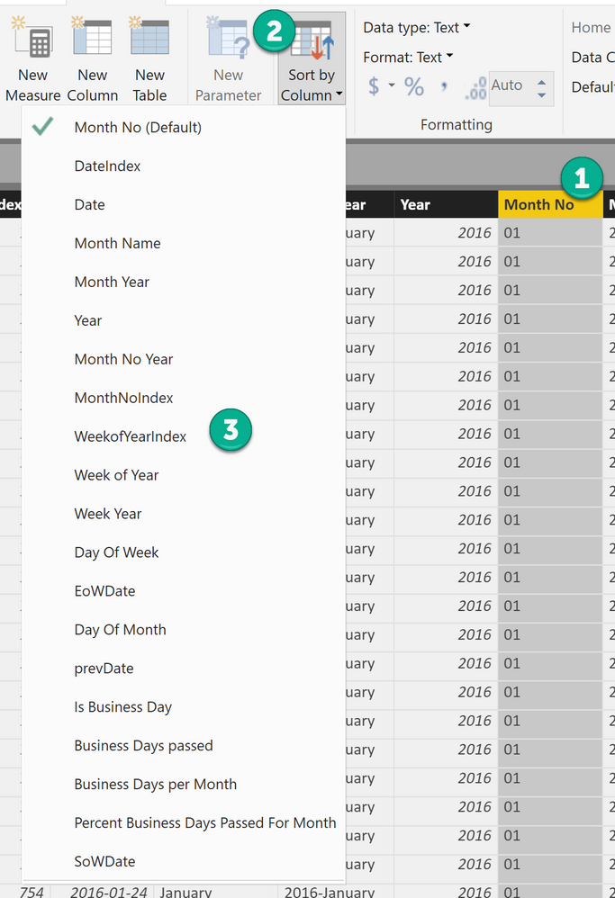
Here are some screenshots
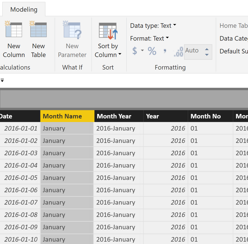
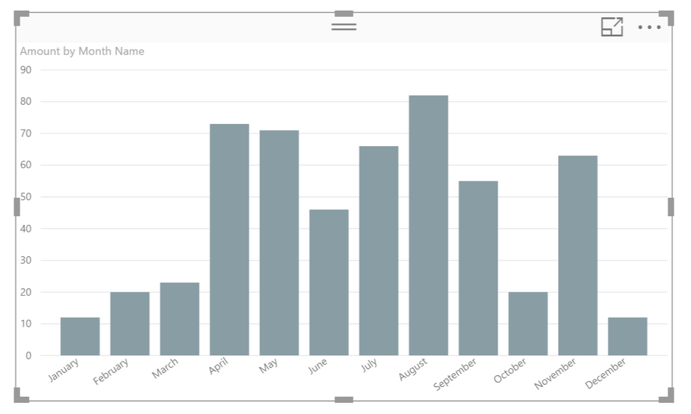
I'm going to sort the values of the column Month Name by another column, to make sure that my visuals start with January and not with February (the default order is alphabetically)
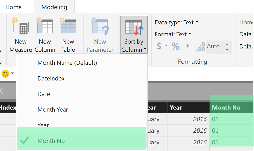
The next screenshot shows that the column Month Name is sorted by the values of the column Month No
Each occcurence of January is matched by 01 no matter of the year.
And this is the result
If this gives you an idea than please share some sampledata that allows to recreate your issue, as I already mentioned above.
Regards
Tom
Did I answer your question? Mark my post as a solution, this will help others!
Proud to be a Super User!
I accept Kudos 😉
Hamburg, Germany
- Mark as New
- Bookmark
- Subscribe
- Mute
- Subscribe to RSS Feed
- Permalink
- Report Inappropriate Content
If you've already properly set up the Sort by Column as he explained, go to the little ... icon in the upper right hand corner of your chart and change what the chart is sorted by.
Did I answer your question? Mark my post as a solution!
Proud to be a Super User!
- Mark as New
- Bookmark
- Subscribe
- Mute
- Subscribe to RSS Feed
- Permalink
- Report Inappropriate Content
Ahh okay, now I am able to remove the extra column. Thank you!
- Mark as New
- Bookmark
- Subscribe
- Mute
- Subscribe to RSS Feed
- Permalink
- Report Inappropriate Content
Hi @MExtross
the screen shot makes this look like a title on the legend, just double check the format tab and the legend section and make sure title is turned off
Dog
- Mark as New
- Bookmark
- Subscribe
- Mute
- Subscribe to RSS Feed
- Permalink
- Report Inappropriate Content
Hi @Dog,
Thanks for replying! I checked that and turned the title off but there is no change...
And it might look like that just because I changed the data colour to white.
Maegan
Helpful resources

Microsoft Fabric Learn Together
Covering the world! 9:00-10:30 AM Sydney, 4:00-5:30 PM CET (Paris/Berlin), 7:00-8:30 PM Mexico City

Power BI Monthly Update - April 2024
Check out the April 2024 Power BI update to learn about new features.

| User | Count |
|---|---|
| 106 | |
| 98 | |
| 80 | |
| 67 | |
| 63 |
| User | Count |
|---|---|
| 145 | |
| 111 | |
| 104 | |
| 84 | |
| 64 |
