- Power BI forums
- Updates
- News & Announcements
- Get Help with Power BI
- Desktop
- Service
- Report Server
- Power Query
- Mobile Apps
- Developer
- DAX Commands and Tips
- Custom Visuals Development Discussion
- Health and Life Sciences
- Power BI Spanish forums
- Translated Spanish Desktop
- Power Platform Integration - Better Together!
- Power Platform Integrations (Read-only)
- Power Platform and Dynamics 365 Integrations (Read-only)
- Training and Consulting
- Instructor Led Training
- Dashboard in a Day for Women, by Women
- Galleries
- Community Connections & How-To Videos
- COVID-19 Data Stories Gallery
- Themes Gallery
- Data Stories Gallery
- R Script Showcase
- Webinars and Video Gallery
- Quick Measures Gallery
- 2021 MSBizAppsSummit Gallery
- 2020 MSBizAppsSummit Gallery
- 2019 MSBizAppsSummit Gallery
- Events
- Ideas
- Custom Visuals Ideas
- Issues
- Issues
- Events
- Upcoming Events
- Community Blog
- Power BI Community Blog
- Custom Visuals Community Blog
- Community Support
- Community Accounts & Registration
- Using the Community
- Community Feedback
Register now to learn Fabric in free live sessions led by the best Microsoft experts. From Apr 16 to May 9, in English and Spanish.
- Power BI forums
- Forums
- Get Help with Power BI
- Desktop
- How can I put an Value in this Visualization?
- Subscribe to RSS Feed
- Mark Topic as New
- Mark Topic as Read
- Float this Topic for Current User
- Bookmark
- Subscribe
- Printer Friendly Page
- Mark as New
- Bookmark
- Subscribe
- Mute
- Subscribe to RSS Feed
- Permalink
- Report Inappropriate Content
How can I put an Value in this Visualization?
Hello I am new on this Site hope i will post it in the right place.
Currently I am trying Power Bi out and I try to build a Chart. Now I have no clue How I can change it that I see this Value here.
Pls look in screenshot
Can u help me with my problem?
Kind Regards
Solved! Go to Solution.
- Mark as New
- Bookmark
- Subscribe
- Mute
- Subscribe to RSS Feed
- Permalink
- Report Inappropriate Content
Hi @Cango
The value does not appear because of lack of "place", it is just not enough pixels to show it.
You can try to apply some steps to try to show them:
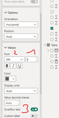
1. Minimize the size of font -8
2. Choose the smallest type of font (I think it is "Din")
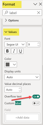
3. switch on "Overflow text"
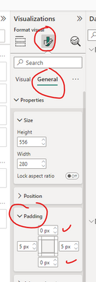
4. Minimize vertical padding
5. Switch off / minimize the size of the title
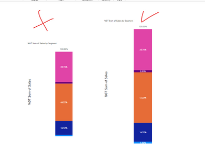
6. resize the graph :
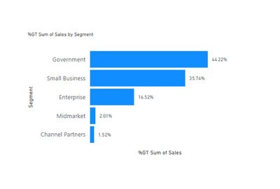
Please note that when it comes to data visualization, this type of graph (such as a pie chart) does not efficiently facilitate data comparison. It is advisable to consider a different approach and create a standard rating graph, as depicted in the image:
If this post helps, then please consider Accepting it as the solution to help the other members find it more quickly
- Mark as New
- Bookmark
- Subscribe
- Mute
- Subscribe to RSS Feed
- Permalink
- Report Inappropriate Content
@Cango also check overflow text setting Format -> Data Labels -> Values
Subscribe to the @PowerBIHowTo YT channel for an upcoming video on List and Record functions in Power Query!!
Learn Power BI and Fabric - subscribe to our YT channel - Click here: @PowerBIHowTo
If my solution proved useful, I'd be delighted to receive Kudos. When you put effort into asking a question, it's equally thoughtful to acknowledge and give Kudos to the individual who helped you solve the problem. It's a small gesture that shows appreciation and encouragement! ❤
Did I answer your question? Mark my post as a solution. Proud to be a Super User! Appreciate your Kudos 🙂
Feel free to email me with any of your BI needs.
- Mark as New
- Bookmark
- Subscribe
- Mute
- Subscribe to RSS Feed
- Permalink
- Report Inappropriate Content
Hi @Cango
The value does not appear because of lack of "place", it is just not enough pixels to show it.
You can try to apply some steps to try to show them:
1. Minimize the size of font -8
2. Choose the smallest type of font (I think it is "Din")
3. switch on "Overflow text"
4. Minimize vertical padding
5. Switch off / minimize the size of the title
6. resize the graph :
Please note that when it comes to data visualization, this type of graph (such as a pie chart) does not efficiently facilitate data comparison. It is advisable to consider a different approach and create a standard rating graph, as depicted in the image:
If this post helps, then please consider Accepting it as the solution to help the other members find it more quickly
Helpful resources

Microsoft Fabric Learn Together
Covering the world! 9:00-10:30 AM Sydney, 4:00-5:30 PM CET (Paris/Berlin), 7:00-8:30 PM Mexico City

Power BI Monthly Update - April 2024
Check out the April 2024 Power BI update to learn about new features.

| User | Count |
|---|---|
| 97 | |
| 95 | |
| 80 | |
| 77 | |
| 66 |
| User | Count |
|---|---|
| 130 | |
| 106 | |
| 105 | |
| 86 | |
| 72 |


