- Power BI forums
- Updates
- News & Announcements
- Get Help with Power BI
- Desktop
- Service
- Report Server
- Power Query
- Mobile Apps
- Developer
- DAX Commands and Tips
- Custom Visuals Development Discussion
- Health and Life Sciences
- Power BI Spanish forums
- Translated Spanish Desktop
- Power Platform Integration - Better Together!
- Power Platform Integrations (Read-only)
- Power Platform and Dynamics 365 Integrations (Read-only)
- Training and Consulting
- Instructor Led Training
- Dashboard in a Day for Women, by Women
- Galleries
- Community Connections & How-To Videos
- COVID-19 Data Stories Gallery
- Themes Gallery
- Data Stories Gallery
- R Script Showcase
- Webinars and Video Gallery
- Quick Measures Gallery
- 2021 MSBizAppsSummit Gallery
- 2020 MSBizAppsSummit Gallery
- 2019 MSBizAppsSummit Gallery
- Events
- Ideas
- Custom Visuals Ideas
- Issues
- Issues
- Events
- Upcoming Events
- Community Blog
- Power BI Community Blog
- Custom Visuals Community Blog
- Community Support
- Community Accounts & Registration
- Using the Community
- Community Feedback
Earn a 50% discount on the DP-600 certification exam by completing the Fabric 30 Days to Learn It challenge.
- Power BI forums
- Forums
- Get Help with Power BI
- Desktop
- Highlighting gives incorrect results for one categ...
- Subscribe to RSS Feed
- Mark Topic as New
- Mark Topic as Read
- Float this Topic for Current User
- Bookmark
- Subscribe
- Printer Friendly Page
- Mark as New
- Bookmark
- Subscribe
- Mute
- Subscribe to RSS Feed
- Permalink
- Report Inappropriate Content
Highlighting gives incorrect results for one category
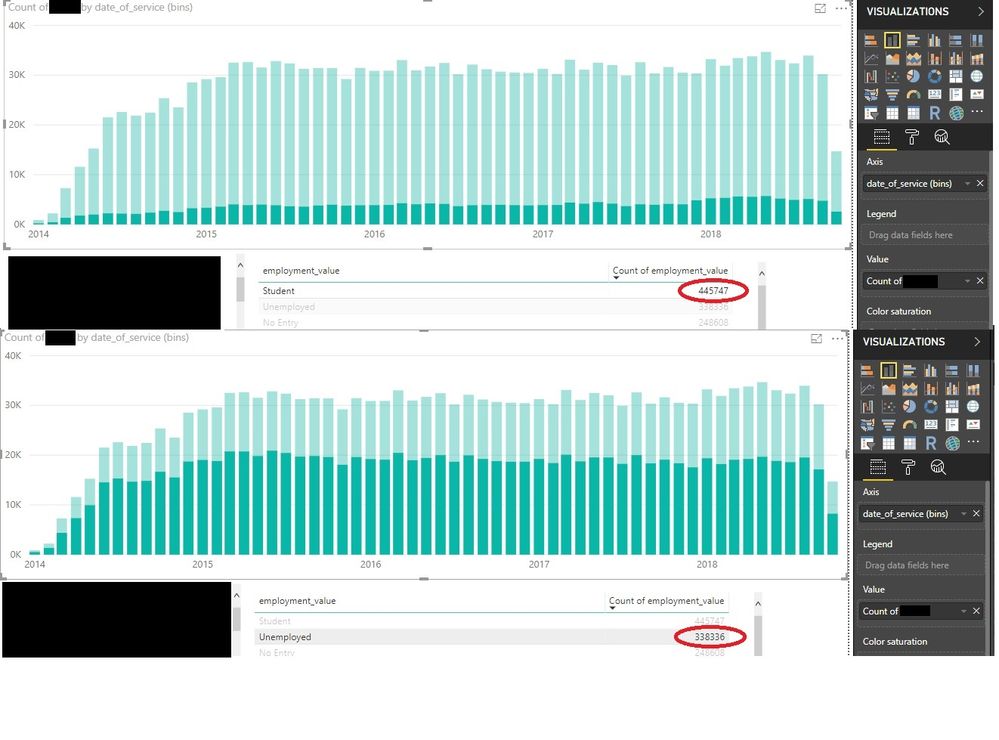
So, this is a chart of client ID's that are distinct in that month (using bins on datetime). When I click the different employment status values in the table below, I get the very strange behavior of the "Unemployed" value displaying probably 5 times the number of clients that it should--4+ times higher than a category that is 30% bigger--and there seems to be no reason for this, as all the other categories work fine, descending just as expected. You can see the top category for comparison...the category below Unemployed works fine, as do all the rest.
This should be pretty straightforward...I've just started this project, so there are very few visualizations, none of which are applying anything. The only thing I can add is that I've established a many to one relationship between a table which contains billing history to get client interactions with clinics, to a demographics table which has only one record per client; I applied a cross filter direction "Both," and "Make this relationship active" is checked. But why would it only affect one category? What's going on here?

Solved! Go to Solution.
- Mark as New
- Bookmark
- Subscribe
- Mute
- Subscribe to RSS Feed
- Permalink
- Report Inappropriate Content
Thank you Yuliana. I figured it out. The problem was (of course my fault) that while the chart was displaying the right total numbers based on client ID, the chart highlighting was using a count of employment_value, which I thought was limited by the client IDs from the billing table (which are a subset of all the clients in our database), but wasn't. And the table was also not limited by the client ID's. I think I was assuming that the table relationship acted like a left join.
I kind of feel like I should delete these noob questions sometimes. But hopefully they're helpful for somebody.
- Mark as New
- Bookmark
- Subscribe
- Mute
- Subscribe to RSS Feed
- Permalink
- Report Inappropriate Content
Hi @ACT,
In the table visual, the "count of employee value" show the total count per category in all years and all months. While the chart visual show the count value for each category per year per month when you click one category in table visual. Besides, please open the "Data label" option, to check whether the dispalyed value on chart is correct when it is filtered for a specific category.
Regards,
Yuliana Gu
If this post helps, then please consider Accept it as the solution to help the other members find it more quickly.
- Mark as New
- Bookmark
- Subscribe
- Mute
- Subscribe to RSS Feed
- Permalink
- Report Inappropriate Content
Thank you Yuliana. I figured it out. The problem was (of course my fault) that while the chart was displaying the right total numbers based on client ID, the chart highlighting was using a count of employment_value, which I thought was limited by the client IDs from the billing table (which are a subset of all the clients in our database), but wasn't. And the table was also not limited by the client ID's. I think I was assuming that the table relationship acted like a left join.
I kind of feel like I should delete these noob questions sometimes. But hopefully they're helpful for somebody.
Helpful resources

Microsoft Fabric Learn Together
Covering the world! 9:00-10:30 AM Sydney, 4:00-5:30 PM CET (Paris/Berlin), 7:00-8:30 PM Mexico City

Power BI Monthly Update - April 2024
Check out the April 2024 Power BI update to learn about new features.

| User | Count |
|---|---|
| 109 | |
| 102 | |
| 86 | |
| 77 | |
| 70 |
| User | Count |
|---|---|
| 120 | |
| 108 | |
| 98 | |
| 83 | |
| 77 |
