- Power BI forums
- Updates
- News & Announcements
- Get Help with Power BI
- Desktop
- Service
- Report Server
- Power Query
- Mobile Apps
- Developer
- DAX Commands and Tips
- Custom Visuals Development Discussion
- Health and Life Sciences
- Power BI Spanish forums
- Translated Spanish Desktop
- Power Platform Integration - Better Together!
- Power Platform Integrations (Read-only)
- Power Platform and Dynamics 365 Integrations (Read-only)
- Training and Consulting
- Instructor Led Training
- Dashboard in a Day for Women, by Women
- Galleries
- Community Connections & How-To Videos
- COVID-19 Data Stories Gallery
- Themes Gallery
- Data Stories Gallery
- R Script Showcase
- Webinars and Video Gallery
- Quick Measures Gallery
- 2021 MSBizAppsSummit Gallery
- 2020 MSBizAppsSummit Gallery
- 2019 MSBizAppsSummit Gallery
- Events
- Ideas
- Custom Visuals Ideas
- Issues
- Issues
- Events
- Upcoming Events
- Community Blog
- Power BI Community Blog
- Custom Visuals Community Blog
- Community Support
- Community Accounts & Registration
- Using the Community
- Community Feedback
Register now to learn Fabric in free live sessions led by the best Microsoft experts. From Apr 16 to May 9, in English and Spanish.
- Power BI forums
- Forums
- Get Help with Power BI
- Desktop
- Highlight and total based on value
- Subscribe to RSS Feed
- Mark Topic as New
- Mark Topic as Read
- Float this Topic for Current User
- Bookmark
- Subscribe
- Printer Friendly Page
- Mark as New
- Bookmark
- Subscribe
- Mute
- Subscribe to RSS Feed
- Permalink
- Report Inappropriate Content
Highlight and total based on value
Hi Guys.
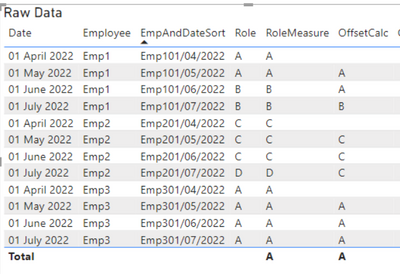
Looking for a way to highlight the job type (text) when the same employee changes the job title between the dates specified, and finally calculating the total number. For example:
Based on the information above, out of 4 employees, 3 of them changed title between the dates specified.
Solved! Go to Solution.
- Mark as New
- Bookmark
- Subscribe
- Mute
- Subscribe to RSS Feed
- Permalink
- Report Inappropriate Content
Hi Azakir
This is a great opportunity to use the new OffSet function in PowerBI! Previously, this would have been quite hard to achieve. As it is not officially release, there is no documentation or intellisense, but I have been using it for sometime so worked out a way to do it.
First, you need to create one field as a sort order. EG

You can see now it is easy to make a comparison on the "current" rows role, and the offset role. this can then be used to return a value that can be used in conditional formatting for the cell.
This measure looks like

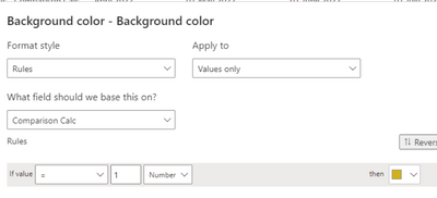
Click "fx" and use this comparison measure to set the colour

This is the result:

Hope this helps
Pi
- Mark as New
- Bookmark
- Subscribe
- Mute
- Subscribe to RSS Feed
- Permalink
- Report Inappropriate Content
Hi Azakir
This is a great opportunity to use the new OffSet function in PowerBI! Previously, this would have been quite hard to achieve. As it is not officially release, there is no documentation or intellisense, but I have been using it for sometime so worked out a way to do it.
First, you need to create one field as a sort order. EG

You can see now it is easy to make a comparison on the "current" rows role, and the offset role. this can then be used to return a value that can be used in conditional formatting for the cell.
This measure looks like

Click "fx" and use this comparison measure to set the colour

This is the result:

Hope this helps
Pi
- Mark as New
- Bookmark
- Subscribe
- Mute
- Subscribe to RSS Feed
- Permalink
- Report Inappropriate Content
Hi @pi_eye
thank you so much. This is such a great solution alongwith the explanation. I really appreciate the time you took to not only provide me with a solution, but also explain it in such a manner, that it's all clear in my mind. This solution worked wonders for me so thank you so much for that.
- Mark as New
- Bookmark
- Subscribe
- Mute
- Subscribe to RSS Feed
- Permalink
- Report Inappropriate Content
You're welcome. It is a new function and I was going to do some research on it anyway - so it is learning for me too!
- Mark as New
- Bookmark
- Subscribe
- Mute
- Subscribe to RSS Feed
- Permalink
- Report Inappropriate Content
Forgot to mention - you can sum the "comparison calc" above to get the total number of changes, as the values are 1 and 0!
Helpful resources

Microsoft Fabric Learn Together
Covering the world! 9:00-10:30 AM Sydney, 4:00-5:30 PM CET (Paris/Berlin), 7:00-8:30 PM Mexico City

Power BI Monthly Update - April 2024
Check out the April 2024 Power BI update to learn about new features.

| User | Count |
|---|---|
| 98 | |
| 96 | |
| 75 | |
| 71 | |
| 64 |
| User | Count |
|---|---|
| 143 | |
| 109 | |
| 103 | |
| 82 | |
| 74 |

