- Power BI forums
- Updates
- News & Announcements
- Get Help with Power BI
- Desktop
- Service
- Report Server
- Power Query
- Mobile Apps
- Developer
- DAX Commands and Tips
- Custom Visuals Development Discussion
- Health and Life Sciences
- Power BI Spanish forums
- Translated Spanish Desktop
- Power Platform Integration - Better Together!
- Power Platform Integrations (Read-only)
- Power Platform and Dynamics 365 Integrations (Read-only)
- Training and Consulting
- Instructor Led Training
- Dashboard in a Day for Women, by Women
- Galleries
- Community Connections & How-To Videos
- COVID-19 Data Stories Gallery
- Themes Gallery
- Data Stories Gallery
- R Script Showcase
- Webinars and Video Gallery
- Quick Measures Gallery
- 2021 MSBizAppsSummit Gallery
- 2020 MSBizAppsSummit Gallery
- 2019 MSBizAppsSummit Gallery
- Events
- Ideas
- Custom Visuals Ideas
- Issues
- Issues
- Events
- Upcoming Events
- Community Blog
- Power BI Community Blog
- Custom Visuals Community Blog
- Community Support
- Community Accounts & Registration
- Using the Community
- Community Feedback
Register now to learn Fabric in free live sessions led by the best Microsoft experts. From Apr 16 to May 9, in English and Spanish.
- Power BI forums
- Forums
- Get Help with Power BI
- Desktop
- Help with Column Calculation
- Subscribe to RSS Feed
- Mark Topic as New
- Mark Topic as Read
- Float this Topic for Current User
- Bookmark
- Subscribe
- Printer Friendly Page
- Mark as New
- Bookmark
- Subscribe
- Mute
- Subscribe to RSS Feed
- Permalink
- Report Inappropriate Content
Help with Column Calculation
Hi there,
I'm trying to visualize our service desk backlog (daily - trended over time)
Below screenshot shows the data I have in the "Data" data table. I also have another table called "Date" which has a list of the calendar dates. Screenshot also shows the calculation I believe will work to give me the number of backlogs given the calendar date.
The calculation steps:
- Count the number of calls with log date = calendar date ---> (Column G)
- Count the number of calls with resolve time = calendar date ---> (Column H)
- Net count (Column I) = Column G - Column H
- Back log = Cumulative of Column I
Now I want to create a visualisation where I use the Calendar date to graph Column I
Can someone kindly guide me what I need to in Power BI to achieve the calculation steps that will allow me to create the graph?
Thank you in advance for your help
Wes
Solved! Go to Solution.
- Mark as New
- Bookmark
- Subscribe
- Mute
- Subscribe to RSS Feed
- Permalink
- Report Inappropriate Content
Hi Wes,
Assuming you have already created a .pbix file in PowerBI and connected to the data, here are some steps to follow:
1. In the Query editor, make sure you have formatted Log Date and Resolve Time fields as 'Date' fields, not 'Date Time'
2. Create a relationship between your Date field and your Log Date field.
3. Create a second relationship between your Date field and your Resolve Time field. It will be inactive (because you can only have one active relationship at a time, but we will use it later.)
4. Add the following measures (note: your fields names might be slightly different, but you should get the idea):
Opened = COUNTROWS(Data)

Resolved = CALCULATE(COUNTROWS(Data),
	USERELATIONSHIP('Calendar'[Dates], Data[Resolve Time]))

Net Count = [Opened] - [Resolved]

Backlog = CALCULATE([Net Count],
	Filter (ALL('Calendar'), 'Calendar'[Dates] <= MAX('Calendar'[Dates])))
5. Create your visualizations. A Waterfall chart of Net Count and Dates would work. Or you can do a line or column chart of the Backlog measure.
regards,
Mal
- Mark as New
- Bookmark
- Subscribe
- Mute
- Subscribe to RSS Feed
- Permalink
- Report Inappropriate Content
Hi Wes,
The approach I took was slightly different to the one that @Phil_Seamark showed you, so if you are trying to combine the two it might not work very well.
My approach is not as sophisticated (mainly because I would struggle to come up with the table creation code that Phil did!), but still worked for me.
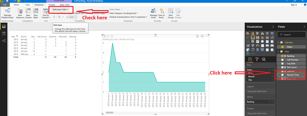
Perhaps you changed the Resolve Time format in the Query Editor, but not in the main Power BI window? To check, click on Resolve Time field on the right of screen, then click on the Modelling tab and check Data Type:
If that doesn't work, here are the steps I followed. Perhaps you can spot what you did differently:
1. Gather your data in a format that works for you. In this case I created a spreadsheet with a sheet called Data. It contained the Call Number, Log Date and Resolve Time data in columns.
2. I also created a Calendar table. There are several ways to do this, but I find the easiest is to create another sheet in your spreadsheet called Calendar, and create a column called Dates. Enter 1 Jan 2015 in the first cell and fill down until 31Dec 2015. (Note that, this isn't really the best way, because it requires manual work/maintenance - but it will do for now)
3. In PowerBI, click Get Data > Excel and select the spreadsheet created above. Then select the Data and Calendar sheets.
4. Edit the queries and make sure the 3 date fields (Calendar[Dates], Data[Log Date] and Date[Resolve Time]) are all set to Date format (not Date/Time)
5. Create the relationships, measures, etc. as per my last post.
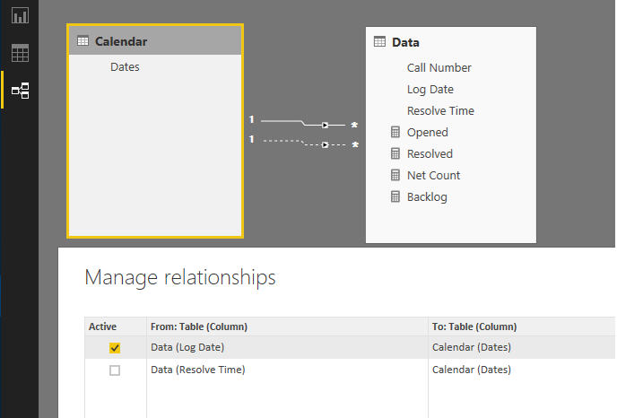
For me, the relationships look like this:
Regards,
Mal
Helpful resources

Microsoft Fabric Learn Together
Covering the world! 9:00-10:30 AM Sydney, 4:00-5:30 PM CET (Paris/Berlin), 7:00-8:30 PM Mexico City

Power BI Monthly Update - April 2024
Check out the April 2024 Power BI update to learn about new features.

| User | Count |
|---|---|
| 103 | |
| 101 | |
| 87 | |
| 73 | |
| 67 |
| User | Count |
|---|---|
| 119 | |
| 111 | |
| 95 | |
| 79 | |
| 72 |


