- Power BI forums
- Updates
- News & Announcements
- Get Help with Power BI
- Desktop
- Service
- Report Server
- Power Query
- Mobile Apps
- Developer
- DAX Commands and Tips
- Custom Visuals Development Discussion
- Health and Life Sciences
- Power BI Spanish forums
- Translated Spanish Desktop
- Power Platform Integration - Better Together!
- Power Platform Integrations (Read-only)
- Power Platform and Dynamics 365 Integrations (Read-only)
- Training and Consulting
- Instructor Led Training
- Dashboard in a Day for Women, by Women
- Galleries
- Community Connections & How-To Videos
- COVID-19 Data Stories Gallery
- Themes Gallery
- Data Stories Gallery
- R Script Showcase
- Webinars and Video Gallery
- Quick Measures Gallery
- 2021 MSBizAppsSummit Gallery
- 2020 MSBizAppsSummit Gallery
- 2019 MSBizAppsSummit Gallery
- Events
- Ideas
- Custom Visuals Ideas
- Issues
- Issues
- Events
- Upcoming Events
- Community Blog
- Power BI Community Blog
- Custom Visuals Community Blog
- Community Support
- Community Accounts & Registration
- Using the Community
- Community Feedback
Register now to learn Fabric in free live sessions led by the best Microsoft experts. From Apr 16 to May 9, in English and Spanish.
- Power BI forums
- Forums
- Get Help with Power BI
- Desktop
- Grouping if statements for a waterfall chart
- Subscribe to RSS Feed
- Mark Topic as New
- Mark Topic as Read
- Float this Topic for Current User
- Bookmark
- Subscribe
- Printer Friendly Page
- Mark as New
- Bookmark
- Subscribe
- Mute
- Subscribe to RSS Feed
- Permalink
- Report Inappropriate Content
Grouping if statements for a waterfall chart
Good day,
I have been struggling with the following, hopefully the community can help me out.
To explain it simple, I have a dataset which consists of:
Account ID (unique ID),
Country,
Account Group name (Name of group in which Account ID belongs),
Sales,
Sales period (ex. Jan 2022)
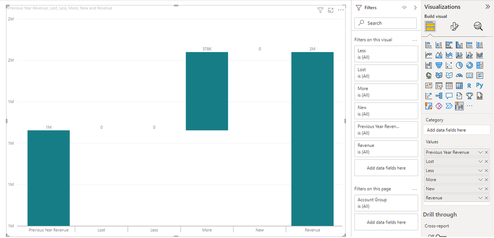
I am using a waterfall chart which should show on a group level in which category they belong, Lost, Less, More, or new Sales, this is based on the months selected in the slicer (ex. Jan & Feb 2022). The problem is that they are all combined as "More" as you can see in the image.
In order to reach this, I had to create the following measures:
Revenue = SUM(Revenue)
PastYearRevenue =
RevenueChange = Revenue - PreviousYearRevenue
Lost/Less/More/New should be defined on the following (on a group level):
if(and(Revenue =<0, PreviousYearRevenue >0),"Lost",
if(and(Revenue >0, PreviousYearRevenue > Revenue), "Less",
if(and(PreviousYearRevenue >0,Revenue > PreviousYearRevenue), "More",
if(and(Revenue >0, PreviousYearRevenue =<0), "New"
So there should be 4 new measures (Lost,Less,More,New) which should be filled in the waterfall chart accordingly.
However the problem is that the groups are all grouped as "More" as a whole sinds they are not defined on a group level.
Does anyone have a trick for this? I tried SUMMARIZE() but unsuccessfully.
- Mark as New
- Bookmark
- Subscribe
- Mute
- Subscribe to RSS Feed
- Permalink
- Report Inappropriate Content
Hi @Abegi ,
How did you create these measures Lost,Less,More and New in your side? Does it exist the field Group with value "Lost","Less","More" and "New"? Could you please provide some sample data which involved in waterfall visual? It is better if you can share a simplified pbix file without sensitive info. Thank you.
Best Regards
If this post helps, then please consider Accept it as the solution to help the other members find it more quickly.
- Mark as New
- Bookmark
- Subscribe
- Mute
- Subscribe to RSS Feed
- Permalink
- Report Inappropriate Content
Thank you for replying @v-yiruan-msft .
That is what I am looking for to be honest. For now it is a simple formula (which is not correct):

Helpful resources

Microsoft Fabric Learn Together
Covering the world! 9:00-10:30 AM Sydney, 4:00-5:30 PM CET (Paris/Berlin), 7:00-8:30 PM Mexico City

Power BI Monthly Update - April 2024
Check out the April 2024 Power BI update to learn about new features.

| User | Count |
|---|---|
| 106 | |
| 105 | |
| 79 | |
| 69 | |
| 62 |
| User | Count |
|---|---|
| 143 | |
| 104 | |
| 103 | |
| 82 | |
| 70 |

