- Power BI forums
- Updates
- News & Announcements
- Get Help with Power BI
- Desktop
- Service
- Report Server
- Power Query
- Mobile Apps
- Developer
- DAX Commands and Tips
- Custom Visuals Development Discussion
- Health and Life Sciences
- Power BI Spanish forums
- Translated Spanish Desktop
- Power Platform Integration - Better Together!
- Power Platform Integrations (Read-only)
- Power Platform and Dynamics 365 Integrations (Read-only)
- Training and Consulting
- Instructor Led Training
- Dashboard in a Day for Women, by Women
- Galleries
- Community Connections & How-To Videos
- COVID-19 Data Stories Gallery
- Themes Gallery
- Data Stories Gallery
- R Script Showcase
- Webinars and Video Gallery
- Quick Measures Gallery
- 2021 MSBizAppsSummit Gallery
- 2020 MSBizAppsSummit Gallery
- 2019 MSBizAppsSummit Gallery
- Events
- Ideas
- Custom Visuals Ideas
- Issues
- Issues
- Events
- Upcoming Events
- Community Blog
- Power BI Community Blog
- Custom Visuals Community Blog
- Community Support
- Community Accounts & Registration
- Using the Community
- Community Feedback
Register now to learn Fabric in free live sessions led by the best Microsoft experts. From Apr 16 to May 9, in English and Spanish.
- Power BI forums
- Forums
- Get Help with Power BI
- Desktop
- Gantt chart overlap
- Subscribe to RSS Feed
- Mark Topic as New
- Mark Topic as Read
- Float this Topic for Current User
- Bookmark
- Subscribe
- Printer Friendly Page
- Mark as New
- Bookmark
- Subscribe
- Mute
- Subscribe to RSS Feed
- Permalink
- Report Inappropriate Content
Gantt chart overlap
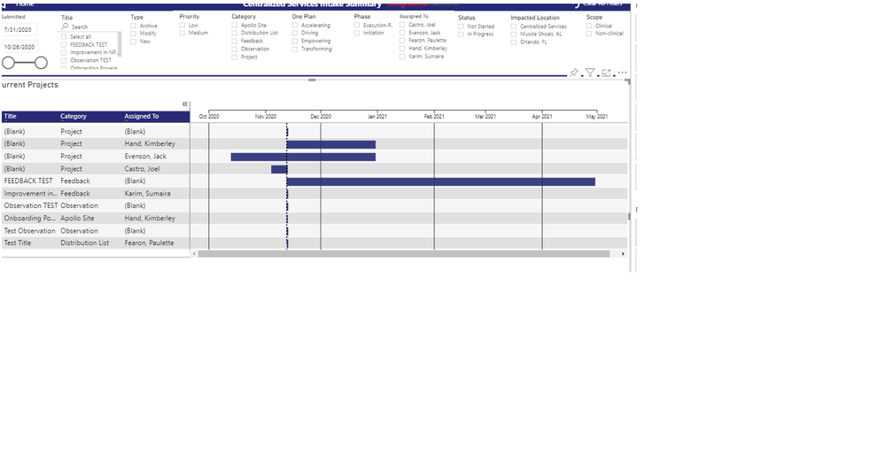
Is there a way you can overlap when items are assigned to same person, (and perhaps just put diff colors) example, Kimberly Hand under assigned to should only have one row so you can see ALL projects in one line for each person. (gantt chart)
- Mark as New
- Bookmark
- Subscribe
- Mute
- Subscribe to RSS Feed
- Permalink
- Report Inappropriate Content
Hi @v-janeyg-msft ,
I stumbled upon this thread and I have the same question, however, I also could not find out the visual you were using. Could you share it with me?
I currently use Gantt Chart by MAQ and it does a lot of things OK, but not to the extent that I can use it properly. Thanks in advance!
- Mark as New
- Bookmark
- Subscribe
- Mute
- Subscribe to RSS Feed
- Permalink
- Report Inappropriate Content
- Mark as New
- Bookmark
- Subscribe
- Mute
- Subscribe to RSS Feed
- Permalink
- Report Inappropriate Content
Hi, @jcastr02
It’s my pleasure to answer for you.
Could you mind providing some data about the needs mentioned in your question and your expected result image with onedrive ?So we can help you soon.
Best Regards
Janey Guo
- Mark as New
- Bookmark
- Subscribe
- Mute
- Subscribe to RSS Feed
- Permalink
- Report Inappropriate Content
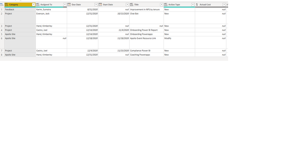
@v-janeyg-msft Thank you Janey - above is sample data - looking to just have one row on gantt chart per "Assigned to" Thank you.
- Mark as New
- Bookmark
- Subscribe
- Mute
- Subscribe to RSS Feed
- Permalink
- Report Inappropriate Content
- Mark as New
- Bookmark
- Subscribe
- Mute
- Subscribe to RSS Feed
- Permalink
- Report Inappropriate Content
Hi, @jcastr02
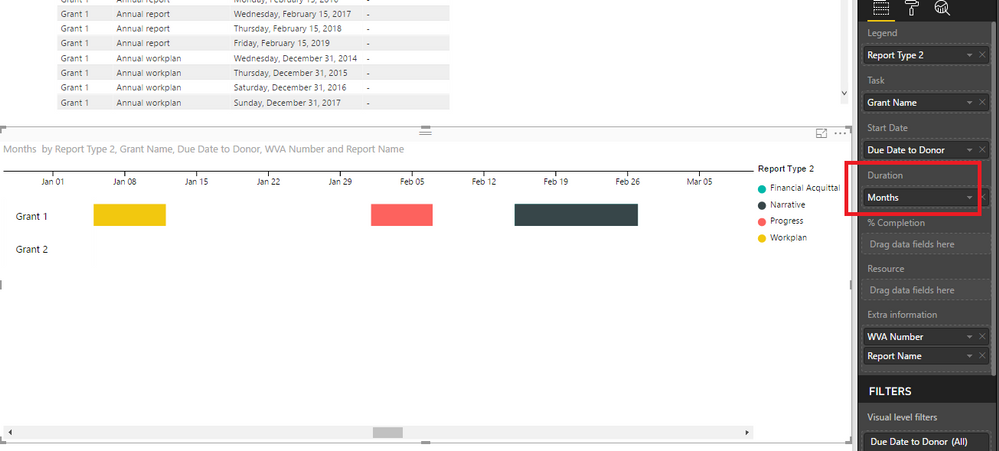
You can add the 'assigned to' column to the 'legend' in the gantt, and then you can use different colors to distinguish them.
You should know that the Legend color will be different or can be changed only when the Duration field is specified. So you may need to fill the Duration field to show Legend color differently.
Like this:
If it doesn’t solve your problem, please feel free to ask me.
Best Regards
Janey Guo
If this post helps, then please consider Accept it as the solution to help the other members find it more quickly.
- Mark as New
- Bookmark
- Subscribe
- Mute
- Subscribe to RSS Feed
- Permalink
- Report Inappropriate Content
@v-janeyg-msft I am currently using the visualazation "Gantt Chart by MAQ Software" Which one are you using? I noticed that the order of the fields menu is different than mine. See below when I place the Assigned to in the legend name it still keeps the two projects for Hand, Kimberley on two different lines. My intent to place hers on one line. I also tried to remove the Project Title and Category out of the "category" but it's not allowing me to place the "title" field in the legend. It gives me error "please select a field that is already present in "category"
- Mark as New
- Bookmark
- Subscribe
- Mute
- Subscribe to RSS Feed
- Permalink
- Report Inappropriate Content
Hi, @jcastr02
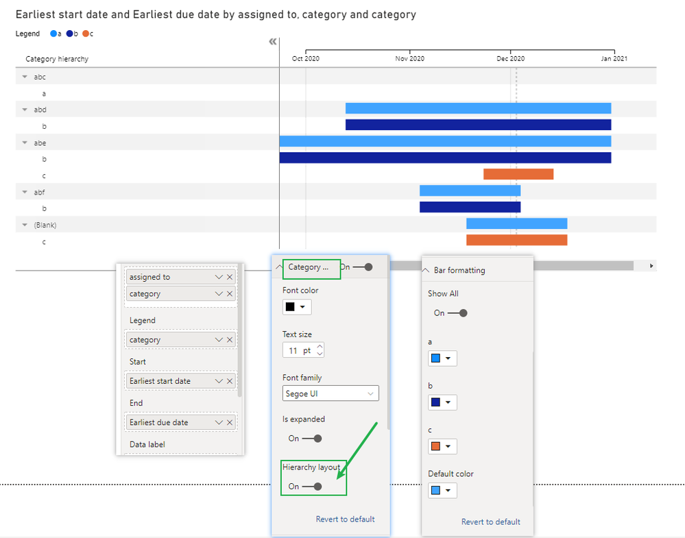
You can turn on the 'hierarchy layout' button then custom format.
Like this:
Here is my sample .pbix file.Hope it helps.
If it doesn’t solve your problem, please feel free to ask me.
Best Regards
Janey Guo
If this post helps, then please consider Accept it as the solution to help the other members find it more quickly.
- Mark as New
- Bookmark
- Subscribe
- Mute
- Subscribe to RSS Feed
- Permalink
- Report Inappropriate Content
Excellent, thank you this worked 🙂
Helpful resources

Microsoft Fabric Learn Together
Covering the world! 9:00-10:30 AM Sydney, 4:00-5:30 PM CET (Paris/Berlin), 7:00-8:30 PM Mexico City

Power BI Monthly Update - April 2024
Check out the April 2024 Power BI update to learn about new features.

| User | Count |
|---|---|
| 98 | |
| 97 | |
| 75 | |
| 71 | |
| 64 |
| User | Count |
|---|---|
| 143 | |
| 109 | |
| 103 | |
| 82 | |
| 74 |


