- Power BI forums
- Updates
- News & Announcements
- Get Help with Power BI
- Desktop
- Service
- Report Server
- Power Query
- Mobile Apps
- Developer
- DAX Commands and Tips
- Custom Visuals Development Discussion
- Health and Life Sciences
- Power BI Spanish forums
- Translated Spanish Desktop
- Power Platform Integration - Better Together!
- Power Platform Integrations (Read-only)
- Power Platform and Dynamics 365 Integrations (Read-only)
- Training and Consulting
- Instructor Led Training
- Dashboard in a Day for Women, by Women
- Galleries
- Community Connections & How-To Videos
- COVID-19 Data Stories Gallery
- Themes Gallery
- Data Stories Gallery
- R Script Showcase
- Webinars and Video Gallery
- Quick Measures Gallery
- 2021 MSBizAppsSummit Gallery
- 2020 MSBizAppsSummit Gallery
- 2019 MSBizAppsSummit Gallery
- Events
- Ideas
- Custom Visuals Ideas
- Issues
- Issues
- Events
- Upcoming Events
- Community Blog
- Power BI Community Blog
- Custom Visuals Community Blog
- Community Support
- Community Accounts & Registration
- Using the Community
- Community Feedback
Earn a 50% discount on the DP-600 certification exam by completing the Fabric 30 Days to Learn It challenge.
- Power BI forums
- Forums
- Get Help with Power BI
- Desktop
- Filter based on both name and date
- Subscribe to RSS Feed
- Mark Topic as New
- Mark Topic as Read
- Float this Topic for Current User
- Bookmark
- Subscribe
- Printer Friendly Page
- Mark as New
- Bookmark
- Subscribe
- Mute
- Subscribe to RSS Feed
- Permalink
- Report Inappropriate Content
Filter based on both name and date
Hi all,
I was hoping someone could help with this. Quite new to Power BI and I mostly just use trial and error until I get it working the way I want but can't figure this one out! Hopefully the below explanation makes sense.
I am trying to run some analysis on sales activity with certain customers based around when the key account manager for a particular customer left our business. I need it to show activity with a "before" and "after" view. The "before" dates being 12 months before that key account manager left and "after" being 12 months after their leaving date.
There are multiple leavers names, all with different leaving dates and each of them have different customers attributed to them.
The KPI's that I am measuring all come from different reports so I have them on different excel sheets e.g. number of calls, number of meetings, number of emails etc.
Each row on each spreadsheet amounts to one KPI with a unique ID so I can use the ID count to get the total number. Each row across all KPI's also contains the date it was created, the customer name and the salesperson who created it amongst other information that is unique to that KPI.
So far I have the dashboard set up for one individual based on their leaving date of 31/01/2020 using the measures below for "Calls". I've applied the same measure for the other KPI's.
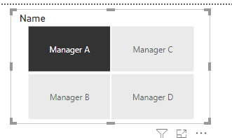
Am I able to create a slicer that allows me to click the name of a certain key account manager and have all of the visuals adjust to just show only the customers attributed to them and the 12 months before and after their specific leaving date?
Solved! Go to Solution.
- Mark as New
- Bookmark
- Subscribe
- Mute
- Subscribe to RSS Feed
- Permalink
- Report Inappropriate Content
Hi @mattb1990
Thank you for the data that you provided . I made a new change based on the data you provided .
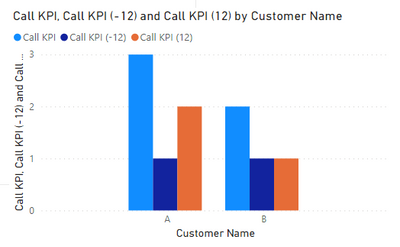
You said if you select Manager A ,then the visual for Calls breaks down to show Customer A and Customer B on the axis along. Customer A would have one bar showing 1 (before) and another bar showing 2 (after). On Customer B I would have a bar showing 1 (before) and 1 (after).
There is a problem that the customers are dynamic , so how does the system determine which customer displays 24 months KPI, which customer displays the first 12 months KPI, and which customer displays the next 12 months KPI ?
My suggestion is that you’d better compare in the same time period instead of different time periods for different customers .
The effect is as shown:
I have attached my pbix file, you can refer to it .
Best Regards
Community Support Team _ Ailsa Tao
If this post helps, then please consider Accept it as the solution to help the other members find it more quickly.
- Mark as New
- Bookmark
- Subscribe
- Mute
- Subscribe to RSS Feed
- Permalink
- Report Inappropriate Content
Hi @mattb1990
From your description, it seems that you want to count the data of each manager 12 months before the departure date and 12 months after the departure date. This data relates to customers, phone calls, meetings, and emails for which the manager is responsible.
Can you provide some relevant data and the results you want . This will make the problem clear and easier to deal with .
I created a simple example myself . You can refer to it .
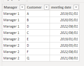
Original data :
Table’ Manager’ and Table’ Meeting’
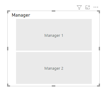
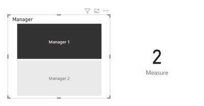
(1)Create a slicer use ‘Manager’[manager],and you can choose the manager you want to filter the data .
(2)Create a measure to count the meet that meeting date between 12 months before the departure date and 12 months after the departure date .
Measure = CALCULATE(COUNTA(Meeting[meeting date]),FILTER(Meeting,Meeting[meeting date]>=EDATE(RELATED(Manager[departure time]),-12) && Meeting[meeting date]<=EDATE(RELATED(Manager[departure time]),12)))
(3)Add a card visual to display the return value of measure. I choose the Manager 1 and there are 2 results that meet the conditions, so the measure shows 2 .
I have attached my pbix file, you can refer to it .
Best Regards
Community Support Team _ Ailsa Tao
If this post helps, then please consider Accept it as the solution to help the other members find it more quickly.
- Mark as New
- Bookmark
- Subscribe
- Mute
- Subscribe to RSS Feed
- Permalink
- Report Inappropriate Content
Thank you very much for your helpful response. I have had a look at the file and it is certainly a lot closer to what I want to achieve than I have been able to manage!
I have provided an example data set here.
Ideally what I would like to show is a visual bar graph for each KPI. The axis would be the name of the customer. There would be two bars per customer, one showing "before" activity and the other showing "after" activity.
I would use the slicer on the manager name to filter each of these graphs.
So in the attached data example I have one sheet that assigns customers to specific managers. I have a sheet that shows that managers leaving date and I have two sheets showing the detail of the calls and email KPIs.
I would like to be able to set this up so that when I select Manager A (who left on 28/08/2020) the visual for Calls breaks down to show Customer A and Customer B on the axis along with before and after activity.
So Customer A would have one bar showing 1 (before) and another bar showing 2 (after). On Customer B I would have a bar showing 1 (before) and 1 (after).
If I then select Manager B (who left on 19/02/2020) the visual would change to Customer C and G on the axis showing 1 before and 2 after for Customer C and 1 before and 1 after for Customer G.
I would then replicate these visuals for emails etc.
https://www.dropbox.com/s/mahqr8b81sbgg4e/example%20data.xlsx?dl=0
Thank you again for your help so far!
- Mark as New
- Bookmark
- Subscribe
- Mute
- Subscribe to RSS Feed
- Permalink
- Report Inappropriate Content
Hi @mattb1990
Thank you for the data that you provided . I made a new change based on the data you provided .
You said if you select Manager A ,then the visual for Calls breaks down to show Customer A and Customer B on the axis along. Customer A would have one bar showing 1 (before) and another bar showing 2 (after). On Customer B I would have a bar showing 1 (before) and 1 (after).
There is a problem that the customers are dynamic , so how does the system determine which customer displays 24 months KPI, which customer displays the first 12 months KPI, and which customer displays the next 12 months KPI ?
My suggestion is that you’d better compare in the same time period instead of different time periods for different customers .
The effect is as shown:
I have attached my pbix file, you can refer to it .
Best Regards
Community Support Team _ Ailsa Tao
If this post helps, then please consider Accept it as the solution to help the other members find it more quickly.
- Mark as New
- Bookmark
- Subscribe
- Mute
- Subscribe to RSS Feed
- Permalink
- Report Inappropriate Content
Thank you for this solution. I've been able to use this to create something close enough to what I was after.
Really appreciate your help.
Kind regards,
Helpful resources

Microsoft Fabric Learn Together
Covering the world! 9:00-10:30 AM Sydney, 4:00-5:30 PM CET (Paris/Berlin), 7:00-8:30 PM Mexico City

Power BI Monthly Update - April 2024
Check out the April 2024 Power BI update to learn about new features.

| User | Count |
|---|---|
| 109 | |
| 102 | |
| 85 | |
| 78 | |
| 70 |
| User | Count |
|---|---|
| 120 | |
| 110 | |
| 95 | |
| 82 | |
| 77 |
