- Power BI forums
- Updates
- News & Announcements
- Get Help with Power BI
- Desktop
- Service
- Report Server
- Power Query
- Mobile Apps
- Developer
- DAX Commands and Tips
- Custom Visuals Development Discussion
- Health and Life Sciences
- Power BI Spanish forums
- Translated Spanish Desktop
- Power Platform Integration - Better Together!
- Power Platform Integrations (Read-only)
- Power Platform and Dynamics 365 Integrations (Read-only)
- Training and Consulting
- Instructor Led Training
- Dashboard in a Day for Women, by Women
- Galleries
- Community Connections & How-To Videos
- COVID-19 Data Stories Gallery
- Themes Gallery
- Data Stories Gallery
- R Script Showcase
- Webinars and Video Gallery
- Quick Measures Gallery
- 2021 MSBizAppsSummit Gallery
- 2020 MSBizAppsSummit Gallery
- 2019 MSBizAppsSummit Gallery
- Events
- Ideas
- Custom Visuals Ideas
- Issues
- Issues
- Events
- Upcoming Events
- Community Blog
- Power BI Community Blog
- Custom Visuals Community Blog
- Community Support
- Community Accounts & Registration
- Using the Community
- Community Feedback
Register now to learn Fabric in free live sessions led by the best Microsoft experts. From Apr 16 to May 9, in English and Spanish.
- Power BI forums
- Forums
- Get Help with Power BI
- Desktop
- Edit the plot area to increase the size of the gra...
- Subscribe to RSS Feed
- Mark Topic as New
- Mark Topic as Read
- Float this Topic for Current User
- Bookmark
- Subscribe
- Printer Friendly Page
- Mark as New
- Bookmark
- Subscribe
- Mute
- Subscribe to RSS Feed
- Permalink
- Report Inappropriate Content
Edit the plot area to increase the size of the graph
HI,
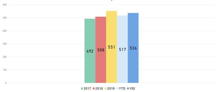
I have a graph shown in Capture 1 attached that is taking up around 60% of my report page but as you can see the the elements of the graph and only taking up approximately 33% of the graph size with big spaces to the left and right - presumably for if I decide to add additioanl x-axis fields.
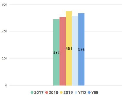
I've tried to reduce the size but as you can see in Capture 2 the whole plot area reduces in size which doesn't help me.
Is there a way to just show what is displayed on the graph and reduce the "white/blank" areas so I fit the graph to 25% of my page?
Thanks,
Cathal
- Mark as New
- Bookmark
- Subscribe
- Mute
- Subscribe to RSS Feed
- Permalink
- Report Inappropriate Content
@CathalSheehan , There is an idea already for this , vote for that
Based on the visual there is some space left out.
Microsoft Power BI Learning Resources, 2023 !!
Learn Power BI - Full Course with Dec-2022, with Window, Index, Offset, 100+ Topics !!
Did I answer your question? Mark my post as a solution! Appreciate your Kudos !! Proud to be a Super User! !!
- Mark as New
- Bookmark
- Subscribe
- Mute
- Subscribe to RSS Feed
- Permalink
- Report Inappropriate Content
Hey @CathalSheehan ,
there is a simple answer, no this is not possible.
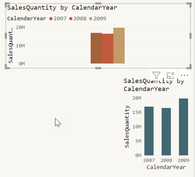
For this reason, I use the stacked column chart visual instead of the clustered column chart.
Here is a screenshot:
In the stacked column chart the year is used as axis, instead of legend.
Another very important option (at least most of the time), is the formatting of the x-axis. Make sure that you choose the type accordingly, either continuous or categorical.
Hopefully, this provides some ideas on how to tackle your challenge.
Regards,
Tom
Did I answer your question? Mark my post as a solution, this will help others!
Proud to be a Super User!
I accept Kudos 😉
Hamburg, Germany
- Mark as New
- Bookmark
- Subscribe
- Mute
- Subscribe to RSS Feed
- Permalink
- Report Inappropriate Content
Hi @TomMartens
Thanks for such a detailed reply. Crystal clear.
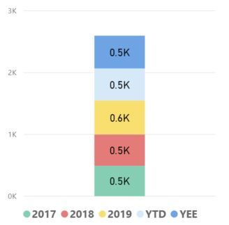
I actually tried to use a stacked chart but the issue with the way my data is structured is all the years all "measures" so they are on values I only have the one element "Manufacturing Costs" on the x-axis. Therefore all the years are shown together. (see attached)
I am goosed? I've looked to try and drag the measures onto the x-axis but I'm not allowed.
Do I need to resturcture my data so I can show the years on the x-axis (don't really think I can do this as this is jsut one element of my reporting) or does someone out there have a very clever solution?
Helpful resources

Microsoft Fabric Learn Together
Covering the world! 9:00-10:30 AM Sydney, 4:00-5:30 PM CET (Paris/Berlin), 7:00-8:30 PM Mexico City

Power BI Monthly Update - April 2024
Check out the April 2024 Power BI update to learn about new features.

| User | Count |
|---|---|
| 105 | |
| 96 | |
| 79 | |
| 67 | |
| 62 |
| User | Count |
|---|---|
| 137 | |
| 106 | |
| 104 | |
| 81 | |
| 63 |


