- Power BI forums
- Updates
- News & Announcements
- Get Help with Power BI
- Desktop
- Service
- Report Server
- Power Query
- Mobile Apps
- Developer
- DAX Commands and Tips
- Custom Visuals Development Discussion
- Health and Life Sciences
- Power BI Spanish forums
- Translated Spanish Desktop
- Power Platform Integration - Better Together!
- Power Platform Integrations (Read-only)
- Power Platform and Dynamics 365 Integrations (Read-only)
- Training and Consulting
- Instructor Led Training
- Dashboard in a Day for Women, by Women
- Galleries
- Community Connections & How-To Videos
- COVID-19 Data Stories Gallery
- Themes Gallery
- Data Stories Gallery
- R Script Showcase
- Webinars and Video Gallery
- Quick Measures Gallery
- 2021 MSBizAppsSummit Gallery
- 2020 MSBizAppsSummit Gallery
- 2019 MSBizAppsSummit Gallery
- Events
- Ideas
- Custom Visuals Ideas
- Issues
- Issues
- Events
- Upcoming Events
- Community Blog
- Power BI Community Blog
- Custom Visuals Community Blog
- Community Support
- Community Accounts & Registration
- Using the Community
- Community Feedback
Register now to learn Fabric in free live sessions led by the best Microsoft experts. From Apr 16 to May 9, in English and Spanish.
- Power BI forums
- Forums
- Get Help with Power BI
- Desktop
- Edit the line and legend on a line cluster column ...
- Subscribe to RSS Feed
- Mark Topic as New
- Mark Topic as Read
- Float this Topic for Current User
- Bookmark
- Subscribe
- Printer Friendly Page
- Mark as New
- Bookmark
- Subscribe
- Mute
- Subscribe to RSS Feed
- Permalink
- Report Inappropriate Content
Edit the line and legend on a line cluster column chart
Hello Community I need your help with this:
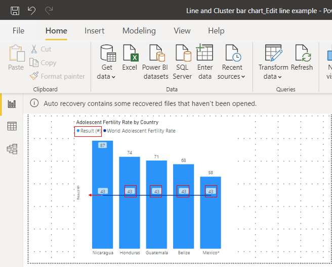
I want to use a line cluster column chart to represent the results of an indicator for five countries and the world. The bars would show the level for every country and the line would show the indicator for the world.
I have the following and would like to edit 3 things (highlighted in red)
1.- Is it possible to edit the legend to remove the light blue for Results # and just leave the dark blue for World Adolescent Fertility rate?
2.- Is it possible to remove the data legend for World Adolescent Fertility rate, it is shown 5 times and I only need it once?
3.- Is it popsible to extend the line as shown by the red arrow?
Any help is appreciated,
Tanks
PS I include a pbix file as an example of what I have
https://drive.google.com/file/d/1Ljbnt41grgm32wyHgE-70LWDi6eq7UO0/view?usp=sharing
Solved! Go to Solution.
- Mark as New
- Bookmark
- Subscribe
- Mute
- Subscribe to RSS Feed
- Permalink
- Report Inappropriate Content
hi @Galoyol84
For your requirement, 1 and 3 could not be achieved in power bi for now.
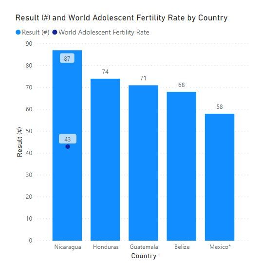
for 2, you could adjust the measure [World Adolescent Fertility Rate] as below:
World Adolescent Fertility Rate = IF( RANKX(ALLSELECTED(FactCountryIndicator[Country]),CALCULATE(SUM(FactCountryIndicator[Result (#)])))=1,43)Result:
Regards,
Lin
If this post helps, then please consider Accept it as the solution to help the other members find it more quickly.
- Mark as New
- Bookmark
- Subscribe
- Mute
- Subscribe to RSS Feed
- Permalink
- Report Inappropriate Content
Hello @Galoyol84
For your need, 1 and 3 could not be achieved in power bi for now.
for 2, you could adjust the [World Adolescent Fertility Rate] measure as shown below:
World Adolescent Fertility Rate = IF( RANKX(ALLSELECTED(FactCountryIndicator[Country]),CALCULATE(SUM(FactCountryIndicator[Result (#)])))=1,43)Result:
Best regards
Lin
If this post helps, then please consider Accept it as the solution to help the other members find it more quickly.
- Mark as New
- Bookmark
- Subscribe
- Mute
- Subscribe to RSS Feed
- Permalink
- Report Inappropriate Content
hi @Galoyol84
For your requirement, 1 and 3 could not be achieved in power bi for now.
for 2, you could adjust the measure [World Adolescent Fertility Rate] as below:
World Adolescent Fertility Rate = IF( RANKX(ALLSELECTED(FactCountryIndicator[Country]),CALCULATE(SUM(FactCountryIndicator[Result (#)])))=1,43)Result:
Regards,
Lin
If this post helps, then please consider Accept it as the solution to help the other members find it more quickly.
- Mark as New
- Bookmark
- Subscribe
- Mute
- Subscribe to RSS Feed
- Permalink
- Report Inappropriate Content
I don't think you can do 1 and 3, but for #2, you could not show data labels for the line (Data Labels area/Customize Series) and (if the values are always the same) add a card visual next to the visual also with that measure. To get all you want, you may need try other visuals from AppSource or even build you own visual with Charticulator.
If this works for you, please mark it as the solution. Kudos are appreciated too. Please let me know if not.
Regards,
Pat
Did I answer your question? Mark my post as a solution! Kudos are also appreciated!
To learn more about Power BI, follow me on Twitter or subscribe on YouTube.
@mahoneypa HoosierBI on YouTube
Helpful resources

Microsoft Fabric Learn Together
Covering the world! 9:00-10:30 AM Sydney, 4:00-5:30 PM CET (Paris/Berlin), 7:00-8:30 PM Mexico City

Power BI Monthly Update - April 2024
Check out the April 2024 Power BI update to learn about new features.

| User | Count |
|---|---|
| 97 | |
| 94 | |
| 74 | |
| 71 | |
| 64 |
| User | Count |
|---|---|
| 143 | |
| 109 | |
| 103 | |
| 82 | |
| 74 |


