- Power BI forums
- Updates
- News & Announcements
- Get Help with Power BI
- Desktop
- Service
- Report Server
- Power Query
- Mobile Apps
- Developer
- DAX Commands and Tips
- Custom Visuals Development Discussion
- Health and Life Sciences
- Power BI Spanish forums
- Translated Spanish Desktop
- Power Platform Integration - Better Together!
- Power Platform Integrations (Read-only)
- Power Platform and Dynamics 365 Integrations (Read-only)
- Training and Consulting
- Instructor Led Training
- Dashboard in a Day for Women, by Women
- Galleries
- Community Connections & How-To Videos
- COVID-19 Data Stories Gallery
- Themes Gallery
- Data Stories Gallery
- R Script Showcase
- Webinars and Video Gallery
- Quick Measures Gallery
- 2021 MSBizAppsSummit Gallery
- 2020 MSBizAppsSummit Gallery
- 2019 MSBizAppsSummit Gallery
- Events
- Ideas
- Custom Visuals Ideas
- Issues
- Issues
- Events
- Upcoming Events
- Community Blog
- Power BI Community Blog
- Custom Visuals Community Blog
- Community Support
- Community Accounts & Registration
- Using the Community
- Community Feedback
Register now to learn Fabric in free live sessions led by the best Microsoft experts. From Apr 16 to May 9, in English and Spanish.
- Power BI forums
- Forums
- Get Help with Power BI
- Desktop
- Dynamic measure as filter in chart
- Subscribe to RSS Feed
- Mark Topic as New
- Mark Topic as Read
- Float this Topic for Current User
- Bookmark
- Subscribe
- Printer Friendly Page
- Mark as New
- Bookmark
- Subscribe
- Mute
- Subscribe to RSS Feed
- Permalink
- Report Inappropriate Content
Dynamic measure as filter in chart
Hi,
I have the following sample data and visuals:
columns:
- group
- version
- class
- number
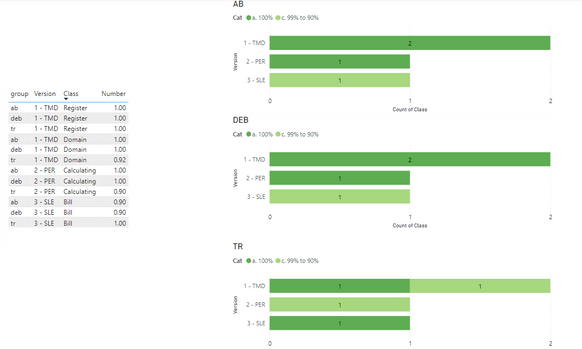
Each group has the same versions, and classes in that version. So for example version "1- TMD" has 2 classes: "Domain" and "Register". Each combination of group, version and class has a number, which is sort of score.
This number is used in a created column named categorie and has the following expression:
With this data I create the following visuals:
Now what I want to do is when I select 2 groups at the same time, it should calculate the numbers for the same version and class for these groups, and divide it by the number of group selected. In the visual I want to see only 1 count for each version and class. I created a measure for this in the sample data.
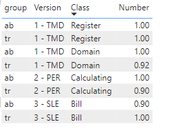
for example: If i select group "ab" and "tr", i have the following data:
When i want to create the stacked bar chart, I expect to see the following;
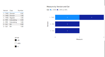
1 - TMD : One bar with a count of 1 for categorie "a. 100%. and One bar with a count of 1 for categorie "c. 99% to 90%.
(class register number 1.00 and 1.00 / 2 = 1
(class domain number 1.00 and 0.92 / 2 = 0.96
2 - PER : One bar with a count of 1 for categorie "c. 99% to 90%.
(class calculating number 1.00 and 0.90 / 2 = 0.95
3 - SLE: One bar with a count of 1 for categorie "c. 99% to 90%.
(class bill number 1.00 and 0.90 / 2 = 0.95
so each combination of version and a class, can only have 1 count in a visual, no matter how many groups are selected.
The problem is that I cant seem to make this work in the chart, because i cant seem to use a measure for filter. Now I use the categorie column but these values are known. But because the number of groups you select is dynamic you cant calculate these values and put them in a column.
How Can i do this?
Link to sample dataset: https://drive.google.com/file/d/1pHwYx5EO5FGiqm8By0jKBsTTzsFs53Ms/view?usp=sharing
@Greg_DecklerI found an older article from you (Solving Attendance with the Disconnected Table Trick, https://community.powerbi.com/t5/Community-Blog/Solving-Attendance-with-the-Disconnected-Table-Trick... ). Is this something that can be used in my case?
Solved! Go to Solution.
- Mark as New
- Bookmark
- Subscribe
- Mute
- Subscribe to RSS Feed
- Permalink
- Report Inappropriate Content
Hi @TechR21 ,
According to your description, here are my steps you can follow as a solution.
(1) My test data is the same as yours.
(2) We can create a table and a measure.
Table = {"a. 100%","b. 100% to 99%","c. 99% to 90%","d. 90% to 75%","e. 75% to 0 %","f. 0%"}Measure =
var _a = SUMMARIZE('Data',Data[Version],'Data'[Class],"CA",if(AVERAGE(Data[Number])=1 ,"a. 100%",
if(AVERAGE(Data[Number])<1 && (AVERAGE(Data[Number])>=0.99),"b. 100% to 99%",
if(AVERAGE(Data[Number])<0.99 && (AVERAGE(Data[Number])>=0.9),"c. 99% to 90%",
if(AVERAGE(Data[Number])<0.9 && (AVERAGE(Data[Number])>=0.75),"d. 90% to 75%",
if(AVERAGE(Data[Number])<0.75 && (AVERAGE(Data[Number])> 0 ),"e. 75% to 0 %",
"f. 0%"
))))))
return COUNTX(FILTER(_a,[CA]=SELECTEDVALUE('Table'[Cat])),[CA])
(3) Then the result is as follows.
If the above one can't help you get the desired result, please provide some sample data in your tables (exclude sensitive data) with Text format and your expected result with backend logic and special examples. It is better if you can share a simplified pbix file. Thank you.
Best Regards,
Neeko Tang
If this post helps, then please consider Accept it as the solution to help the other members find it more quickly.
- Mark as New
- Bookmark
- Subscribe
- Mute
- Subscribe to RSS Feed
- Permalink
- Report Inappropriate Content
Yes, this is exactly what i need. thank you so much! Now i also know what i did wrong, and couldnt figure where the mistake was.
Helpful resources

Microsoft Fabric Learn Together
Covering the world! 9:00-10:30 AM Sydney, 4:00-5:30 PM CET (Paris/Berlin), 7:00-8:30 PM Mexico City

Power BI Monthly Update - April 2024
Check out the April 2024 Power BI update to learn about new features.

| User | Count |
|---|---|
| 106 | |
| 105 | |
| 79 | |
| 69 | |
| 62 |
| User | Count |
|---|---|
| 142 | |
| 105 | |
| 103 | |
| 84 | |
| 70 |


