- Power BI forums
- Updates
- News & Announcements
- Get Help with Power BI
- Desktop
- Service
- Report Server
- Power Query
- Mobile Apps
- Developer
- DAX Commands and Tips
- Custom Visuals Development Discussion
- Health and Life Sciences
- Power BI Spanish forums
- Translated Spanish Desktop
- Power Platform Integration - Better Together!
- Power Platform Integrations (Read-only)
- Power Platform and Dynamics 365 Integrations (Read-only)
- Training and Consulting
- Instructor Led Training
- Dashboard in a Day for Women, by Women
- Galleries
- Community Connections & How-To Videos
- COVID-19 Data Stories Gallery
- Themes Gallery
- Data Stories Gallery
- R Script Showcase
- Webinars and Video Gallery
- Quick Measures Gallery
- 2021 MSBizAppsSummit Gallery
- 2020 MSBizAppsSummit Gallery
- 2019 MSBizAppsSummit Gallery
- Events
- Ideas
- Custom Visuals Ideas
- Issues
- Issues
- Events
- Upcoming Events
- Community Blog
- Power BI Community Blog
- Custom Visuals Community Blog
- Community Support
- Community Accounts & Registration
- Using the Community
- Community Feedback
Register now to learn Fabric in free live sessions led by the best Microsoft experts. From Apr 16 to May 9, in English and Spanish.
- Power BI forums
- Forums
- Get Help with Power BI
- Desktop
- Dynamic graph - manual selection
- Subscribe to RSS Feed
- Mark Topic as New
- Mark Topic as Read
- Float this Topic for Current User
- Bookmark
- Subscribe
- Printer Friendly Page
- Mark as New
- Bookmark
- Subscribe
- Mute
- Subscribe to RSS Feed
- Permalink
- Report Inappropriate Content
Dynamic graph - manual selection
Dear all,
I saw an amazing feature of Power BI on Linkedin.
Unfortunately, I can't find the link anymore....
I want to create a column chart and I want to be able to change data directly into the graph with my mouse.
For example,
Y axis: Name of employees
X axis: Number of days
I want to move my column chart for one employee for more days.
Is it possible to do it in Power BI? Any clue how to do it?
Thank you in advance for you help
Solved! Go to Solution.
- Mark as New
- Bookmark
- Subscribe
- Mute
- Subscribe to RSS Feed
- Permalink
- Report Inappropriate Content
Hi @julrua
I'm sorry that I can't fully understand what you mean . Maybe you can describe it more clearly .
(1)What’s the meaning of Number of days .The diff between Start Date and End Data ?
(2)What kind of visual effect it is if you move your column chart for one employee for more days ?
I created a simple example, you can refer to the following :
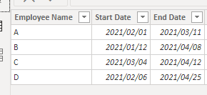
Original data :
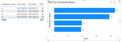
I create a column to count the diff days between Start Date and End Date .
DIFF = DATEDIFF('Table'[Start Date],'Table'[End Date],DAY)
And add a bar chart to display the effect .
If possible, please provide detailed requirements and non-private data . This will help us better understand the problem and give a solution .
Best Regards
Community Support Team _ Ailsa Tao
If this post helps, then please consider Accept it as the solution to help the other members find it more quickly.
- Mark as New
- Bookmark
- Subscribe
- Mute
- Subscribe to RSS Feed
- Permalink
- Report Inappropriate Content
@julrua , Check if you find it in Gallary
https://community.powerbi.com/t5/Data-Stories-Gallery/bd-p/DataStoriesGallery
https://community.powerbi.com/t5/Quick-Measures-Gallery/bd-p/QuickMeasuresGallery
But seem like measure and
measure slicer
https://www.youtube.com/watch?v=b9352Vxuj-M
https://community.powerbi.com/t5/Desktop/Slicer-MTD-QTD-YTD-to-filter-dates-using-the-slicer/td-p/50...
https://radacad.com/change-the-column-or-measure-value-in-a-power-bi-visual-by-selection-of-the-slic...
https://www.youtube.com/watch?v=vlnx7QUVYME
Dynamically change chart axis in Power BI
https://www.youtube.com/watch?v=6jeSIRpjv0M
https://datamonkeysite.com/2020/10/22/change-dimension-dynamically-using-parameter-in-powerbi/
Microsoft Power BI Learning Resources, 2023 !!
Learn Power BI - Full Course with Dec-2022, with Window, Index, Offset, 100+ Topics !!
Did I answer your question? Mark my post as a solution! Appreciate your Kudos !! Proud to be a Super User! !!
Helpful resources

Microsoft Fabric Learn Together
Covering the world! 9:00-10:30 AM Sydney, 4:00-5:30 PM CET (Paris/Berlin), 7:00-8:30 PM Mexico City

Power BI Monthly Update - April 2024
Check out the April 2024 Power BI update to learn about new features.

| User | Count |
|---|---|
| 105 | |
| 94 | |
| 75 | |
| 63 | |
| 62 |
| User | Count |
|---|---|
| 137 | |
| 105 | |
| 104 | |
| 80 | |
| 63 |


