- Power BI forums
- Updates
- News & Announcements
- Get Help with Power BI
- Desktop
- Service
- Report Server
- Power Query
- Mobile Apps
- Developer
- DAX Commands and Tips
- Custom Visuals Development Discussion
- Health and Life Sciences
- Power BI Spanish forums
- Translated Spanish Desktop
- Power Platform Integration - Better Together!
- Power Platform Integrations (Read-only)
- Power Platform and Dynamics 365 Integrations (Read-only)
- Training and Consulting
- Instructor Led Training
- Dashboard in a Day for Women, by Women
- Galleries
- Community Connections & How-To Videos
- COVID-19 Data Stories Gallery
- Themes Gallery
- Data Stories Gallery
- R Script Showcase
- Webinars and Video Gallery
- Quick Measures Gallery
- 2021 MSBizAppsSummit Gallery
- 2020 MSBizAppsSummit Gallery
- 2019 MSBizAppsSummit Gallery
- Events
- Ideas
- Custom Visuals Ideas
- Issues
- Issues
- Events
- Upcoming Events
- Community Blog
- Power BI Community Blog
- Custom Visuals Community Blog
- Community Support
- Community Accounts & Registration
- Using the Community
- Community Feedback
Register now to learn Fabric in free live sessions led by the best Microsoft experts. From Apr 16 to May 9, in English and Spanish.
- Power BI forums
- Forums
- Get Help with Power BI
- Desktop
- Dynamic X-axis for numerous categories
- Subscribe to RSS Feed
- Mark Topic as New
- Mark Topic as Read
- Float this Topic for Current User
- Bookmark
- Subscribe
- Printer Friendly Page
- Mark as New
- Bookmark
- Subscribe
- Mute
- Subscribe to RSS Feed
- Permalink
- Report Inappropriate Content
Dynamic X-axis for numerous categories
Hi All,
I'm stuck in an unusual kind of problem w.r.t Clustered Column Charts in Power BI.
Basically, I have created a measure involving multiple tables to arrive at a number/result/output (in %).
Now, I need to show the same result across various categories in a clustered column chart. The only problem is there are 90,000+ categories.
These 90,000+ categories have also been used as slicers.
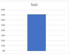
Our team has agreed to show, overall value when none of the categories is selected (without having to keep the category column in the Axis field, as it takes forever to show the output).
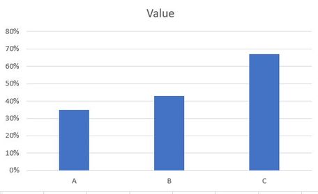
However, when a user selects multiple categories from the slicer, I need to show the selected category in X-axis ( as seen in second image)
Request your kind help.
Solved! Go to Solution.
- Mark as New
- Bookmark
- Subscribe
- Mute
- Subscribe to RSS Feed
- Permalink
- Report Inappropriate Content
Hi @sailendra ,
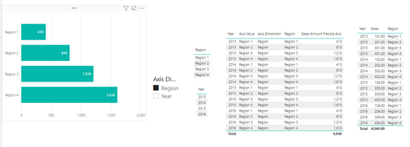
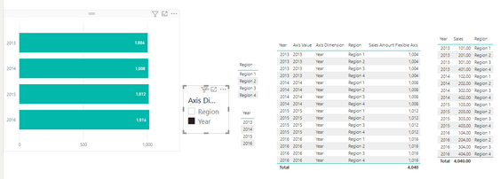
I did a test and think that the similar solutions provided below can help you, create a measure, use functions such as HASONEVALUE, switch, and filter the slicer to dynamically display the results in the visual.
related solution link: Solved: Dynamic change in X Axis - Microsoft Power BI Community
If the problem is still not resolved, can you provide a test data model (delete sensitive information) so that I can do accurate testing. Looking forward to your reply.
Best Regards,
Henry
If this post helps, then please consider Accept it as the solution to help the other members find it more quickly.
Helpful resources

Microsoft Fabric Learn Together
Covering the world! 9:00-10:30 AM Sydney, 4:00-5:30 PM CET (Paris/Berlin), 7:00-8:30 PM Mexico City

Power BI Monthly Update - April 2024
Check out the April 2024 Power BI update to learn about new features.

| User | Count |
|---|---|
| 100 | |
| 99 | |
| 80 | |
| 77 | |
| 66 |
| User | Count |
|---|---|
| 134 | |
| 106 | |
| 104 | |
| 85 | |
| 73 |


