- Power BI forums
- Updates
- News & Announcements
- Get Help with Power BI
- Desktop
- Service
- Report Server
- Power Query
- Mobile Apps
- Developer
- DAX Commands and Tips
- Custom Visuals Development Discussion
- Health and Life Sciences
- Power BI Spanish forums
- Translated Spanish Desktop
- Power Platform Integration - Better Together!
- Power Platform Integrations (Read-only)
- Power Platform and Dynamics 365 Integrations (Read-only)
- Training and Consulting
- Instructor Led Training
- Dashboard in a Day for Women, by Women
- Galleries
- Community Connections & How-To Videos
- COVID-19 Data Stories Gallery
- Themes Gallery
- Data Stories Gallery
- R Script Showcase
- Webinars and Video Gallery
- Quick Measures Gallery
- 2021 MSBizAppsSummit Gallery
- 2020 MSBizAppsSummit Gallery
- 2019 MSBizAppsSummit Gallery
- Events
- Ideas
- Custom Visuals Ideas
- Issues
- Issues
- Events
- Upcoming Events
- Community Blog
- Power BI Community Blog
- Custom Visuals Community Blog
- Community Support
- Community Accounts & Registration
- Using the Community
- Community Feedback
Register now to learn Fabric in free live sessions led by the best Microsoft experts. From Apr 16 to May 9, in English and Spanish.
- Power BI forums
- Forums
- Get Help with Power BI
- Desktop
- Dynamic Line and Column chart - need some help wit...
- Subscribe to RSS Feed
- Mark Topic as New
- Mark Topic as Read
- Float this Topic for Current User
- Bookmark
- Subscribe
- Printer Friendly Page
- Mark as New
- Bookmark
- Subscribe
- Mute
- Subscribe to RSS Feed
- Permalink
- Report Inappropriate Content
Dynamic Line and Column chart - need some help with slicers and managing chart
Hi everyone,
This is my first post here, so please be patient with me. I need a little of your help and wisdom 🙂
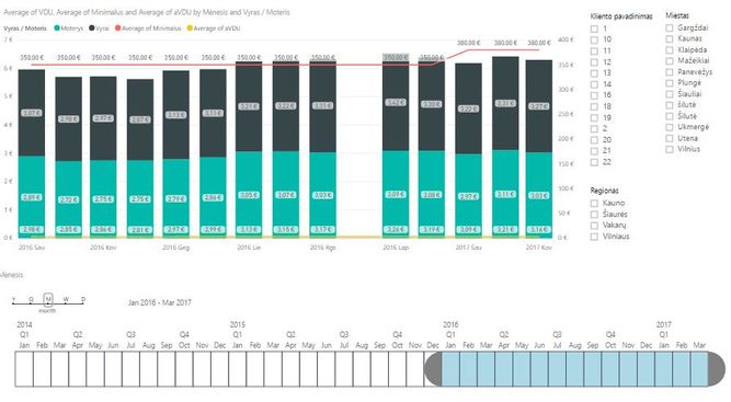
I am trying to build a chart Dynamic Line and Column chart and can`t seem to get the functionality that I need to customise it. The chart will have a few columns and lines assigned to custom X, Y and Y1 axes, along with a few slicers, and the problem is that I can't seem to find a way to assign different axes and slicers to different lines.
For example the idea of the graph is to to provide user easy-to-compare market data that could be easily drilled down, sliced and adjusted to users needs.
1) Column graph shows the salaries that are breaked down to man and women to compare equality.
2) Red line shows minimum salary in the region.
3) Yellow line should be the same data as 1), but independent of colums slicers (basically showing comparison data, mainly averages)
Slicers:
• Company (to sort data by company)
• City (to sort data by City)
• Region (to sort data by region)
• Date (to adjust data displayed in needed timescale)
What does not work.
1. All lines get assigned the same axes, in this case Y1. Y1 does not work for the yellow line and I need to assign it to the Y axes, and only the red line to the Y1 axes, but cant find a way to do that.
2. The data displayed on the chart and assigned to different chart components is completely controlled by one slicer/set of slicers. But I would like to have the yellow line to have a different set of slicers than the others. So depending on scenario the chart should allow user to compare any one particular Company vs other Target companies OR vs Region OR vs City. For that Yellow line (3) needs to have separate Company, City and Region Slicers from Columns (1). But currently the same set of slicers applies to all the chart components, so basically I would like to be able to control different lines/columns independently.
Many thanks in advance,
Dovydas
- Mark as New
- Bookmark
- Subscribe
- Mute
- Subscribe to RSS Feed
- Permalink
- Report Inappropriate Content
In Power BI Desktop combo chart, you can only have one Y-axis for column/bar and the the other for line. And the chart will repond to all slicers, it's not supported to have slicer working for corresponding part within chart independently.
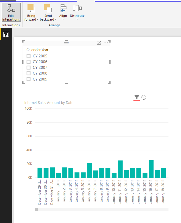
In your scenario, I suggest you separtate the Line chart and Column chart. Then you can edit the interaction between slicers and charts.
Regards,
Helpful resources

Microsoft Fabric Learn Together
Covering the world! 9:00-10:30 AM Sydney, 4:00-5:30 PM CET (Paris/Berlin), 7:00-8:30 PM Mexico City

Power BI Monthly Update - April 2024
Check out the April 2024 Power BI update to learn about new features.

| User | Count |
|---|---|
| 108 | |
| 98 | |
| 81 | |
| 65 | |
| 62 |
| User | Count |
|---|---|
| 147 | |
| 116 | |
| 104 | |
| 88 | |
| 65 |


