- Power BI forums
- Updates
- News & Announcements
- Get Help with Power BI
- Desktop
- Service
- Report Server
- Power Query
- Mobile Apps
- Developer
- DAX Commands and Tips
- Custom Visuals Development Discussion
- Health and Life Sciences
- Power BI Spanish forums
- Translated Spanish Desktop
- Power Platform Integration - Better Together!
- Power Platform Integrations (Read-only)
- Power Platform and Dynamics 365 Integrations (Read-only)
- Training and Consulting
- Instructor Led Training
- Dashboard in a Day for Women, by Women
- Galleries
- Community Connections & How-To Videos
- COVID-19 Data Stories Gallery
- Themes Gallery
- Data Stories Gallery
- R Script Showcase
- Webinars and Video Gallery
- Quick Measures Gallery
- 2021 MSBizAppsSummit Gallery
- 2020 MSBizAppsSummit Gallery
- 2019 MSBizAppsSummit Gallery
- Events
- Ideas
- Custom Visuals Ideas
- Issues
- Issues
- Events
- Upcoming Events
- Community Blog
- Power BI Community Blog
- Custom Visuals Community Blog
- Community Support
- Community Accounts & Registration
- Using the Community
- Community Feedback
Register now to learn Fabric in free live sessions led by the best Microsoft experts. From Apr 16 to May 9, in English and Spanish.
- Power BI forums
- Forums
- Get Help with Power BI
- Desktop
- Display message when data points exceed reference ...
- Subscribe to RSS Feed
- Mark Topic as New
- Mark Topic as Read
- Float this Topic for Current User
- Bookmark
- Subscribe
- Printer Friendly Page
- Mark as New
- Bookmark
- Subscribe
- Mute
- Subscribe to RSS Feed
- Permalink
- Report Inappropriate Content
Display message when data points exceed reference line
Hi, i have a line chart with a reference line below. How can i display a message whenever my data point exceeds the reference line?
Solved! Go to Solution.
- Mark as New
- Bookmark
- Subscribe
- Mute
- Subscribe to RSS Feed
- Permalink
- Report Inappropriate Content
Hi @weijunawj
In addition to amitchandak's reply, I will show the way in details.
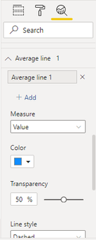
Firstly, I need to know how did you get the reference line. Is it an average line in visual analysis?
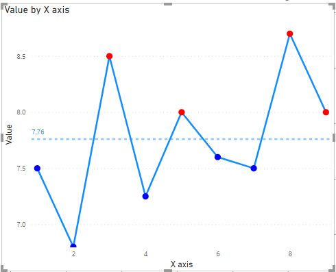
If you want to show different colors to distinguish whether the value exceeds the average, build a measure as below.
Color =
VAR _AVERAGE = CALCULATE(AVERAGE('Table'[Value]),ALL('Table'))
RETURN
IF(SUM('Table'[Value])>_AVERAGE,"RED","BLUE")
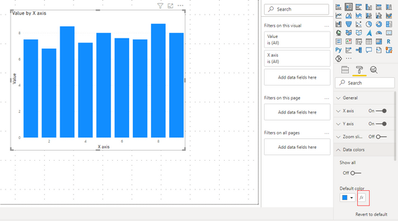
Build a bar chart and use FX in Data color in Format.
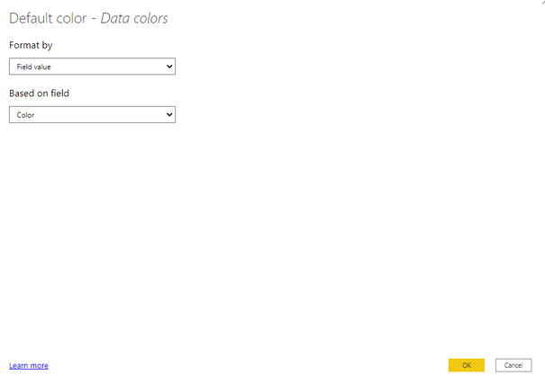
Select Field value in Format by and based on color measure. Then select ok and transform the bar chart to line chart.
Result is as below.
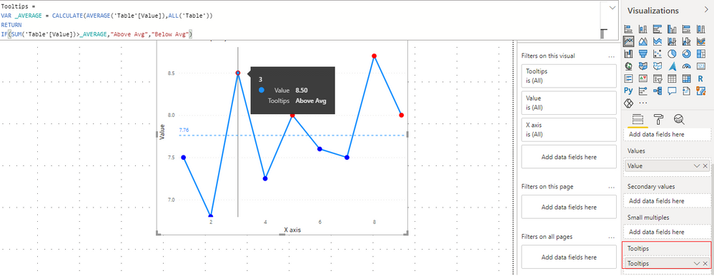
If you need to a tooltip to show whether the value exceeds the average, you can change the result in color measure and add this measure into tooltips in this visual.
Tooltips =
VAR _AVERAGE = CALCULATE(AVERAGE('Table'[Value]),ALL('Table'))
RETURN
IF(SUM('Table'[Value])>_AVERAGE,"Above Avg","Below Avg")
To see the tooltip, you need to hang your mouse on the point in line chart. Or the tooltips will be hidden.
You can build a tooltip based on report page as well.
For reference: Create tooltips based on report pages in Power BI Desktop
Best Regards,
Rico Zhou
If this post helps, then please consider Accept it as the solution to help the other members find it more quickly.
- Mark as New
- Bookmark
- Subscribe
- Mute
- Subscribe to RSS Feed
- Permalink
- Report Inappropriate Content
@weijunawj , One way is to create conditional formatting on bar visual and convert back to the line. But if the other line is not avg line and is measure it might not work
Color =
if( [Value] > [Avg Value], "Green",
"Blue"
)
Use in conditional formatting with a field value option
or create a measure and use on tool tip
Color =
if( [Value] > [Avg Value], "Above Avg",
"Below Avg"
)
Microsoft Power BI Learning Resources, 2023 !!
Learn Power BI - Full Course with Dec-2022, with Window, Index, Offset, 100+ Topics !!
Did I answer your question? Mark my post as a solution! Appreciate your Kudos !! Proud to be a Super User! !!
- Mark as New
- Bookmark
- Subscribe
- Mute
- Subscribe to RSS Feed
- Permalink
- Report Inappropriate Content
Hi sir, sorry i'm new to power bi. How can i create a measure and use on tool tip as mentioned in your reply? and where do i enter the condition "
Color =
if( [Value] > [Avg Value], "Above Avg",
"Below Avg"
)" ?
Thank you
- Mark as New
- Bookmark
- Subscribe
- Mute
- Subscribe to RSS Feed
- Permalink
- Report Inappropriate Content
@weijunawj , Assume you have a measure value, then you can create a new meausre
Color =
var = calculate([Value], allselected(Table))
return
if( [Value] > [Avg Value], "Above Avg", "Below Avg" )
Then add that to tooltip (Visual Pane)
Microsoft Power BI Learning Resources, 2023 !!
Learn Power BI - Full Course with Dec-2022, with Window, Index, Offset, 100+ Topics !!
Did I answer your question? Mark my post as a solution! Appreciate your Kudos !! Proud to be a Super User! !!
Helpful resources

Microsoft Fabric Learn Together
Covering the world! 9:00-10:30 AM Sydney, 4:00-5:30 PM CET (Paris/Berlin), 7:00-8:30 PM Mexico City

Power BI Monthly Update - April 2024
Check out the April 2024 Power BI update to learn about new features.

| User | Count |
|---|---|
| 114 | |
| 105 | |
| 78 | |
| 68 | |
| 63 |
| User | Count |
|---|---|
| 148 | |
| 107 | |
| 106 | |
| 83 | |
| 70 |

