- Power BI forums
- Updates
- News & Announcements
- Get Help with Power BI
- Desktop
- Service
- Report Server
- Power Query
- Mobile Apps
- Developer
- DAX Commands and Tips
- Custom Visuals Development Discussion
- Health and Life Sciences
- Power BI Spanish forums
- Translated Spanish Desktop
- Power Platform Integration - Better Together!
- Power Platform Integrations (Read-only)
- Power Platform and Dynamics 365 Integrations (Read-only)
- Training and Consulting
- Instructor Led Training
- Dashboard in a Day for Women, by Women
- Galleries
- Community Connections & How-To Videos
- COVID-19 Data Stories Gallery
- Themes Gallery
- Data Stories Gallery
- R Script Showcase
- Webinars and Video Gallery
- Quick Measures Gallery
- 2021 MSBizAppsSummit Gallery
- 2020 MSBizAppsSummit Gallery
- 2019 MSBizAppsSummit Gallery
- Events
- Ideas
- Custom Visuals Ideas
- Issues
- Issues
- Events
- Upcoming Events
- Community Blog
- Power BI Community Blog
- Custom Visuals Community Blog
- Community Support
- Community Accounts & Registration
- Using the Community
- Community Feedback
Register now to learn Fabric in free live sessions led by the best Microsoft experts. From Apr 16 to May 9, in English and Spanish.
- Power BI forums
- Forums
- Get Help with Power BI
- Desktop
- Different shade of color in bar chart for months n...
- Subscribe to RSS Feed
- Mark Topic as New
- Mark Topic as Read
- Float this Topic for Current User
- Bookmark
- Subscribe
- Printer Friendly Page
- Mark as New
- Bookmark
- Subscribe
- Mute
- Subscribe to RSS Feed
- Permalink
- Report Inappropriate Content
Different shade of color in bar chart for months not in Rolling 12?
Hello All,
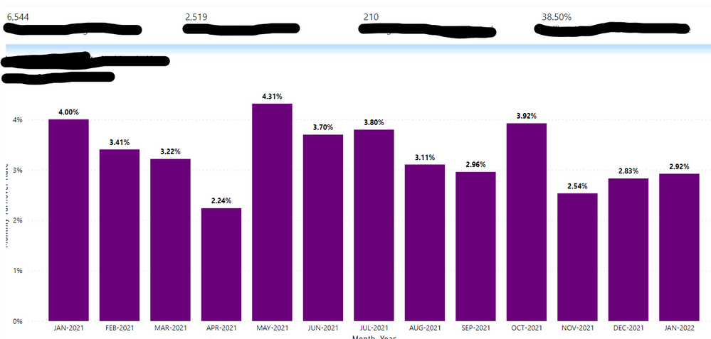
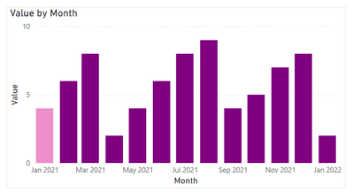
In the image below I have a Rolling 12 ticker with totals and a bar chart that has the last 13 months. A request was asked if I could color Jan 2021 a lighter shade of purple to show that it is not included in the Rolling 12 ticker totals. I didn't believe this to be an option in Power BI, but didn't know if anyone has tried something like this before or knows of way of doing this. A thought came to mind of a slicer that would highlight only the months in the Rolling 12 but a slicer won't highlight a chart it only filters it. Any ideas would be greatly appreciated.
Note: This data will update next month, so the Rolling 12 will be March-2021 through Feb-2022. That means Jan-2021 will go away and Feb-2021 becomes the new month that isn't apart of the Rolling 12 and needs to be a lighter shade. This process needs to be dynamic.
Solved! Go to Solution.
- Mark as New
- Bookmark
- Subscribe
- Mute
- Subscribe to RSS Feed
- Permalink
- Report Inappropriate Content
Hi @nleuck_101 ,
According to your description, here's my solution.
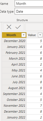
This is my sample data, the data type of the month column Date.
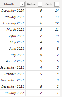
1.Create a calculated column Rank.
Rank = RANKX('Table','Table'[Month],,DESC,Dense)Get the rank column based on the month.
2. Create a color measure.
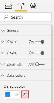
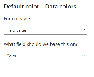
Color = IF(MAX('Table'[Rank])=13,"#ec8fca", "Purple")3.Select the visual, then under the Format tab, expand Data colors, there is a fx beside the Default color, click it.
Select the color measure as the based color.
Get the expected result.
I attach my sample below for reference.
Best Regards,
Community Support Team _ kalyj
If this post helps, then please consider Accept it as the solution to help the other members find it more quickly.
Helpful resources

Microsoft Fabric Learn Together
Covering the world! 9:00-10:30 AM Sydney, 4:00-5:30 PM CET (Paris/Berlin), 7:00-8:30 PM Mexico City

Power BI Monthly Update - April 2024
Check out the April 2024 Power BI update to learn about new features.

| User | Count |
|---|---|
| 104 | |
| 101 | |
| 79 | |
| 72 | |
| 64 |
| User | Count |
|---|---|
| 143 | |
| 109 | |
| 103 | |
| 82 | |
| 74 |
