- Power BI forums
- Updates
- News & Announcements
- Get Help with Power BI
- Desktop
- Service
- Report Server
- Power Query
- Mobile Apps
- Developer
- DAX Commands and Tips
- Custom Visuals Development Discussion
- Health and Life Sciences
- Power BI Spanish forums
- Translated Spanish Desktop
- Power Platform Integration - Better Together!
- Power Platform Integrations (Read-only)
- Power Platform and Dynamics 365 Integrations (Read-only)
- Training and Consulting
- Instructor Led Training
- Dashboard in a Day for Women, by Women
- Galleries
- Community Connections & How-To Videos
- COVID-19 Data Stories Gallery
- Themes Gallery
- Data Stories Gallery
- R Script Showcase
- Webinars and Video Gallery
- Quick Measures Gallery
- 2021 MSBizAppsSummit Gallery
- 2020 MSBizAppsSummit Gallery
- 2019 MSBizAppsSummit Gallery
- Events
- Ideas
- Custom Visuals Ideas
- Issues
- Issues
- Events
- Upcoming Events
- Community Blog
- Power BI Community Blog
- Custom Visuals Community Blog
- Community Support
- Community Accounts & Registration
- Using the Community
- Community Feedback
Earn a 50% discount on the DP-600 certification exam by completing the Fabric 30 Days to Learn It challenge.
- Power BI forums
- Forums
- Get Help with Power BI
- Desktop
- Dax help - measure to show % of passed items by ca...
- Subscribe to RSS Feed
- Mark Topic as New
- Mark Topic as Read
- Float this Topic for Current User
- Bookmark
- Subscribe
- Printer Friendly Page
- Mark as New
- Bookmark
- Subscribe
- Mute
- Subscribe to RSS Feed
- Permalink
- Report Inappropriate Content
Dax help - measure to show % of passed items by category
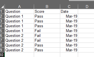
I have a clustered stacked chart in excel I use to trend test improvements over the last few months. For example, the % of question 1 being passed will show for april, may and june. Then the same for question 2 and so on.
PBI doesn't support that but it looks like their stacked % chart will get me close. Problem is, % is for all of the questions and not just for one category at a time
Below is how my columns look in PBI and I would like the stacked % bar chart to show that question 1 is 75% as that is the percentage of the question being passed. The next section of the bar would be for question 2 and that would show 50%. Then I can have a 1 column for each month and I can compare improvements that way.
This possible?
Solved! Go to Solution.
- Mark as New
- Bookmark
- Subscribe
- Mute
- Subscribe to RSS Feed
- Permalink
- Report Inappropriate Content
That is caused by the fact that if either argument to the divide function returns a blank, the result of the divide will be blank. One fix for ths is to check if the count of all scores is greater than 0 then add a hard 0 to the count of passed scores.
eg
Pass % =
VAR _allScoresCnt = CALCULATE(COUNTROWS(Table1),ALL(Table1[Score]))
VAR _passCnt = CALCULATE(COUNTROWS(Table1), Table1[Score] = "Pass") + IF(_allScoresCnt > 0,0)
return DIVIDE(_passCnt, _allScoresCnt)
- Mark as New
- Bookmark
- Subscribe
- Mute
- Subscribe to RSS Feed
- Permalink
- Report Inappropriate Content
You should be able to do this with a measure like the following
Pass % =
VAR _passCnt = CALCULATE(COUNTROWS(Table1), Table1[Score] = "Pass")
VAR _allScoresCnt = CALCULATE(COUNTROWS(Table1),ALL(Table1[Score]))
return DIVIDE(_passCnt, _allScoresCnt)
Then simply create a normal stacked column chart and put this measure on the values and the questions on the Axis
@bryanc78 wrote:PBI doesn't support that but it looks like their stacked % chart will get me close.
I don't really understand what you are trying to achieve. If you can post an image of the output maybe the same chart exists in Power BI but just has a different name.
- Mark as New
- Bookmark
- Subscribe
- Mute
- Subscribe to RSS Feed
- Permalink
- Report Inappropriate Content
- Mark as New
- Bookmark
- Subscribe
- Mute
- Subscribe to RSS Feed
- Permalink
- Report Inappropriate Content
That is caused by the fact that if either argument to the divide function returns a blank, the result of the divide will be blank. One fix for ths is to check if the count of all scores is greater than 0 then add a hard 0 to the count of passed scores.
eg
Pass % =
VAR _allScoresCnt = CALCULATE(COUNTROWS(Table1),ALL(Table1[Score]))
VAR _passCnt = CALCULATE(COUNTROWS(Table1), Table1[Score] = "Pass") + IF(_allScoresCnt > 0,0)
return DIVIDE(_passCnt, _allScoresCnt)
- Mark as New
- Bookmark
- Subscribe
- Mute
- Subscribe to RSS Feed
- Permalink
- Report Inappropriate Content
Do you know if any resources that would good to start learning DAX?
- Mark as New
- Bookmark
- Subscribe
- Mute
- Subscribe to RSS Feed
- Permalink
- Report Inappropriate Content
My friends over at sqlbi.com have a stack of great resources. They wrote a book called "The Definitive Guide to DAX" and the also have videos and run training courses and have a number of articles on their site. And there is a list of a number of great DAX resources here: https://social.technet.microsoft.com/wiki/contents/articles/1088.dax-resource-center.aspx


