- Power BI forums
- Updates
- News & Announcements
- Get Help with Power BI
- Desktop
- Service
- Report Server
- Power Query
- Mobile Apps
- Developer
- DAX Commands and Tips
- Custom Visuals Development Discussion
- Health and Life Sciences
- Power BI Spanish forums
- Translated Spanish Desktop
- Power Platform Integration - Better Together!
- Power Platform Integrations (Read-only)
- Power Platform and Dynamics 365 Integrations (Read-only)
- Training and Consulting
- Instructor Led Training
- Dashboard in a Day for Women, by Women
- Galleries
- Community Connections & How-To Videos
- COVID-19 Data Stories Gallery
- Themes Gallery
- Data Stories Gallery
- R Script Showcase
- Webinars and Video Gallery
- Quick Measures Gallery
- 2021 MSBizAppsSummit Gallery
- 2020 MSBizAppsSummit Gallery
- 2019 MSBizAppsSummit Gallery
- Events
- Ideas
- Custom Visuals Ideas
- Issues
- Issues
- Events
- Upcoming Events
- Community Blog
- Power BI Community Blog
- Custom Visuals Community Blog
- Community Support
- Community Accounts & Registration
- Using the Community
- Community Feedback
Register now to learn Fabric in free live sessions led by the best Microsoft experts. From Apr 16 to May 9, in English and Spanish.
- Power BI forums
- Forums
- Get Help with Power BI
- Desktop
- Create dynamic line on x-axis to show today's date
- Subscribe to RSS Feed
- Mark Topic as New
- Mark Topic as Read
- Float this Topic for Current User
- Bookmark
- Subscribe
- Printer Friendly Page
- Mark as New
- Bookmark
- Subscribe
- Mute
- Subscribe to RSS Feed
- Permalink
- Report Inappropriate Content
Create dynamic line on x-axis to show today's date
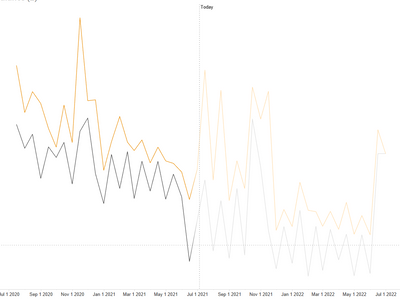
I am trying to create a dynamic line on my line chart to indicate today's date. and also make future data a bit transparent. Any idea how to achieve this? I saw a few solutions about creating a new measure and use the line and stacked chart. it doesn't apply to my use case because I don't have data points for all date. This is the file:
https://drive.google.com/drive/folders/1aZwMygofzomDdI9Tsa9W2qxzhi1dRKfD?usp=sharing
Here is what I am tyring to achieve:
Dataset looks like this:
| Period | Group | Profits |
| 2020-08-15 0:00 | Group B | 526650.0483 |
| 2020-08-15 0:00 | Group A | 358686.7175 |
| 2020-08-31 0:00 | Group B | 479743.9389 |
| 2020-08-31 0:00 | Group A | 184101.7028 |
| 2020-09-15 0:00 | Group B | 381205.785 |
| 2020-09-15 0:00 | Group A | 308477.628 |
| 2020-09-30 0:00 | Group B | 307498.7097 |
| 2020-09-30 0:00 | Group A | 266755.2061 |
| 2020-10-15 0:00 | Group B | 473268.3453 |
| 2020-10-15 0:00 | Group A | 326478.0087 |
| 2020-10-31 0:00 | Group B | 325795.688 |
| 2020-10-31 0:00 | Group A | 162072.1676 |
| 2020-11-15 0:00 | Group B | 818205.48 |
| 2020-11-15 0:00 | Group A | 369871.0837 |
| 2020-11-30 0:00 | Group B | 490788.7987 |
| 2020-11-30 0:00 | Group A | 422384.8563 |
| 2020-12-15 0:00 | Group B | 494155.8499 |
| 2020-12-15 0:00 | Group A | 202818.2976 |
| 2020-12-31 0:00 | Group B | 216382.5483 |
| 2020-12-31 0:00 | Group A | 84604.37819 |
| 2021-01-15 0:00 | Group B | 328950.9571 |
| 2021-01-15 0:00 | Group A | 278617.7077 |
| 2021-01-31 0:00 | Group B | 428521.5152 |
| 2021-01-31 0:00 | Group A | 144391.1824 |
| 2021-02-15 0:00 | Group B | 326873.0559 |
| 2021-02-15 0:00 | Group A | 289905.5259 |
| 2021-02-28 0:00 | Group B | 294048.3064 |
| 2021-02-28 0:00 | Group A | 104598.8772 |
| 2021-03-15 0:00 | Group B | 335980.1284 |
| 2021-03-15 0:00 | Group A | 251847.6486 |
| 2021-03-31 0:00 | Group B | 245569.5233 |
| 2021-03-31 0:00 | Group A | 134085.6492 |
Solved! Go to Solution.
- Mark as New
- Bookmark
- Subscribe
- Mute
- Subscribe to RSS Feed
- Permalink
- Report Inappropriate Content
Hi @windynan ,
I didn't find any chart meets your requirements. You can vote for conditional formatting for line chart : https://ideas.powerbi.com/ideas/idea/?ideaid=0671c26d-bd0e-43ad-b78c-bb097f2c54af
As a workaround, you can do some overlapping data point between History and future like:
GroupAFuture = IF(MAX(Dim_Date[Date])>=TODAY()-3,CALCULATE(SUM(data[Profits]),data[Item] = "Group A"),BLANK())

GroupAHistory = IF(MAX(Dim_Date[Date])<=TODAY()+3,CALCULATE(SUM(data[Profits]),data[Item] = "Group A"),BLANK())
If this post helps, then please consider Accept it as the solution to help the other members find it more quickly.
Best Regards,
Dedmon Dai
- Mark as New
- Bookmark
- Subscribe
- Mute
- Subscribe to RSS Feed
- Permalink
- Report Inappropriate Content
Hi @windynan ,
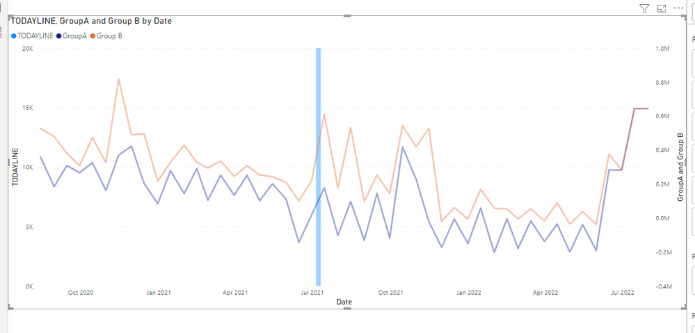
You can create a dim_date table and create one to many relationship to fact table:
Dim_Date = CALENDAR(MIN(data[Period]),MAX(data[Period]))
Then you can use the following three measure in your line and stacked column chart:
GroupA = CALCULATE(SUM(data[Profits]),data[Item] = "Group A")
Group B = CALCULATE(SUM(data[Profits]),data[Item] = "Group B")
TODAYLINE = IF(SELECTEDVALUE(Dim_Date[Date]) = TODAY(), 20000)
Please refer to the pbix file.
If this post helps, then please consider Accept it as the solution to help the other members find it more quickly.
Best Regards,
Dedmon Dai
- Mark as New
- Bookmark
- Subscribe
- Mute
- Subscribe to RSS Feed
- Permalink
- Report Inappropriate Content
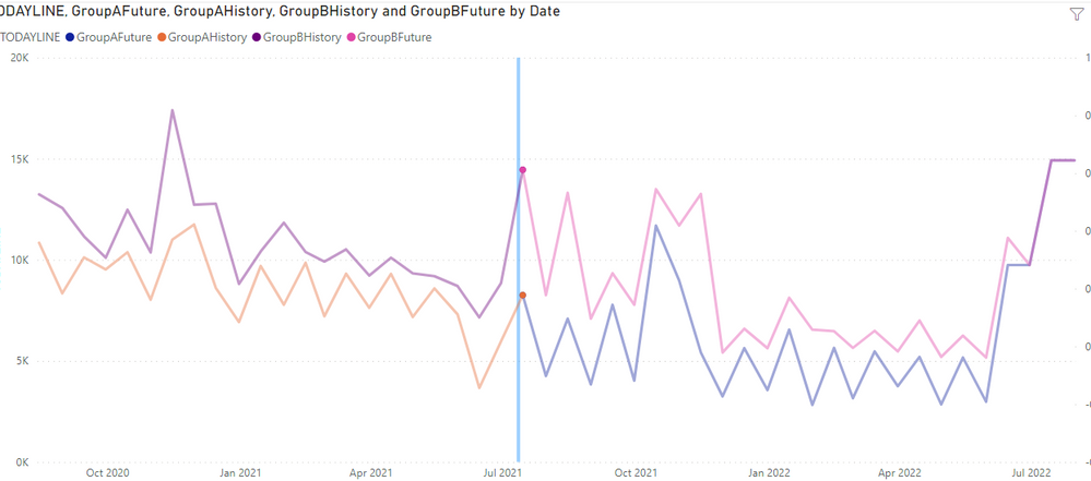
Thanks @v-deddai1-msft ! Very helpful, but this is half of what I need. Based on this, I am still looking for ways to make future data points transparent, like what I showed in my picture. I tried to created four groups, like:
Group A History,
Group A future,
Group B History,
Group B future
However, there will be gaps when I put them on the line charts. Any idead how to link the charts? or any other ways that you can think about make future data lighter color?
- Mark as New
- Bookmark
- Subscribe
- Mute
- Subscribe to RSS Feed
- Permalink
- Report Inappropriate Content
Hi @windynan ,
I didn't find any chart meets your requirements. You can vote for conditional formatting for line chart : https://ideas.powerbi.com/ideas/idea/?ideaid=0671c26d-bd0e-43ad-b78c-bb097f2c54af
As a workaround, you can do some overlapping data point between History and future like:
GroupAFuture = IF(MAX(Dim_Date[Date])>=TODAY()-3,CALCULATE(SUM(data[Profits]),data[Item] = "Group A"),BLANK())

GroupAHistory = IF(MAX(Dim_Date[Date])<=TODAY()+3,CALCULATE(SUM(data[Profits]),data[Item] = "Group A"),BLANK())
If this post helps, then please consider Accept it as the solution to help the other members find it more quickly.
Best Regards,
Dedmon Dai
- Mark as New
- Bookmark
- Subscribe
- Mute
- Subscribe to RSS Feed
- Permalink
- Report Inappropriate Content
Two potential suggestions:
1. Build it with the Charticulator visual, and add a measure that returns either 1 or 0.5 to be used as the Opacity value of the Marks/Links based on whether the date is past or future.
(2) Season 1 - Charticulator - YouTube
2. Use the native visual along with 4 measures, one for each combination of past/future and Group A/B, and set the desired colors for each.
Pat
Did I answer your question? Mark my post as a solution! Kudos are also appreciated!
To learn more about Power BI, follow me on Twitter or subscribe on YouTube.
@mahoneypa HoosierBI on YouTube
Helpful resources

Microsoft Fabric Learn Together
Covering the world! 9:00-10:30 AM Sydney, 4:00-5:30 PM CET (Paris/Berlin), 7:00-8:30 PM Mexico City

Power BI Monthly Update - April 2024
Check out the April 2024 Power BI update to learn about new features.

| User | Count |
|---|---|
| 98 | |
| 96 | |
| 78 | |
| 72 | |
| 66 |
| User | Count |
|---|---|
| 136 | |
| 109 | |
| 104 | |
| 82 | |
| 73 |


