- Power BI forums
- Updates
- News & Announcements
- Get Help with Power BI
- Desktop
- Service
- Report Server
- Power Query
- Mobile Apps
- Developer
- DAX Commands and Tips
- Custom Visuals Development Discussion
- Health and Life Sciences
- Power BI Spanish forums
- Translated Spanish Desktop
- Power Platform Integration - Better Together!
- Power Platform Integrations (Read-only)
- Power Platform and Dynamics 365 Integrations (Read-only)
- Training and Consulting
- Instructor Led Training
- Dashboard in a Day for Women, by Women
- Galleries
- Community Connections & How-To Videos
- COVID-19 Data Stories Gallery
- Themes Gallery
- Data Stories Gallery
- R Script Showcase
- Webinars and Video Gallery
- Quick Measures Gallery
- 2021 MSBizAppsSummit Gallery
- 2020 MSBizAppsSummit Gallery
- 2019 MSBizAppsSummit Gallery
- Events
- Ideas
- Custom Visuals Ideas
- Issues
- Issues
- Events
- Upcoming Events
- Community Blog
- Power BI Community Blog
- Custom Visuals Community Blog
- Community Support
- Community Accounts & Registration
- Using the Community
- Community Feedback
Register now to learn Fabric in free live sessions led by the best Microsoft experts. From Apr 16 to May 9, in English and Spanish.
- Power BI forums
- Forums
- Get Help with Power BI
- Desktop
- Conditional Formatting where Provider % is 10% abo...
- Subscribe to RSS Feed
- Mark Topic as New
- Mark Topic as Read
- Float this Topic for Current User
- Bookmark
- Subscribe
- Printer Friendly Page
- Mark as New
- Bookmark
- Subscribe
- Mute
- Subscribe to RSS Feed
- Permalink
- Report Inappropriate Content
Conditional Formatting where Provider % is 10% above or 10% below Group average
Hey everyone,
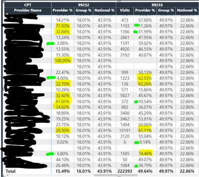
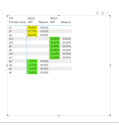
I'm trying to use Conditional Formatting that will highlight the #'s where the "Provider %" is 10% below or above the "Group Average". See my screenshot as an example: The yellow highlighted #'s are all at least 10% higher than that of the Group %. And the Green Highlighted #'s fall at least 10% below the Group %. Thanks in advance for the help!
Solved! Go to Solution.
- Mark as New
- Bookmark
- Subscribe
- Mute
- Subscribe to RSS Feed
- Permalink
- Report Inappropriate Content
Hi @jonnyA ,
I dont know your measure of Group before,so I tested with a simple aggregation measure which can be aggregated.
For your measure,it is a judgement statement,you could use below dax expression instead:
Measure= Sumx(Values('Table'[Provider_Degree]),'Table'[Group%])If you still cant work out,could you pls provide some sample data or your .pbix file for test?
Remember to remove the confidential information.
Best Regards,
Kelly
Did I answer your question? Mark my post as a solution!
- Mark as New
- Bookmark
- Subscribe
- Mute
- Subscribe to RSS Feed
- Permalink
- Report Inappropriate Content
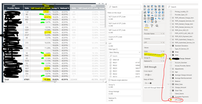
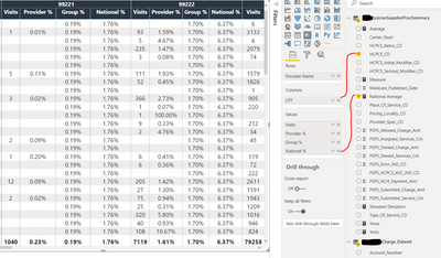
@amitchandak , sorry to bother you again, but any chance you could help me finish the measure in question? I responded earlier this afternoon, but didnt hear back. I have a lot of red squigglies. I think one issue might be that where I have entered the CPT Code (Highlighted yellow) aka Provider %, the measure is looking for a calculated measure and "CPT Code" is not a calculated measure. I dont know? Any help is appreciated, thank you!
- Mark as New
- Bookmark
- Subscribe
- Mute
- Subscribe to RSS Feed
- Permalink
- Report Inappropriate Content
Hi !
Please answer following question.
[Provider %] & [Group %] are measures. Seems like they are not from your sample images. Then what aggregation you are using for those while plotting them in matrix visual.
Please specify source calculation for both these 2 KPIs
Regards,
Hasham
- Mark as New
- Bookmark
- Subscribe
- Mute
- Subscribe to RSS Feed
- Permalink
- Report Inappropriate Content
I think i was incorrect in my original question ... Here is what I am looking to do now.
I'm looking for some help on creating a measure that highlights the %'s in column "%RT Count of CPT_Code" which is 10% above and 10 below the total avgerage for "%RT Count of CPT_Code".
The %'s highlighted in yellow represent any % that is higher than 25.50% which is 10% above the 15.50% Total.
The %'s highlighted in green represent any % that is lower than 5.50% which is 10% below the 15.50 Total.
- Mark as New
- Bookmark
- Subscribe
- Mute
- Subscribe to RSS Feed
- Permalink
- Report Inappropriate Content
Hi @jonnyA ,
Create a measure as below:
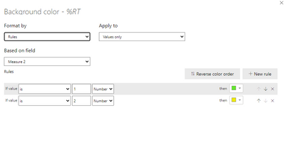
Measure 2 = IF(MAX('Table'[%RT])<'Table'[Measure]*0.9,1,
IF(MAX('Table'[%RT])>'Table'[Measure]*1.1,2,BLANK()))
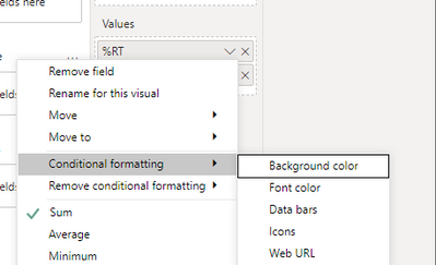
Then set a conditional formatting for background as below:
Finally you will see:
For the related .pbix file,pls see attached.
Best Regards,
Kelly
Did I answer your question? Mark my post as a solution!
- Mark as New
- Bookmark
- Subscribe
- Mute
- Subscribe to RSS Feed
- Permalink
- Report Inappropriate Content
Thank you soooo much for your response. I feel like this formula will work, however, I am having an issue with the 18.04% part of the formula.
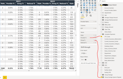
So, my "Group %" is a measure I created. So I have the calculator icon in from of my measure. Here is the formula i am using for Group % aka Group Average (Ignore Degree) ...
- Mark as New
- Bookmark
- Subscribe
- Mute
- Subscribe to RSS Feed
- Permalink
- Report Inappropriate Content
Hi @jonnyA ,
I dont know your measure of Group before,so I tested with a simple aggregation measure which can be aggregated.
For your measure,it is a judgement statement,you could use below dax expression instead:
Measure= Sumx(Values('Table'[Provider_Degree]),'Table'[Group%])If you still cant work out,could you pls provide some sample data or your .pbix file for test?
Remember to remove the confidential information.
Best Regards,
Kelly
Did I answer your question? Mark my post as a solution!
- Mark as New
- Bookmark
- Subscribe
- Mute
- Subscribe to RSS Feed
- Permalink
- Report Inappropriate Content
Hi !
Try creating a measure to calculate Differenc between Provider % & Group %. Then use this measure in Conditinal Formatting & use Rules to highlight If Differece is >= .1 Then highlight "Yellow", Add another rule if Difference is <=.1 Then highlight "Green"
Regards,
Hasham
- Mark as New
- Bookmark
- Subscribe
- Mute
- Subscribe to RSS Feed
- Permalink
- Report Inappropriate Content
@jonnyA , Try a color measure like
New measure =
var _1 =[Provider %] - calculate([Provider %], allselected(Table))
Switch( True() ,
_1 <=.1 ||( _1 <0 && _1 >=-.1), "green",
"yellow"
)
You can use conditional formatting with field value option.
Microsoft Power BI Learning Resources, 2023 !!
Learn Power BI - Full Course with Dec-2022, with Window, Index, Offset, 100+ Topics !!
Did I answer your question? Mark my post as a solution! Appreciate your Kudos !! Proud to be a Super User! !!
- Mark as New
- Bookmark
- Subscribe
- Mute
- Subscribe to RSS Feed
- Permalink
- Report Inappropriate Content
Thank you, but I need some help writing the measure with the data I have, let me try to explain ... Can you help me fill in the gaps with the measure you gave me?!?!
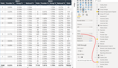
Visits, aka "Voucher #" is Count Distinct
Provider %, aka "CPT Code" is Count
Group %, aka "Group Average Ignore Degree is shown as % of Grand total
National Average is % of Grand total
Helpful resources

Microsoft Fabric Learn Together
Covering the world! 9:00-10:30 AM Sydney, 4:00-5:30 PM CET (Paris/Berlin), 7:00-8:30 PM Mexico City

Power BI Monthly Update - April 2024
Check out the April 2024 Power BI update to learn about new features.

| User | Count |
|---|---|
| 105 | |
| 96 | |
| 79 | |
| 67 | |
| 62 |
| User | Count |
|---|---|
| 137 | |
| 105 | |
| 104 | |
| 80 | |
| 63 |
