- Power BI forums
- Updates
- News & Announcements
- Get Help with Power BI
- Desktop
- Service
- Report Server
- Power Query
- Mobile Apps
- Developer
- DAX Commands and Tips
- Custom Visuals Development Discussion
- Health and Life Sciences
- Power BI Spanish forums
- Translated Spanish Desktop
- Power Platform Integration - Better Together!
- Power Platform Integrations (Read-only)
- Power Platform and Dynamics 365 Integrations (Read-only)
- Training and Consulting
- Instructor Led Training
- Dashboard in a Day for Women, by Women
- Galleries
- Community Connections & How-To Videos
- COVID-19 Data Stories Gallery
- Themes Gallery
- Data Stories Gallery
- R Script Showcase
- Webinars and Video Gallery
- Quick Measures Gallery
- 2021 MSBizAppsSummit Gallery
- 2020 MSBizAppsSummit Gallery
- 2019 MSBizAppsSummit Gallery
- Events
- Ideas
- Custom Visuals Ideas
- Issues
- Issues
- Events
- Upcoming Events
- Community Blog
- Power BI Community Blog
- Custom Visuals Community Blog
- Community Support
- Community Accounts & Registration
- Using the Community
- Community Feedback
Register now to learn Fabric in free live sessions led by the best Microsoft experts. From Apr 16 to May 9, in English and Spanish.
- Power BI forums
- Forums
- Get Help with Power BI
- Desktop
- Combo Charts Legend Color Not Changing based on Fi...
- Subscribe to RSS Feed
- Mark Topic as New
- Mark Topic as Read
- Float this Topic for Current User
- Bookmark
- Subscribe
- Printer Friendly Page
- Mark as New
- Bookmark
- Subscribe
- Mute
- Subscribe to RSS Feed
- Permalink
- Report Inappropriate Content
Combo Charts Legend Color Not Changing based on Filter
Hello Everyone,
I seemed to be having an issue with the color of the legend on a combo chart.
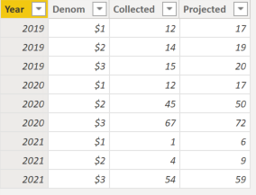
Here is what I have in my table:
| Year | Money | Collected | Projected |
| 2019 | $1 | 12 | 17 |
| 2019 | $2 | 14 | 19 |
| 2019 | $3 | 15 | 20 |
| 2020 | $1 | 12 | 17 |
| 2020 | $2 | 45 | 50 |
| 2020 | $3 | 67 | 72 |
| 2021 | $1 | 1 | 6 |
| 2021 | $2 | 4 | 9 |
| 2021 | $3 | 54 | 59 |
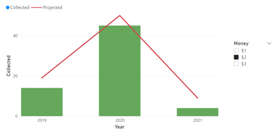
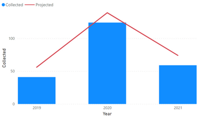
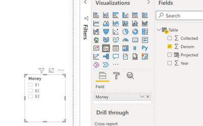
Here is what I have on my canvas, a combo chart + a filter:
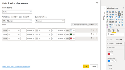
I used conditional formatting to color the chart according to what the user selects. In the example above, if the user selects $2 the chart should be "Green". This is working great.
However, the color of the legend representing the bar chart is still blue on the top left corner.
Anyone knows how to get the color of the legend to change as well?
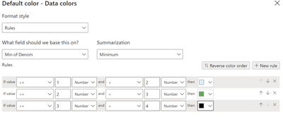
PS: this is conditional formatting:
Thank you, any help would be greatly appreciated.
- Mark as New
- Bookmark
- Subscribe
- Mute
- Subscribe to RSS Feed
- Permalink
- Report Inappropriate Content
Hi @Gladiator909 ,
According to your description, I dia a sample and did not reproduce the phenomenon. Can you provide your specific steps? Maybe your desktop version isn't up to date, try updating to see if the problem still assists.
And you can refer to the following link.
Solved: Change the color of the chart based on the objecti... - Microsoft Power BI Community
Best Regards,
Community Support Team _ xiaosun
If this post helps, then please consider Accept it as the solution to help the other members find it more quickly.
- Mark as New
- Bookmark
- Subscribe
- Mute
- Subscribe to RSS Feed
- Permalink
- Report Inappropriate Content
Hi there,
Thank you for your reply.
Interesting that you were not able to reproduce it. Here are my steps:
Data Table:
(1) Creating the Combo Chart:
- I selected "Line and clustered column chart"
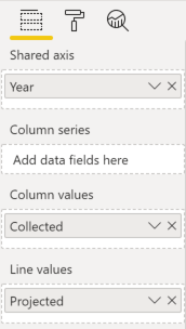
- Here is the fields section:
When I do the above, I end up with this visual:
(2) I create a filter for the money, by selecting filter and using the "Denom" field from my table as such:
(3) This is where I use conditional formatting to set the color of my chart depending on what the user is selecting. This is done as such:
(4) The filter works great but the color of the legend still doesnt change accordingly. It looks like its defaulted to the blue color at the beginning.
I tried the same thing on a newer version of PowerBI and same thing.
Thank you for all the help
- Mark as New
- Bookmark
- Subscribe
- Mute
- Subscribe to RSS Feed
- Permalink
- Report Inappropriate Content
Helpful resources

Microsoft Fabric Learn Together
Covering the world! 9:00-10:30 AM Sydney, 4:00-5:30 PM CET (Paris/Berlin), 7:00-8:30 PM Mexico City

Power BI Monthly Update - April 2024
Check out the April 2024 Power BI update to learn about new features.

| User | Count |
|---|---|
| 105 | |
| 94 | |
| 75 | |
| 63 | |
| 62 |
| User | Count |
|---|---|
| 137 | |
| 105 | |
| 104 | |
| 80 | |
| 63 |
