- Power BI forums
- Updates
- News & Announcements
- Get Help with Power BI
- Desktop
- Service
- Report Server
- Power Query
- Mobile Apps
- Developer
- DAX Commands and Tips
- Custom Visuals Development Discussion
- Health and Life Sciences
- Power BI Spanish forums
- Translated Spanish Desktop
- Power Platform Integration - Better Together!
- Power Platform Integrations (Read-only)
- Power Platform and Dynamics 365 Integrations (Read-only)
- Training and Consulting
- Instructor Led Training
- Dashboard in a Day for Women, by Women
- Galleries
- Community Connections & How-To Videos
- COVID-19 Data Stories Gallery
- Themes Gallery
- Data Stories Gallery
- R Script Showcase
- Webinars and Video Gallery
- Quick Measures Gallery
- 2021 MSBizAppsSummit Gallery
- 2020 MSBizAppsSummit Gallery
- 2019 MSBizAppsSummit Gallery
- Events
- Ideas
- Custom Visuals Ideas
- Issues
- Issues
- Events
- Upcoming Events
- Community Blog
- Power BI Community Blog
- Custom Visuals Community Blog
- Community Support
- Community Accounts & Registration
- Using the Community
- Community Feedback
Register now to learn Fabric in free live sessions led by the best Microsoft experts. From Apr 16 to May 9, in English and Spanish.
- Power BI forums
- Forums
- Get Help with Power BI
- Desktop
- Color bar chart based on value in another table & ...
- Subscribe to RSS Feed
- Mark Topic as New
- Mark Topic as Read
- Float this Topic for Current User
- Bookmark
- Subscribe
- Printer Friendly Page
- Mark as New
- Bookmark
- Subscribe
- Mute
- Subscribe to RSS Feed
- Permalink
- Report Inappropriate Content
Color bar chart based on value in another table & column
Hello,
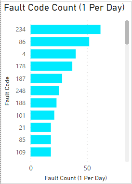
Is there a way to color a bar chart's bars based on values in another table & column? I have one table which displays fault codes and their occurrences, and another table that relates those fault codes to fault levels.
I have tried conditional formatting and creating DAX measures, but each of those wants me to aggregate the fault level column. which I do not need. Essentially I need conditional formatting along the lines of (in pseudocode):
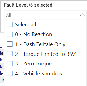
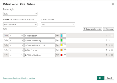
if fault_level = "0 - No Reaction", color those bars blue, else if fault_level = "1 - Dash Telltale Only", color those bars green, else if fault_level = "2 - Torque Limited to 35%", color those bars yellow, else if fault_level = "3 - Zero Torque", color those bars orange, else if fault_level = "4 - Vehicle Shutdown", color those bars red.
For example, if fault 234 has a fault level of zero, I want that bar to be blue. If fault level has a fault level of 3, I want that to be orange.
Please see the screenshots below.
I tried conditional formatting, but the summarization is not needed and it won't let me conditionally format without it.
Any help would be deeply appreciated!
Solved! Go to Solution.
- Mark as New
- Bookmark
- Subscribe
- Mute
- Subscribe to RSS Feed
- Permalink
- Report Inappropriate Content
I figured it out, I needed to add a legend with the same column I was conditionally formatting with.
- Mark as New
- Bookmark
- Subscribe
- Mute
- Subscribe to RSS Feed
- Permalink
- Report Inappropriate Content
Does it work with that summarization? Usually as long as the summarization doesn't do something you don't want it to be doing, it's fine to let it do its thing. In this case, if it's getting the first fault level, and you have a rule for each fault level, I'd expect it to work fine assuming your relationship is flowing in the right direction.
- Mark as New
- Bookmark
- Subscribe
- Mute
- Subscribe to RSS Feed
- Permalink
- Report Inappropriate Content
I figured it out, I needed to add a legend with the same column I was conditionally formatting with.
- Mark as New
- Bookmark
- Subscribe
- Mute
- Subscribe to RSS Feed
- Permalink
- Report Inappropriate Content
It does not, unfortunately. The bar chart in the attached screenshot in my previous post is the result of the conditional formatting I also screenshotted in the previous post. Initially, the bar chart was a darker blue.
Helpful resources

Microsoft Fabric Learn Together
Covering the world! 9:00-10:30 AM Sydney, 4:00-5:30 PM CET (Paris/Berlin), 7:00-8:30 PM Mexico City

Power BI Monthly Update - April 2024
Check out the April 2024 Power BI update to learn about new features.

| User | Count |
|---|---|
| 96 | |
| 95 | |
| 80 | |
| 74 | |
| 66 |
| User | Count |
|---|---|
| 130 | |
| 106 | |
| 105 | |
| 86 | |
| 72 |


