- Power BI forums
- Updates
- News & Announcements
- Get Help with Power BI
- Desktop
- Service
- Report Server
- Power Query
- Mobile Apps
- Developer
- DAX Commands and Tips
- Custom Visuals Development Discussion
- Health and Life Sciences
- Power BI Spanish forums
- Translated Spanish Desktop
- Power Platform Integration - Better Together!
- Power Platform Integrations (Read-only)
- Power Platform and Dynamics 365 Integrations (Read-only)
- Training and Consulting
- Instructor Led Training
- Dashboard in a Day for Women, by Women
- Galleries
- Community Connections & How-To Videos
- COVID-19 Data Stories Gallery
- Themes Gallery
- Data Stories Gallery
- R Script Showcase
- Webinars and Video Gallery
- Quick Measures Gallery
- 2021 MSBizAppsSummit Gallery
- 2020 MSBizAppsSummit Gallery
- 2019 MSBizAppsSummit Gallery
- Events
- Ideas
- Custom Visuals Ideas
- Issues
- Issues
- Events
- Upcoming Events
- Community Blog
- Power BI Community Blog
- Custom Visuals Community Blog
- Community Support
- Community Accounts & Registration
- Using the Community
- Community Feedback
Register now to learn Fabric in free live sessions led by the best Microsoft experts. From Apr 16 to May 9, in English and Spanish.
- Power BI forums
- Forums
- Get Help with Power BI
- Desktop
- Can't get my data right in multi axes chart
- Subscribe to RSS Feed
- Mark Topic as New
- Mark Topic as Read
- Float this Topic for Current User
- Bookmark
- Subscribe
- Printer Friendly Page
- Mark as New
- Bookmark
- Subscribe
- Mute
- Subscribe to RSS Feed
- Permalink
- Report Inappropriate Content
Can't get my data right in multi axes chart
The current visual contains 2 colomns from 2 Tables.
Colomn A in Table 1 = A text type (“names of departments”) –> Axis
Colomn B in Table 2 = A text type (“descriptions of cases”) –> Values
There are now the following fiilters on the visual:
- Fullname (names of employees) From Table 3: “employees”
- Count of descriptions of cases from Table 2
- Date (created on or after…) from Table 2
- Is this a request to call back the customer (all – yes and no) This comes from Colomn C (True/False type), in Table 1
- The name of the department (from Colomn A) it needs to show is… From Table 1
Now it shows all the calls to the five teams of one department.
I want to make a multiple axes chart.
I thought I’d show 3 bars per team: All the calls/the ones with a request to call back/the ones without a request to call back/
But I can’t get it right:
Table 4 contains two measures (they are DAX – so I guess they are measures, not quick measures – I didn’t made them…).
"Call back to customer is needed"
"Call back to customer is not needed"
I thought could use them…
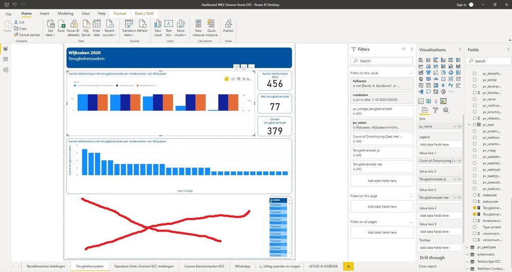
If I drag these measures to Value axis 2 and Values axis 3 (Value axis 1 contains the count of descriptions of cases) it seems to lose the filter on the wanted department, the bars (dark blue and red) show the same numbers for all 5 teams: all the “yes/no call backs”…
Who can help me with this?
Kind Regards,
Simone
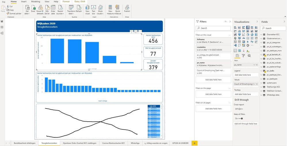
1 CURRENT VISUAL – With all the calls for entire department 456 = all, 77= with request to call back, 379 = no request to call back
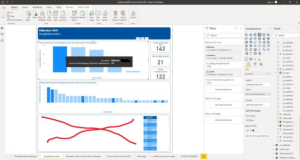
2 ALL THE CALLS FOR 1 TEAM… 143 = all, 21= with request to call back, 122 = no request to call back
3. NOW CHART TYPE = xVIZ MULTIPLE AXES
4. MEASURE OF CALL BACK = TRUE
- Mark as New
- Bookmark
- Subscribe
- Mute
- Subscribe to RSS Feed
- Permalink
- Report Inappropriate Content
Hi @cowboyracer ,
Do you mind sharing your .pbix file? Or please show me the sample data. Then I will understand more clearly about your issue.
Xue Ding
If this post helps, then please consider Accept it as the solution to help the other members find it more quickly.
Helpful resources

Microsoft Fabric Learn Together
Covering the world! 9:00-10:30 AM Sydney, 4:00-5:30 PM CET (Paris/Berlin), 7:00-8:30 PM Mexico City

Power BI Monthly Update - April 2024
Check out the April 2024 Power BI update to learn about new features.

| User | Count |
|---|---|
| 104 | |
| 95 | |
| 80 | |
| 67 | |
| 62 |
| User | Count |
|---|---|
| 138 | |
| 107 | |
| 104 | |
| 82 | |
| 63 |


