- Power BI forums
- Updates
- News & Announcements
- Get Help with Power BI
- Desktop
- Service
- Report Server
- Power Query
- Mobile Apps
- Developer
- DAX Commands and Tips
- Custom Visuals Development Discussion
- Health and Life Sciences
- Power BI Spanish forums
- Translated Spanish Desktop
- Power Platform Integration - Better Together!
- Power Platform Integrations (Read-only)
- Power Platform and Dynamics 365 Integrations (Read-only)
- Training and Consulting
- Instructor Led Training
- Dashboard in a Day for Women, by Women
- Galleries
- Community Connections & How-To Videos
- COVID-19 Data Stories Gallery
- Themes Gallery
- Data Stories Gallery
- R Script Showcase
- Webinars and Video Gallery
- Quick Measures Gallery
- 2021 MSBizAppsSummit Gallery
- 2020 MSBizAppsSummit Gallery
- 2019 MSBizAppsSummit Gallery
- Events
- Ideas
- Custom Visuals Ideas
- Issues
- Issues
- Events
- Upcoming Events
- Community Blog
- Power BI Community Blog
- Custom Visuals Community Blog
- Community Support
- Community Accounts & Registration
- Using the Community
- Community Feedback
Register now to learn Fabric in free live sessions led by the best Microsoft experts. From Apr 16 to May 9, in English and Spanish.
- Power BI forums
- Forums
- Get Help with Power BI
- Desktop
- Average is incorrect.... between the bar graph ave...
- Subscribe to RSS Feed
- Mark Topic as New
- Mark Topic as Read
- Float this Topic for Current User
- Bookmark
- Subscribe
- Printer Friendly Page
- Mark as New
- Bookmark
- Subscribe
- Mute
- Subscribe to RSS Feed
- Permalink
- Report Inappropriate Content
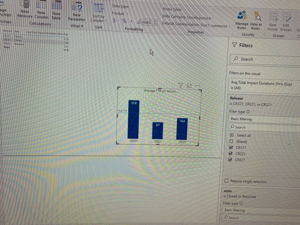
Average is incorrect.... between the bar graph average line and the average shown in card
Hi,
Could someone please provide some insights.. i have a very simple measure like - Total Duration is a value that includes the numbers in hours like 3.4, 2.6 etc
Average_Total_Duration=
VAR TD= AVERAGE('Testing'[Total Duration)
Retrun TD
when i look at the data - I see something is wrong mith the number that is shown in the bar graph average line and the average that is shown in the card and the table
In the below screen shot i have a bar chart with the average measure and also i have the average line that is based on the same measure - but the table is showing 17.9 which is the value at the Total line - this is wrong because the average of those 3 numbers is 14.6 - the one in the bar graph is correct
when i calculate the average not sure why i am getting 17.9 - i have the same set of filters - visual level fitlers on both the bar graph and table - but the average shown in the table is not right - any help please
Solved! Go to Solution.
- Mark as New
- Bookmark
- Subscribe
- Mute
- Subscribe to RSS Feed
- Permalink
- Report Inappropriate Content
Hi Owen, thank you so much for your help and time. I really appreciate your explanation on what is going on between the 2 calculations - in the below calculation first we calculate the CALCULATE ( AVERAGE ( 'Testing'[Total Duration] ) ) this gives me the same result which gives me the same result as table 17.9
then for each unique value in the release we are calculating the average using the average x function
Average_Total_Duration=
VAR TD =
    AVERAGEX (
        VALUES ( 'Testing'[Release] ),
        CALCULATE ( AVERAGE ( 'Testing'[Total Duration] ) )
    )
RETURN
    TD
thanks a lot
- Mark as New
- Bookmark
- Subscribe
- Mute
- Subscribe to RSS Feed
- Permalink
- Report Inappropriate Content
Hi @Raj007
The reason for the difference is that there are two different calculations happening here:
- The Average Line created in the Analytics Pane calculates the arithmetic mean of each of the "data points" in the visual. In the screenshot, this is the mean of the 3 values = 14.6.
- The Total in the table is the arithmetic mean of each value in the 'Testing'[Total Duration] column, so each row of the 'Testing' table has equal weighting.
To produce the same result in both visuals, you could instead use a measure like this (I'm assuming Release is in the 'Testing' table):
Average_Total_Duration=
VAR TD =
AVERAGEX (
VALUES ( 'Testing'[Release] ),
CALCULATE ( AVERAGE ( 'Testing'[Total Duration] ) )
)
RETURN
TDThis calculates the average per Release, then averages those.
Regards,
Owen
- Mark as New
- Bookmark
- Subscribe
- Mute
- Subscribe to RSS Feed
- Permalink
- Report Inappropriate Content
Hi Owen, thank you so much for your help and time. I really appreciate your explanation on what is going on between the 2 calculations - in the below calculation first we calculate the CALCULATE ( AVERAGE ( 'Testing'[Total Duration] ) ) this gives me the same result which gives me the same result as table 17.9
then for each unique value in the release we are calculating the average using the average x function
Average_Total_Duration=
VAR TD =
AVERAGEX (
VALUES ( 'Testing'[Release] ),
CALCULATE ( AVERAGE ( 'Testing'[Total Duration] ) )
)
RETURN
TD
thanks a lot
Helpful resources

Microsoft Fabric Learn Together
Covering the world! 9:00-10:30 AM Sydney, 4:00-5:30 PM CET (Paris/Berlin), 7:00-8:30 PM Mexico City

Power BI Monthly Update - April 2024
Check out the April 2024 Power BI update to learn about new features.

| User | Count |
|---|---|
| 104 | |
| 96 | |
| 80 | |
| 67 | |
| 62 |
| User | Count |
|---|---|
| 137 | |
| 106 | |
| 104 | |
| 81 | |
| 63 |

