- Power BI forums
- Updates
- News & Announcements
- Get Help with Power BI
- Desktop
- Service
- Report Server
- Power Query
- Mobile Apps
- Developer
- DAX Commands and Tips
- Custom Visuals Development Discussion
- Health and Life Sciences
- Power BI Spanish forums
- Translated Spanish Desktop
- Power Platform Integration - Better Together!
- Power Platform Integrations (Read-only)
- Power Platform and Dynamics 365 Integrations (Read-only)
- Training and Consulting
- Instructor Led Training
- Dashboard in a Day for Women, by Women
- Galleries
- Community Connections & How-To Videos
- COVID-19 Data Stories Gallery
- Themes Gallery
- Data Stories Gallery
- R Script Showcase
- Webinars and Video Gallery
- Quick Measures Gallery
- 2021 MSBizAppsSummit Gallery
- 2020 MSBizAppsSummit Gallery
- 2019 MSBizAppsSummit Gallery
- Events
- Ideas
- Custom Visuals Ideas
- Issues
- Issues
- Events
- Upcoming Events
- Community Blog
- Power BI Community Blog
- Custom Visuals Community Blog
- Community Support
- Community Accounts & Registration
- Using the Community
- Community Feedback
Register now to learn Fabric in free live sessions led by the best Microsoft experts. From Apr 16 to May 9, in English and Spanish.
- Power BI forums
- Forums
- Get Help with Power BI
- Desktop
- Adding trend arrows on top of Icons
- Subscribe to RSS Feed
- Mark Topic as New
- Mark Topic as Read
- Float this Topic for Current User
- Bookmark
- Subscribe
- Printer Friendly Page
- Mark as New
- Bookmark
- Subscribe
- Mute
- Subscribe to RSS Feed
- Permalink
- Report Inappropriate Content
Adding trend arrows on top of Icons
Good Evening,
I have conditionally formatted Icons for risk ratings of Red, Amber, Green like the below formatted based on risk numbers of 1, 2 and 3.
I have previous RAG ratings using numbers and calculated columns to work out the change (0 no change, 1 downwards trend, -1 upwards trend) - I'm trying to work out a simple way to keep the below icons but overlay trend arrows onto them to show their trajectory, is there a simple way to do this?
Would I need to remove the conditional formatting with the icons only shown below and use another method?
Thanks!
- Mark as New
- Bookmark
- Subscribe
- Mute
- Subscribe to RSS Feed
- Permalink
- Report Inappropriate Content
Thanks for such a quick reply @Bipin-Lala , I will take a look at these after Easter 🙂
- Mark as New
- Bookmark
- Subscribe
- Mute
- Subscribe to RSS Feed
- Permalink
- Report Inappropriate Content
Hi @pigsinblankets,
We also had a similar requirement as yours, where we had to display the Current Week's RAG along with a trend icon based on the comparison of Current Week's RAG with Last Week's RAG.
But for us, we were displaying the RAG and Trend icons in 2 different columns, since it looked a bit clean and it satisfied the business's requirement.
Overlaying icons in Power BI is not natively available, but I can suggest the following that may satisfy your requirements -
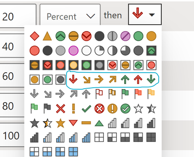
1.) We had also considered displaying the RAG and Trend icon together by using colored Trend arrows, that are available in Power BI default icon set
For example
- Green Up Arrow - RAG improved to Green this week
- Green Circle - No change in Green RAG
- Yellow Up Arrow - RAG improved Yellow this week
- Yellow Circle - No change in Yellow RAG
- Yellow Down Arrow - RAG declined to Yellow this week
- Red Down Arrow - RAG declined to Red this week
- Red Circle - No change in Red RAG
Of course, you would have to create a calculated column and assign numbers to each of the above conditions based on RAG and Trend. These numbers will then be used in conditional formatting to assign icons.
2.) You can create your own custom overlayed icons in any image editing tool (or my favorite PowerPoint!) and then import those custom icons in Power BI. So create your custom RAG + Trend overlayed icons, convert them to base 64 encoding, and add them to a JSON theme file. Once you import this theme file to Power BI, these icons will be available to use in conditional formatting.
These blogs elaborate on the steps to add import custom icons in detail -
- https://medium.com/@khalidwaleed007/custom-icons-in-power-bi-bc8374bbae70
- https://www.mssqltips.com/sqlservertip/6530/power-bi-rag-icons-custom-conditional-formatting/
That's how we were able to add a blue circle icon to our RAG icons and change it to BRAG for reporting!😂
Let me know if any of the suggestions help!
Helpful resources

Microsoft Fabric Learn Together
Covering the world! 9:00-10:30 AM Sydney, 4:00-5:30 PM CET (Paris/Berlin), 7:00-8:30 PM Mexico City

Power BI Monthly Update - April 2024
Check out the April 2024 Power BI update to learn about new features.

| User | Count |
|---|---|
| 105 | |
| 96 | |
| 79 | |
| 67 | |
| 62 |
| User | Count |
|---|---|
| 137 | |
| 105 | |
| 104 | |
| 80 | |
| 63 |


