- Power BI forums
- Updates
- News & Announcements
- Get Help with Power BI
- Desktop
- Service
- Report Server
- Power Query
- Mobile Apps
- Developer
- DAX Commands and Tips
- Custom Visuals Development Discussion
- Health and Life Sciences
- Power BI Spanish forums
- Translated Spanish Desktop
- Power Platform Integration - Better Together!
- Power Platform Integrations (Read-only)
- Power Platform and Dynamics 365 Integrations (Read-only)
- Training and Consulting
- Instructor Led Training
- Dashboard in a Day for Women, by Women
- Galleries
- Community Connections & How-To Videos
- COVID-19 Data Stories Gallery
- Themes Gallery
- Data Stories Gallery
- R Script Showcase
- Webinars and Video Gallery
- Quick Measures Gallery
- 2021 MSBizAppsSummit Gallery
- 2020 MSBizAppsSummit Gallery
- 2019 MSBizAppsSummit Gallery
- Events
- Ideas
- Custom Visuals Ideas
- Issues
- Issues
- Events
- Upcoming Events
- Community Blog
- Power BI Community Blog
- Custom Visuals Community Blog
- Community Support
- Community Accounts & Registration
- Using the Community
- Community Feedback
Register now to learn Fabric in free live sessions led by the best Microsoft experts. From Apr 16 to May 9, in English and Spanish.
- Power BI forums
- Forums
- Get Help with Power BI
- DAX Commands and Tips
- Proper row context in a measure to copy the value ...
- Subscribe to RSS Feed
- Mark Topic as New
- Mark Topic as Read
- Float this Topic for Current User
- Bookmark
- Subscribe
- Printer Friendly Page
- Mark as New
- Bookmark
- Subscribe
- Mute
- Subscribe to RSS Feed
- Permalink
- Report Inappropriate Content
Proper row context in a measure to copy the value from another column dynamically
Good afternoon,
I'm new to the forum and fairly new with DAX. I have a single table that has columns, company, plant, valuestream, and asset that I'm using as company hierarchy. There is a row in the table per asset per day. I have a column chart where the user can drill down through the company hierarchy that calculates and displays productivity. So, if I drill to the plant level, the number of columns displayed are the number of different plants in the plant column, different valuestreams in the valuestream column and so on through the hierarchy.
I have a second line chart connected to the same table showing productivity, again, on the Y axis but with date on the X axis allowing the user to drill into productivity history based on the drill down filter on the column chart. However, I don't want a single series on the line chart. I want a multi-series line chart based on the number of items displayed on the column chart. So, if I drill to the plant level and 3 plants are shown, I want there to be 3 data series in the line chart. This requires a dynamic legend on the line chart that changes based on the drill level of the company hierarchy. My thought was to create a measure that points/copies from the appropriate column (company, plant, valuestream, asset) base on the drill level filter in the company hierarchy and use that for the legend in the line chart. I've written the following DAX measure but I'm running into row/filter context issues (I think). Here's the code. I'm hoping I'm just missing something based on my current experience level. Appreciate any help.
Thanks!
JP
- Mark as New
- Bookmark
- Subscribe
- Mute
- Subscribe to RSS Feed
- Permalink
- Report Inappropriate Content
Basically, the default behaviour of the line chart shows an updated single line (data series) of history based on the drill level of the column chart. However, I wanted the line chart to show the history but instead of a single line show multiple data series matching what is displayed in the column chart. Starting at the top of the company hierarchy, company is shown as a single bar. The line chart would also show history as a single line representing company. The user drills down in the column chart to the next level which is plant. 3 bars are shown for plant 1, plant 2, and plant 3. I want the line chart to show the history for 3 data series, plant 1, plant 2, and plant 3. This behaviour would continue as they drill down. As far as I can tell, the legend in the line chart controls the data series since I have a date hierarchy in the x axis. However, the appropriate data to drive the legend as the drill happens are in different columns. So, I'm trying to create a dynamic column or measure that will used as the legend. So, if the drill level is plant, then load data to the dynamic column or measure from the plant column and so on. I've been trying to write the measure based on the filter level of the column chart but have not been successful. So, currently, I'm using the bookmarks to swap in/out 4 different line charts that use 4 different legends. This is not ideal for the reasons I mentioned, previously. I've provided a link to the pbix file that hopefully provides additional clarity.
- Mark as New
- Bookmark
- Subscribe
- Mute
- Subscribe to RSS Feed
- Permalink
- Report Inappropriate Content
Below is a hopefully a better explanation of what I'm trying to achieve. I have a single table, that looks like this:
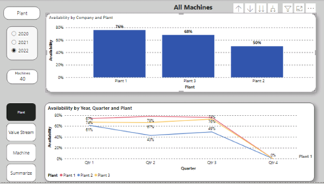
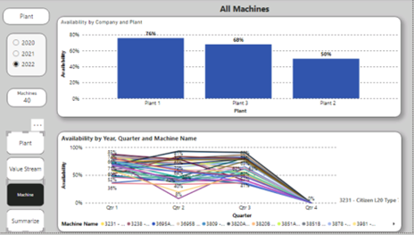
The desired report is the first chart, below. Both column and line charts are displaying a measure called Availability in the Y axis which is Daily Available/Daily Planned. The column chart x axis contains Company Hierarchy drill down. The line chart x axis is Date Hierarchy drill down. There is a single slicer for year that the user can check and then use the line chart to drill down, further. The issue I have is trying to display the same number of data series in the line chart based on the drill down filter of the column chart. Currently, I must change the legend to point to the appropriate column in the Company Hierarchy. Therefore, the solution below has 4 different line charts saved as bookmarks. When the user clicks on a company hierarchy button, the appropriate line chart is displayed and previous hidden. This is not a workable solution. A) managing date drill down on 4 line charts where only 1 is visible at a time causes problems. B) the user could click on a bookmark that displays too many series as show in the second chart, below.
The reason for posting on the DAX Forum is that I’m trying to write some DAX to provide a better solution. My preferences in order:
- Create a measure with row context that I can use as a dynamic legend in the line chart. The measure would contain the values from the appropriate company hierarchy column (company, plant, value stream, or machine) based on the filters of the column chart.
- Limit the line chart to two selections, summary, and the appropriate multi-series line chart based on the filters of the column chart by filtering a dimension table and using as a slicer.
Both solutions require the understanding the filter level of the column chart and applying to achieve one of the preferences above. I started with the DAX, below, which displays a single value shown in the upper left card, above.
I’ve verified that the card updates appropriately as I drill. Now, I’m trying use this concept, replacing the labels with DAX functions to accomplish one or both above preferences. However, everything I’ve tried has context issues and doesn't update as desired.
Any assistance appreciated!
- Mark as New
- Bookmark
- Subscribe
- Mute
- Subscribe to RSS Feed
- Permalink
- Report Inappropriate Content
Hi there.
Not able to fully grasp it without something tangible. Without the data and the report it'll be hard, I guess, for anybody to help 😞 I hope I'm wrong and someone else can help with the info you've given.
Sorry!
- Mark as New
- Bookmark
- Subscribe
- Mute
- Subscribe to RSS Feed
- Permalink
- Report Inappropriate Content
Hi there.
Please simplify your description to only include the most relavant parts. Please try to give examples of what you want, preferably by means of pictures as well (since a picture is worth a thousand words). Also, please when you paste your formulas, try to format them correctly beforhand. Here's an online formatter: DAX Formatter by SQLBI
Thanks.
Helpful resources

Microsoft Fabric Learn Together
Covering the world! 9:00-10:30 AM Sydney, 4:00-5:30 PM CET (Paris/Berlin), 7:00-8:30 PM Mexico City

Power BI Monthly Update - April 2024
Check out the April 2024 Power BI update to learn about new features.

| User | Count |
|---|---|
| 46 | |
| 28 | |
| 23 | |
| 12 | |
| 8 |
| User | Count |
|---|---|
| 76 | |
| 51 | |
| 45 | |
| 16 | |
| 12 |


