- Power BI forums
- Updates
- News & Announcements
- Get Help with Power BI
- Desktop
- Service
- Report Server
- Power Query
- Mobile Apps
- Developer
- DAX Commands and Tips
- Custom Visuals Development Discussion
- Health and Life Sciences
- Power BI Spanish forums
- Translated Spanish Desktop
- Power Platform Integration - Better Together!
- Power Platform Integrations (Read-only)
- Power Platform and Dynamics 365 Integrations (Read-only)
- Training and Consulting
- Instructor Led Training
- Dashboard in a Day for Women, by Women
- Galleries
- Community Connections & How-To Videos
- COVID-19 Data Stories Gallery
- Themes Gallery
- Data Stories Gallery
- R Script Showcase
- Webinars and Video Gallery
- Quick Measures Gallery
- 2021 MSBizAppsSummit Gallery
- 2020 MSBizAppsSummit Gallery
- 2019 MSBizAppsSummit Gallery
- Events
- Ideas
- Custom Visuals Ideas
- Issues
- Issues
- Events
- Upcoming Events
- Community Blog
- Power BI Community Blog
- Custom Visuals Community Blog
- Community Support
- Community Accounts & Registration
- Using the Community
- Community Feedback
Register now to learn Fabric in free live sessions led by the best Microsoft experts. From Apr 16 to May 9, in English and Spanish.
- Power BI forums
- Forums
- Get Help with Power BI
- DAX Commands and Tips
- Difficulties with making visuals filter each other...
- Subscribe to RSS Feed
- Mark Topic as New
- Mark Topic as Read
- Float this Topic for Current User
- Bookmark
- Subscribe
- Printer Friendly Page
- Mark as New
- Bookmark
- Subscribe
- Mute
- Subscribe to RSS Feed
- Permalink
- Report Inappropriate Content
Difficulties with making visuals filter each other in the desired manner
Dear Community, I am currently working in a 3 column table, called "Status", that has the columns productID, statusName and statusValue. An example with 12 rows should look like this:
| productID | StatusName | StatusValue |
| 100 | Ampel1 | green |
| 100 | Ampel2 | green |
| 100 | Ampel3 | yellow |
| 100 | Ampel4 | red |
| 101 | Ampel1 | green |
| 101 | Ampel2 | green |
| 101 | Ampel3 | green |
| 101 | Ampel4 | red |
| 102 | Ampel1 | red |
| 102 | Ampel2 | red |
| 102 | Ampel3 | red |
| 102 | Ampel4 | red |
My goal is to create 4 bar charts that show the Counts of statusValues for each of the statusNames. Currently I do this by creating the bar chart, adding the [StatusName] column as a filter and manually selecting the correct statusName as the filter, for example "Ampel1".Afterwards I created a measure that uses COUNTROWS(Status) and added it as the y-axis for all the bar charts and selected the StatusValue column as my x-axis. While this works my team lead recently asked me whether it would be possible to have the bar-charts filter each other whenever a bar is clicked. Wihin the sample data context the bar-chart for the statusName "Ampel2" would show the counts of green:2, red:1, yellow:0. Clicking on the "green" bar within the bar-chart for statusName = "Ampel1" should change the results shown in the "Ampel2"-Chart to green:2, red:0, yellow:0 because the product with the ID 102 is no longer considered within the context of the "Ampel2"-Chart as it's statusValue for Ampel1 is not "green".
Is there any way to make this work within a table like this? I know that if each statusName had it's own column it would be easy, but I haven't given up on this approach yet.
Solved! Go to Solution.
- Mark as New
- Bookmark
- Subscribe
- Mute
- Subscribe to RSS Feed
- Permalink
- Report Inappropriate Content
Hi @jonmaas ,
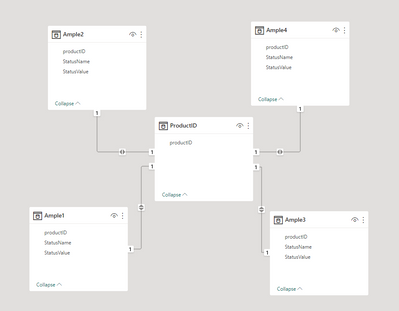
You may need to change your data model:
First create four different tables for StatusName
Then create a table for Product ID
Manage relationships between them:
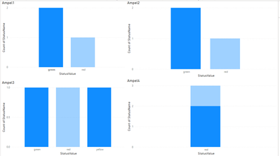
Create four charts with four different tables:
Final Output:
Best Regards,
Jianbo Li
If this post helps, then please consider Accept it as the solution to help the other members find it more quickly.
- Mark as New
- Bookmark
- Subscribe
- Mute
- Subscribe to RSS Feed
- Permalink
- Report Inappropriate Content
Hi @jonmaas ,
Where is the ID 103? I can't find it in your example.
Sorry for that the information you have provided is not making the problem clear to me. Can you please share more details to help us clarify your scenario?
Please provide me with more details about your table and your problem or share me with your pbix file after removing sensitive data.
Refer to:
How to provide sample data in the Power BI Forum
How to Get Your Question Answered Quickly
Best Regards,
Jianbo Li
If this post helps, then please consider Accept it as the solution to help the other members find it more quickly.
- Mark as New
- Bookmark
- Subscribe
- Mute
- Subscribe to RSS Feed
- Permalink
- Report Inappropriate Content
Thank you for you engagement! This is a rather embarrassing typo and was meant to be "102".
Is there any other information you'd require to understand my problem?
Best regards,
Jonathan
- Mark as New
- Bookmark
- Subscribe
- Mute
- Subscribe to RSS Feed
- Permalink
- Report Inappropriate Content
Hi @jonmaas ,
You may need to change your data model:
First create four different tables for StatusName
Then create a table for Product ID
Manage relationships between them:
Create four charts with four different tables:
Final Output:
Best Regards,
Jianbo Li
If this post helps, then please consider Accept it as the solution to help the other members find it more quickly.
- Mark as New
- Bookmark
- Subscribe
- Mute
- Subscribe to RSS Feed
- Permalink
- Report Inappropriate Content
Hi @jonmaas ,
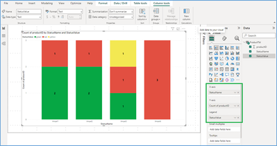
You can try below properties for bar chart to have the count of Products based on StatusValue and StatusName.
X-Axis : StatusName
Y-Axis : Count of ProductID
Legends : StatusValue
Please refer to the below screenshot for the same,
Thanks!
Inogic Professional Services Division
Power Platform and Microsoft Dynamics 365 CRM Development – All under one roof!
Drop an email at crm@inogic.com
Services: http://www.inogic.com/services/
Power Platform/Dynamics 365 CRM Tips and Tricks: http://www.inogic.com/blog/
An expert technical extension for your techno-functional business needs
Drop an email at crm@inogic.com
Service: https://www.inogic.com/services/
Tips and Tricks: https://www.inogic.com/blog/
- Mark as New
- Bookmark
- Subscribe
- Mute
- Subscribe to RSS Feed
- Permalink
- Report Inappropriate Content
Thank you for your suggestion. Unfortunately stacked bar-charts are not what I want to use. Neither is the filtering I asked about included within your suggestion. Implementing the chart with your suggested field selection still does not allow me to filter the bar for "Ampel2" to only consider products that have a certain value for "Ampel1" by clicking the bar representing the desired value.
Helpful resources

Microsoft Fabric Learn Together
Covering the world! 9:00-10:30 AM Sydney, 4:00-5:30 PM CET (Paris/Berlin), 7:00-8:30 PM Mexico City

Power BI Monthly Update - April 2024
Check out the April 2024 Power BI update to learn about new features.

| User | Count |
|---|---|
| 56 | |
| 27 | |
| 24 | |
| 14 | |
| 9 |
| User | Count |
|---|---|
| 77 | |
| 61 | |
| 47 | |
| 17 | |
| 12 |


