- Power BI forums
- Updates
- News & Announcements
- Get Help with Power BI
- Desktop
- Service
- Report Server
- Power Query
- Mobile Apps
- Developer
- DAX Commands and Tips
- Custom Visuals Development Discussion
- Health and Life Sciences
- Power BI Spanish forums
- Translated Spanish Desktop
- Power Platform Integration - Better Together!
- Power Platform Integrations (Read-only)
- Power Platform and Dynamics 365 Integrations (Read-only)
- Training and Consulting
- Instructor Led Training
- Dashboard in a Day for Women, by Women
- Galleries
- Community Connections & How-To Videos
- COVID-19 Data Stories Gallery
- Themes Gallery
- Data Stories Gallery
- R Script Showcase
- Webinars and Video Gallery
- Quick Measures Gallery
- 2021 MSBizAppsSummit Gallery
- 2020 MSBizAppsSummit Gallery
- 2019 MSBizAppsSummit Gallery
- Events
- Ideas
- Custom Visuals Ideas
- Issues
- Issues
- Events
- Upcoming Events
- Community Blog
- Power BI Community Blog
- Custom Visuals Community Blog
- Community Support
- Community Accounts & Registration
- Using the Community
- Community Feedback
Register now to learn Fabric in free live sessions led by the best Microsoft experts. From Apr 16 to May 9, in English and Spanish.
- Power BI forums
- Forums
- Get Help with Power BI
- Custom Visuals Development Discussion
- Combo chart with multiple line charts and can be f...
- Subscribe to RSS Feed
- Mark Topic as New
- Mark Topic as Read
- Float this Topic for Current User
- Bookmark
- Subscribe
- Printer Friendly Page
- Mark as New
- Bookmark
- Subscribe
- Mute
- Subscribe to RSS Feed
- Permalink
- Report Inappropriate Content
Combo chart with multiple line charts and can be filtered by column legend
Hello Power BI expert and user!
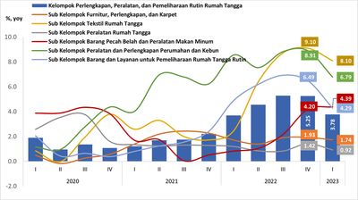
I am new to making a dashboard with Power BI, so I am still lacking many parts and right now, I am struggling to remake this chart (it's the one I made with Excel).
I am so sorry because my data is using Indonesian words. Here I try to explain how actually my data is.
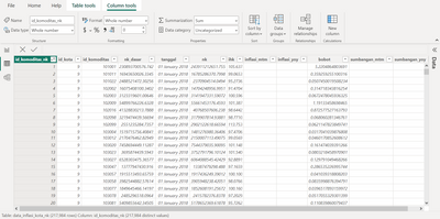
So, I have a table (Table 1) containing these columns:
1. id_komoditas_nk: it's just a unique value for each row
2. id_kota: id_city
3. id_komoditas: id_commodity for each commodity
4. nk_dasar: nk stands for consumption value and nk_dasar is the base for consumption value, which took from the year 2018. It means that the nk_dasar for 2019-2023 is the same as the value from nk_dasar from 2018.
5. tanggal: date that actually contains month and year because my data is updating monthly.
6. nk: consumption value monthly
7. ihk: cpi (consumer price indeks)
8. inflasi_mtm: inflation month to month
9. inflasi_yoy: inflation year on year
10. you can ignore the sumbangan_mtm and sumbangan_yoy columns.
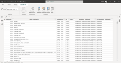
And I join Table 1 with Table 2 which contains the information for each id_commodity. The table looks like this.
So, each id_commodity will be nested to kelompok_komoditas (commodity_group) and sub_kelompok_komoditas (sub_commodity_group).
For example:
id_commodity 101001 (BERAS/RICE), 101011 (MIE KERING INSTANT/INSTANT NOODLE), 102002 (AYAM/CHICKEN) nested in commodity_group: MAKANAN, MINUMAN, TEMBAKAU or in English FOOD, DRINK, TOBACCO and sub_commodity_group: MAKANAN or in English FOOD.
I want to actually make a combo chart from those data. The column chart (bar chart) presents the information on yoy inflation for one commodity_group and the line charts will present the information on yoy inflation for sub_commodity_group. So, the line charts are more than one and I know if I want to show inflation, I should make a calculation through DAX.
So, I just want you to help me make that combo chart with NK value only. I just want to know that is it possible to remake the chart I made in Excel?
I also attach my pbix from the Google Drive link since the message board doesn't allow me to attach pbix file. I really need your guidance expert! Thank you so much in advance.
Here's the link: https://drive.google.com/file/d/19wTHX7nhUO8sZpT0PywKoI59ibIZMLvW/view?usp=sharing
p.s.: I also need to can filter the chart based on commodity_group. So, whenever I filtered commodity_group, the line charts of sub_commodity_groups are also changing.
Helpful resources

Microsoft Fabric Learn Together
Covering the world! 9:00-10:30 AM Sydney, 4:00-5:30 PM CET (Paris/Berlin), 7:00-8:30 PM Mexico City

Power BI Monthly Update - April 2024
Check out the April 2024 Power BI update to learn about new features.

| User | Count |
|---|---|
| 5 | |
| 2 | |
| 1 | |
| 1 | |
| 1 |


