- Power BI forums
- Updates
- News & Announcements
- Get Help with Power BI
- Desktop
- Service
- Report Server
- Power Query
- Mobile Apps
- Developer
- DAX Commands and Tips
- Custom Visuals Development Discussion
- Health and Life Sciences
- Power BI Spanish forums
- Translated Spanish Desktop
- Power Platform Integration - Better Together!
- Power Platform Integrations (Read-only)
- Power Platform and Dynamics 365 Integrations (Read-only)
- Training and Consulting
- Instructor Led Training
- Dashboard in a Day for Women, by Women
- Galleries
- Community Connections & How-To Videos
- COVID-19 Data Stories Gallery
- Themes Gallery
- Data Stories Gallery
- R Script Showcase
- Webinars and Video Gallery
- Quick Measures Gallery
- 2021 MSBizAppsSummit Gallery
- 2020 MSBizAppsSummit Gallery
- 2019 MSBizAppsSummit Gallery
- Events
- Ideas
- Custom Visuals Ideas
- Issues
- Issues
- Events
- Upcoming Events
- Community Blog
- Power BI Community Blog
- Custom Visuals Community Blog
- Community Support
- Community Accounts & Registration
- Using the Community
- Community Feedback
Register now to learn Fabric in free live sessions led by the best Microsoft experts. From Apr 16 to May 9, in English and Spanish.
- Power BI forums
- Forums
- Get Help with Power BI
- Desktop
- Creating a bar chart with a weighted average of 5 ...
- Subscribe to RSS Feed
- Mark Topic as New
- Mark Topic as Read
- Float this Topic for Current User
- Bookmark
- Subscribe
- Printer Friendly Page
- Mark as New
- Bookmark
- Subscribe
- Mute
- Subscribe to RSS Feed
- Permalink
- Report Inappropriate Content
Creating a bar chart with a weighted average of 5 other columns
Hello, I've a SharePoint list with a set of questions showing a ranked list of choices (first through fifth) that I'd like to combined into a "weighted" average. Sample data is below:
Rank scoring would be opposite of the rank (1st tier is worth 5, 2nd tier is 4, etc.) As best I was able to figure it out, the measure could be calculated as:
((COUNTA('Motivation'[Motivation1])*5)) + ((COUNTA('Motivation'[Motivation2])*4))
+ (COUNTA('Motivation'[Motivation3])*3)+ (COUNTA('Motivation'[Motivation4])*2) + (COUNTA('Motivation'[Motivation5])*1))
So there's my measure. Now for my problem. I was able to put that on my Y-axis, but I couldn't get an appropriate X-axis. Putting any specific motivation on the X-axis (used just for the motivation names) limited the numbers to JUST that one set of data. I attempted to create stacked charts, etc. with each of the 4 Motivations on top of each other, and I couldn't make it work.
I'm not sure what I'm missing. I think it's possible to put the result of that measure into a table, but I'm quite new at PowerBI and don't know enough DAX to make it happen; I've scoured the forum and can't quite make the examples here work. Alternatively, if it's not in an extra table, I'm not sure if there's a way to just make it work inside the visualization itself.
Any help would be greatly appreciated.
Thank you very much
Clint
Solved! Go to Solution.
- Mark as New
- Bookmark
- Subscribe
- Mute
- Subscribe to RSS Feed
- Permalink
- Report Inappropriate Content
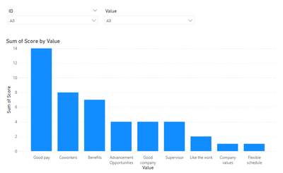
If you are looking for a result similar to...
Your best bet would be to unpivot the motivation columns and assign the scoring in Power Query before building your visuals.
Access Power Query by clicking the 'Transform data' button on the Home ribbon.
Hope this gets you pointed in the right direction.
Proud to be a Super User! |  |
- Mark as New
- Bookmark
- Subscribe
- Mute
- Subscribe to RSS Feed
- Permalink
- Report Inappropriate Content
If you are looking for a result similar to...
Your best bet would be to unpivot the motivation columns and assign the scoring in Power Query before building your visuals.
Access Power Query by clicking the 'Transform data' button on the Home ribbon.
Hope this gets you pointed in the right direction.
Proud to be a Super User! |  |
Helpful resources

Microsoft Fabric Learn Together
Covering the world! 9:00-10:30 AM Sydney, 4:00-5:30 PM CET (Paris/Berlin), 7:00-8:30 PM Mexico City

Power BI Monthly Update - April 2024
Check out the April 2024 Power BI update to learn about new features.

| User | Count |
|---|---|
| 106 | |
| 105 | |
| 80 | |
| 68 | |
| 61 |
| User | Count |
|---|---|
| 143 | |
| 104 | |
| 103 | |
| 82 | |
| 70 |


