- Power BI forums
- Updates
- News & Announcements
- Get Help with Power BI
- Desktop
- Service
- Report Server
- Power Query
- Mobile Apps
- Developer
- DAX Commands and Tips
- Custom Visuals Development Discussion
- Health and Life Sciences
- Power BI Spanish forums
- Translated Spanish Desktop
- Power Platform Integration - Better Together!
- Power Platform Integrations (Read-only)
- Power Platform and Dynamics 365 Integrations (Read-only)
- Training and Consulting
- Instructor Led Training
- Dashboard in a Day for Women, by Women
- Galleries
- Community Connections & How-To Videos
- COVID-19 Data Stories Gallery
- Themes Gallery
- Data Stories Gallery
- R Script Showcase
- Webinars and Video Gallery
- Quick Measures Gallery
- 2021 MSBizAppsSummit Gallery
- 2020 MSBizAppsSummit Gallery
- 2019 MSBizAppsSummit Gallery
- Events
- Ideas
- Custom Visuals Ideas
- Issues
- Issues
- Events
- Upcoming Events
- Community Blog
- Power BI Community Blog
- Custom Visuals Community Blog
- Community Support
- Community Accounts & Registration
- Using the Community
- Community Feedback
Earn a 50% discount on the DP-600 certification exam by completing the Fabric 30 Days to Learn It challenge.
- Power BI forums
- Forums
- Get Help with Power BI
- Developer
- How to Order wise align clusterd chart
- Subscribe to RSS Feed
- Mark Topic as New
- Mark Topic as Read
- Float this Topic for Current User
- Bookmark
- Subscribe
- Printer Friendly Page
- Mark as New
- Bookmark
- Subscribe
- Mute
- Subscribe to RSS Feed
- Permalink
- Report Inappropriate Content
How to Order wise align clusterd chart
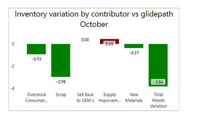
I want to make this graph order wise like below
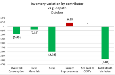
Solved! Go to Solution.
- Mark as New
- Bookmark
- Subscribe
- Mute
- Subscribe to RSS Feed
- Permalink
- Report Inappropriate Content
Hi @THENNA_41 ,
I created a sample pbix file(see attachment), please check whether that is what you want.
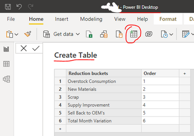
1. Create a sorted table by manual typing. You can also put this sorted table on a cloud-based file (e.g. OneDrive), which makes it easy to maintain and refresh later.
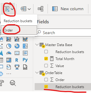
2. Select the field "Reduction buckets" and sort by column "Order"
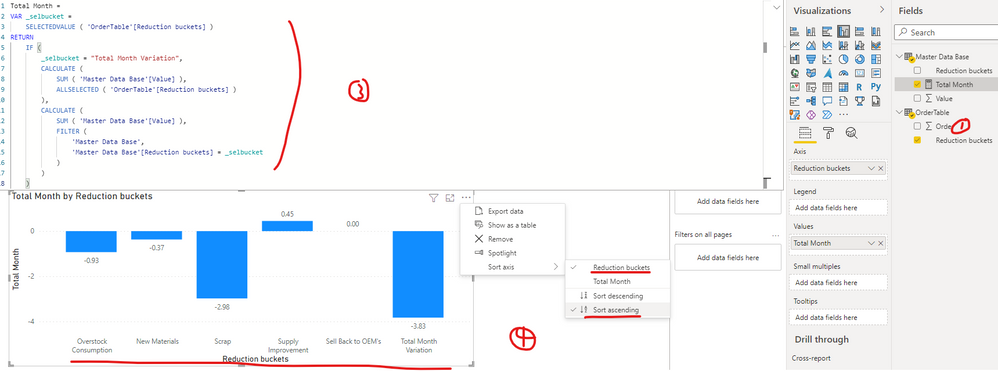
3. Update the formula of your measure [Total Month] as below:
Total Month =
VAR _selbucket =
    SELECTEDVALUE ( 'OrderTable'[Reduction buckets] )
RETURN
    IF (
        _selbucket = "Total Month Variation",
        CALCULATE (
            SUM ( 'Master Data Base'[Value] ),
            ALLSELECTED ( 'OrderTable'[Reduction buckets] )
        ),
        CALCULATE (
            SUM ( 'Master Data Base'[Value] ),
            FILTER (
                'Master Data Base',
                'Master Data Base'[Reduction buckets] = _selbucket
            )
        )
    )
4. Create a clustered column chart(Axis:Reduction buckets of table OrderTable Values: Total Month)
Best Regards
If this post helps, then please consider Accept it as the solution to help the other members find it more quickly.
- Mark as New
- Bookmark
- Subscribe
- Mute
- Subscribe to RSS Feed
- Permalink
- Report Inappropriate Content

I want to make this graph order wise like below

Helpful resources

Microsoft Fabric Learn Together
Covering the world! 9:00-10:30 AM Sydney, 4:00-5:30 PM CET (Paris/Berlin), 7:00-8:30 PM Mexico City

Power BI Monthly Update - April 2024
Check out the April 2024 Power BI update to learn about new features.

| User | Count |
|---|---|
| 15 | |
| 5 | |
| 2 | |
| 1 | |
| 1 |
| User | Count |
|---|---|
| 27 | |
| 3 | |
| 3 | |
| 2 | |
| 2 |
