Hi @Karim_Hossam,
I'm afraid it's hard to do with Power BI native visual. Maybe you can try a R visual. You can try it in this file.
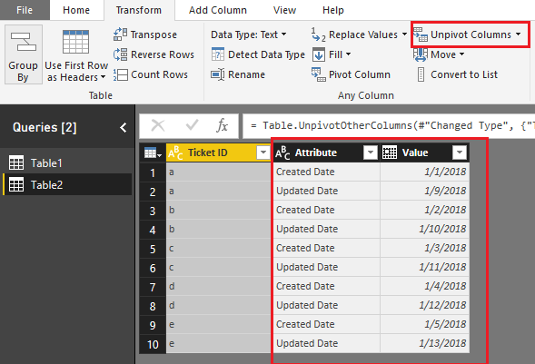
1. Reformat the data.
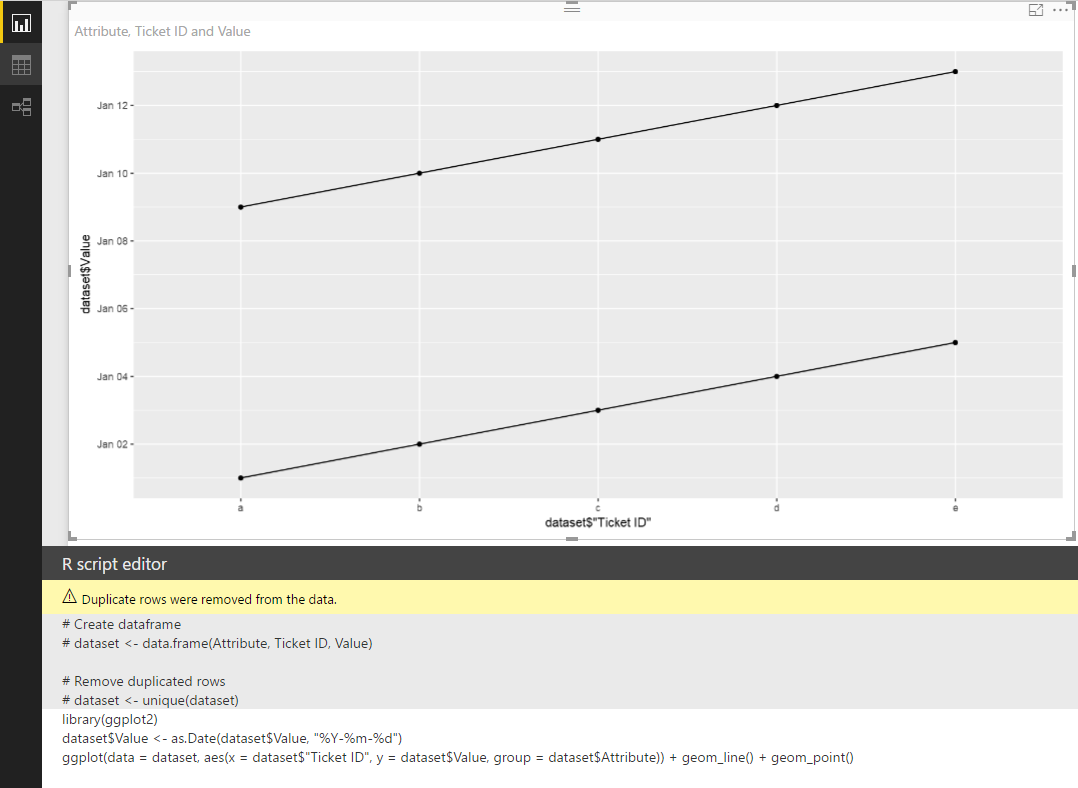
2. Create a R visual.
library(ggplot2)
dataset$Value <- as.Date(dataset$Value, "%Y-%m-%d")
ggplot(data = dataset, aes(x = dataset$"Ticket ID", y = dataset$Value, group = dataset$Attribute)) + geom_line() + geom_point()
Best Regards,
Dale
Community Support Team _ Dale
If this post helps, then please consider Accept it as the solution to help the other members find it more quickly.


