Jumpstart your career with the Fabric Career Hub
Find everything you need to get certified on Fabric—skills challenges, live sessions, exam prep, role guidance, and more.
Get started- Power BI forums
- Updates
- News & Announcements
- Get Help with Power BI
- Desktop
- Service
- Report Server
- Power Query
- Mobile Apps
- Developer
- DAX Commands and Tips
- Custom Visuals Development Discussion
- Health and Life Sciences
- Power BI Spanish forums
- Translated Spanish Desktop
- Power Platform Integration - Better Together!
- Power Platform Integrations (Read-only)
- Power Platform and Dynamics 365 Integrations (Read-only)
- Training and Consulting
- Instructor Led Training
- Dashboard in a Day for Women, by Women
- Galleries
- Community Connections & How-To Videos
- COVID-19 Data Stories Gallery
- Themes Gallery
- Data Stories Gallery
- R Script Showcase
- Webinars and Video Gallery
- Quick Measures Gallery
- 2021 MSBizAppsSummit Gallery
- 2020 MSBizAppsSummit Gallery
- 2019 MSBizAppsSummit Gallery
- Events
- Ideas
- Custom Visuals Ideas
- Issues
- Issues
- Events
- Upcoming Events
- Community Blog
- Power BI Community Blog
- Custom Visuals Community Blog
- Community Support
- Community Accounts & Registration
- Using the Community
- Community Feedback
Grow your Fabric skills and prepare for the DP-600 certification exam by completing the latest Microsoft Fabric challenge.
- Power BI forums
- Forums
- Get Help with Power BI
- Desktop
- Visualize top 3 comparable data points to selectio...
- Subscribe to RSS Feed
- Mark Topic as New
- Mark Topic as Read
- Float this Topic for Current User
- Bookmark
- Subscribe
- Printer Friendly Page
- Mark as New
- Bookmark
- Subscribe
- Mute
- Subscribe to RSS Feed
- Permalink
- Report Inappropriate Content
Visualize top 3 comparable data points to selection
Hi all,
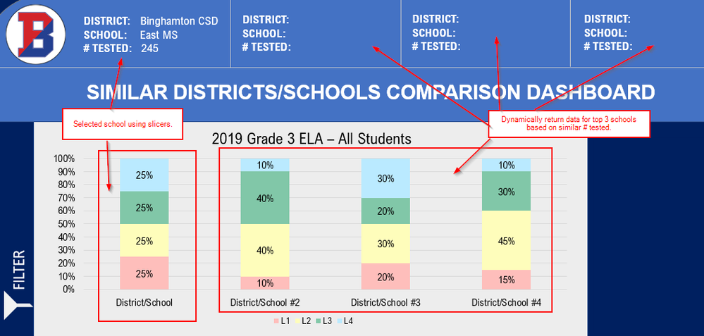
I have a table of school assessment scores. I want to be able to filter and pick a specific school and then have Power BI display the top 3 other schools from the dataset that are comparable to my filtered school. In my mockup design below I have the selected school and then the 3 returned schools in the same chart visual, but I would be okay splitting out the selected school to its own visual if that makes it easier. I also need measures for school name, district, and # tested that can be referenced as a card for the fields along the top of the report.
For example...if the school I select has a # tested of 245, I'd like to see the top 3 schools with a similar # tested (between 221-269). My plan is to use GenerateSeries to come up with a +/- 10% range to use as the criteria. Something like this:
GENERATESERIES( 'My Measures'[SelectedSchoolNumTested] - 'My Measures'[SwingNumber] , 'My Measures'[SelectedSchoolNumTested] + 'My Measures'[SwingNumber] )SwingNumber = ('My Measures'[SelectedSchoolNumTested] * .1 )SelectedSchoolNumTested = SELECTEDVALUE(AssessmentData[NUM_TESTED])
Filtering and displaying the selected school is easy, I have that working. Finding a way to find and display the top 3 similar schools is much more challenging. I have my pbix file linked below. If anyone in the community could give me a nudge in the right direction I'd very much appreciate it!
Link to pbix: https://app.box.com/s/doyhlwmoeinatfan6gcfhm1aluzckysp
Thanks in advance for any help you can provide!
Solved! Go to Solution.
- Mark as New
- Bookmark
- Subscribe
- Mute
- Subscribe to RSS Feed
- Permalink
- Report Inappropriate Content
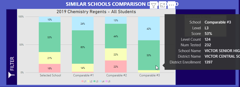
I was able to solve this by creating a static table with a column that contains Selected School, Comparable #1, Comparable #2, Comparable #3. Another column with levels of L1, L2, L3, L4, and L5. I then wrote a measure where I was able to create a virtual table in a variable and generate output appropriately. I then dropped the static column into the x-axis and the the other column into the legend. The measure I created went into the y-axis. I was also able to create other measures to use as tooltips so I could show the actual school names that are returned.
Works perfectly!
- Mark as New
- Bookmark
- Subscribe
- Mute
- Subscribe to RSS Feed
- Permalink
- Report Inappropriate Content
I'd like to see the top 3 schools with a similar # tested (between 221-269).
Top 3 by what? highest value?
Note: Hidden synced slicers make for a bad UX and are a nightmare to debug. Please try using the filter pane instead.
- Mark as New
- Bookmark
- Subscribe
- Mute
- Subscribe to RSS Feed
- Permalink
- Report Inappropriate Content
Thanks for the reply. The more I've been thinking about this...I'd like to have a parameter/slicer for the user to select +/- 10% and then filter the results by that number * num_tested (ex. num_tested is 100, user provides 5% to parameter/slicer, assessment data is filtered to show schools with num_tested of 100-105 or if user provides -5% it would filter num_tested to be 95-100). So top 3 would start closest to num_tested and work away either + or -.
And yes, I can see the hidden synced slicer already being a nightmare to debug. My users aren’t used to using the filter pane but I can work on that!
- Mark as New
- Bookmark
- Subscribe
- Mute
- Subscribe to RSS Feed
- Permalink
- Report Inappropriate Content
It might be (a lot) easier to have a basic table with all schools and their parameters sorted by the score and then instruct your users to scroll to the desired school. They will then automatically see the schools "around" the selection, with no need to specify any percentages etc (although you could add that as a measure)
- Mark as New
- Bookmark
- Subscribe
- Mute
- Subscribe to RSS Feed
- Permalink
- Report Inappropriate Content
I think showing all that data to the user would be too noisy. My users really only care about a couple dozen schools around them but would want to see the few schools around the state that would compare to themselves. I don't have the data in front of me but there are hundreds or more schools in the state.
Helpful resources
| User | Count |
|---|---|
| 77 | |
| 74 | |
| 63 | |
| 61 | |
| 45 |
| User | Count |
|---|---|
| 108 | |
| 103 | |
| 93 | |
| 83 | |
| 64 |


